Graphic novels are becoming increasingly popular, bringing out more and more talented artists to portray either an already popular novel in their own artistic voice, or to give extreme visual life to their personal works. Regardless of the origin of the story, graphic novels have fierce competition as they are already competing not just against other story lines but other artists. In order to get an edge, graphic novel cover design really has to have something special that is going to draw a reader away from everything else. Below are some examples of successful graphic novel covers.
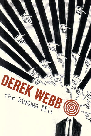
 The Ringing Bell by Derek WebbStrange images can create an effect that is very hard to ignore, and this cover is a great example of that design technique. Multiple long arms in black long sleeves come together, pointing fingers at a single focal spot, which at first glance seems to be a person. At second glance, the reader sees that this person actually has a target for their head, giving the reader a better idea about how this particular person feels, though it doesn’t explain why everyone is pointing their finger at him or her. Even the tie looks like an arrow pointing towards the target. The simple colors of black and white are really all that is needed to get the point across; the author doesn’t need an entire rainbow in order to show that this person is the target for so many others. The red of author’s name and the target are just enough contrast to get a little bit more attention from anyone passing by, to turn a few heads enough to see the rest of this odd cover.
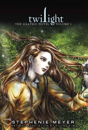
 Twilight Graphic Novel by Stephenie MeyerTwilight has become such an intense success, that it wouldn’t take very much of a cover to make it enticing to readers. So many people have either read or heard of the series, that just the title should be enough to garner a second glance. But this cover designer has made it downright impossible to ignore with these incredibly beautiful covers depicting the two main characters. A set of two books for one story helps to add to the beauty, as two separate images on individual covers becomes one incredible scene when the covers are put side by side. These wondrously artistic drawings are a fantastic way to really capture attention, even those that have not read the series or may not have been interested before, might be captivated by these cover designs. Not only are they a true work of art, but a very successful way of grabbing the attention of any reader that passes by.
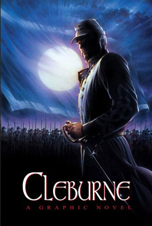
 Cleburne by Justin MurphyIt’s hard to tell if this image is a photo or has just been drawn so well that the detail comes together perfectly to make it look like a photo. Regardless of the medium used, the image itself is dark and intense, and a great way to attract attention. The man in uniform is only slightly illuminated, enough to show what looks like a Civil War soldier, complete with cap and sword. The light of the moon makes it harder to determine if the color of that uniform is actually blue or gray, not allowing the reader to know the side of this mysterious man until they actually start reading. In the background stands an army, with bayonets pointing towards a sky that has been fully lit up by an incredibly large full moon. The final effect of this image is one of complete absorption of anyone that happens to lay eyes on it. The imagery is dark, yet beautiful, leading to an intense need to know about the man that graces this cover.
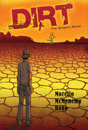
 Dirt by Morello McMenemy RohoWhat may look like a crudely drawn image at first is actually a unique style in many cartoons, both in books and on television. Though it is not as detail driven as other artistic styles, it easily conveys a story without being bogged down by excessive detail. A man stands in the foreground, looking across what seems to be a desert, or at least deserted landscape, that is completely dead except for one lonely tree far off in the distance. From this view point it looks like the tree may already be dead as well, but it still serves as the only piece of anything resembling life nearby, except for the man himself. It is an intriguing image that definitely creates a bit of curiosity as to who this man is, and why he is standing in the middle of a desert. The colors help to portray the dry, arid felling that comes with such scenery. The red and yellow of the dusty ground, the orange of a burnt sky, even the red of the title itself to really let the reader know that this “dirt” is everywhere. As if there is no escape. This cover, with its simpler artistic style, creates an incredible image that really reaches out to the reader, and pokes at their curiosity.
 H2O by Brannen HollingsworthThis artwork is just a jaw dropping example of what cover art can be with the right artist. It just inspires people to really take a step back and think, “wow”. Not only is the detail so intense that it has photo-like qualities, but the imagery depicted in the picture is completely unforgettable. The Statue of Liberty is an iconic symbol of America, one that is and has been easily recognized all over the world. When it is depicted beached on the shore, as it is here, it immediately creates a stir of emotions in the reader, and this is going to lead to the need to take a closer look in order to find out what else is out of order with this otherwise seemingly normal image. The title becomes a new focal point after the reader scans the city in the background, and though the waters have obviously receded, it is water that is the key focus of this graphic novel. Curiosity sparks, and intrigue leads the reader to take an even closer look, only this time by turning this incredibly beautiful and almost mesmerizing cover, and reading the pages within.


