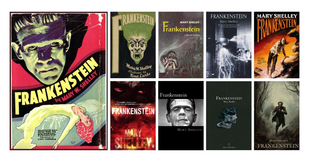
For over 200 years, Frankenstein’s book covers have lured in new readers. The images on the covers keep changing, but they always hint at the creepy story inside. Whether it’s an old-school Gothic vibe or a sleek modern design, the covers grab your attention. The covers reel you in by showing just enough to spark your curiosity. Shelley’s story is as compelling as ever. Still, those provocative covers have been essential in hooking generation after generation of readers.
Table of Contents
Frankenstein Book Covers
Mary Shelley’s classic Gothic novel Frankenstein provides a fascinating visual history of its various interpretations and marketing approaches over time through its book covers. That book has been around for over 200 years, but how it’s been packaged and sold keeps evolving.
Each cover tries to remake Shelley’s cautionary tale for that era. The message about science gone wild stays the same, but the covers remix it to get people’s attention. Some covers lay thick, but you must admit they pull you in!
Shelley probably never could’ve imagined her book getting so many makeovers! But all these provocative covers have kept Frankenstein alive in pop culture. Whether you’re into the vintage Gothic style or the modern minimalist versions, a cool cover will draw you into Shelley’s timeless cautionary tale. So take a spin through the wild evolution of Frankenstein covers with us!
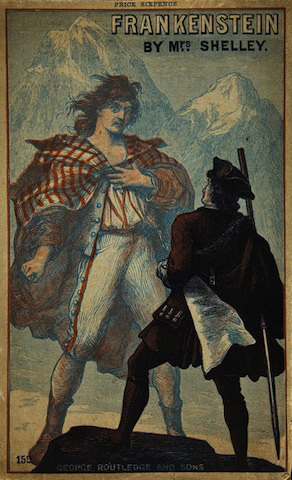
Starting this list is the book jacket released for the edition published in 1882 by George Routledge & Sons. At first glance, one can instantly tell it’s a vintage design. The typography and design possess an appealing simplicity. Devoid of serifs, the lettering opts for the clarity of sans-serif faces, allowing the words to be visible against the light background. The text, which utilizes a black-and-white color scheme, is cleverly positioned in the upper right corner to complement the nearby illustration. Through its dignified balance of image and words – both pronounced clearly in crisp colors – this cover achieves a graphic elegance.
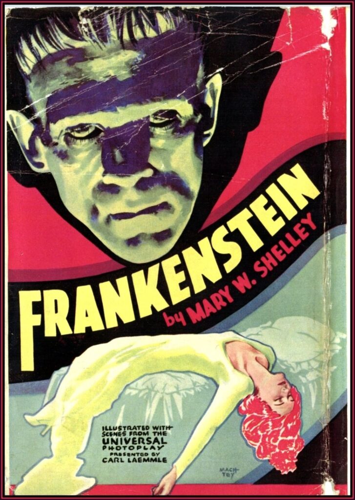
Capitalizing on the popularity surrounding James Whale’s cinematic portrayal, publisher Grosset & Dunlap released “photoplay” editions of Shelley’s novel featuring production stills of the stars of this nascent Hollywood hit. On this cover, people can find the enduring iconography of Frankenstein’s Monster – with a flat-topped head and electrode neck bolts. The enlarged, central “F” directs attention like a lightning rod to the name “Frankenstein,” reflecting the oscillating polarities of wonder and horror intrinsic to the Monster’s genesis. Enrobed in a vivid crimson cloth binding and stark onyx lettering, this photoplay edition of Frankenstein is an artifact of its era.
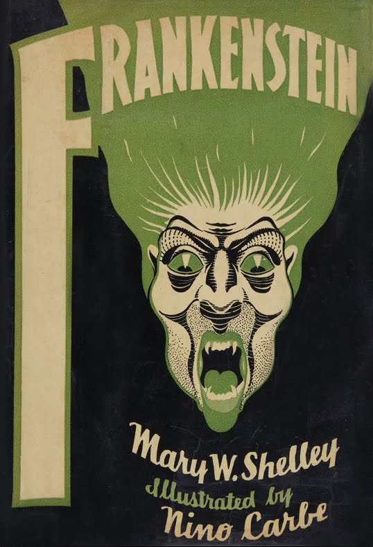
Nino Cambré brings his considerable talents to bear on the 1932 Grosset & Dunlap cover design of Frankenstein. With meticulous attention to detail, Cambré renders the artwork in green, cream, and black colors. There are two key points to focus on in this design: the letter “F” enlarged to highlight the title and the haunting illustration of the monstrous figure. Meanwhile, the author’s and illustrator’s names lie beneath in a cursive script font. Cambré thus visualizes the haunting essence at the heart of this Gothic masterwork and produces a profoundly arresting work of art in its own right – one that lingers in the mind’s eye long after.
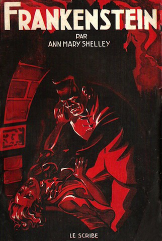
This red, funereal black and creamy ivory-colored cover captures the foreboding essence of Shelley’s seminal tale with its stark illustration of implied violence – a masculine figure, perhaps the Doctor himself, throttling the life from an obscured female form. The boldfaced title sits atop the composition in crisp, uniform sans-serif, the capital letters underscoring the latent urgency of the scene below.
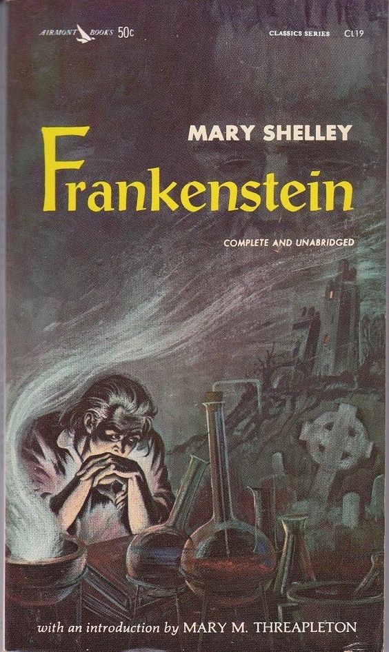
A striking vision emerges from the cover released as part of the Airmont Books Classic Series in 1963. The cover art features a dark and ominous image, using shadowy tones and haunting motifs to create a foreboding atmosphere. Visual elements such as the man, flasks, books, and a tall tower give readers an immediate idea of what’s to come in the narrative. Closely viewing the cover will allow readers to see the story’s monster camouflaged in the dark sky! Meanwhile, as for the typography, this edition used a serif typeface for the title and a sans serif one for the author’s name, which was pretty small and placed on top of the title. Dark and intriguing, this edition’s book cover does that for Frankenstein!
This 1976 edition from Pocket Books puts forth a decidedly contemporary take on the Frankenstein mythos. At the fore, rendered in detailed strokes and vibrant hues, stands the monster himself – the icon of Shelley’s tale. This monster stands menacingly against its eerie surroundings. Yellow sans-serif letters boldly spell the title, the author’s name glowing crimson below it. This cover’s reimagined visual motifs and imaginative modernist aesthetic tap into the essence of Shelley’s seminal tale while evoking nostalgia.

Next to this list is a book cover that uses a realistic visual to portray the crafting of Frankenstein. The illustration, mainly in cool-toned black, white, and gray, features machines and electric bolts, as if owned by a mad scientist ages back. The typography is also simple and uniform: a serif font that only varies in size- the title being the biggest, followed by the author’s name and another text.
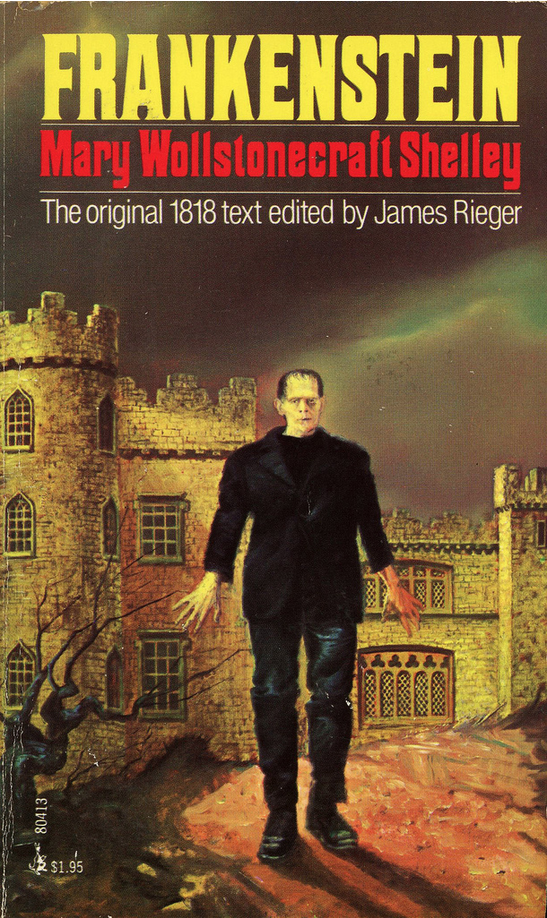
The cover art of this 1984 paperback edition of Frankenstein presents a dramatic, modern reimagining of Shelley’s Gothic classic. Awash in bold tones of sanguine scarlet, fiery orange, and brilliant gold, the background illustration depicts a lone, sinister figure, face obscured in shadow as he strides with maleficent intent. The font used for title lettering and the author’s name harmonizes flawlessly with the graphic sensibilities of the overall composition. For an audience potentially unfamiliar with the original novel’s exploration of moral philosophy and human ambition, such vivid artwork reinforces widespread associations between the name “Frankenstein” and the terrifying creature himself.

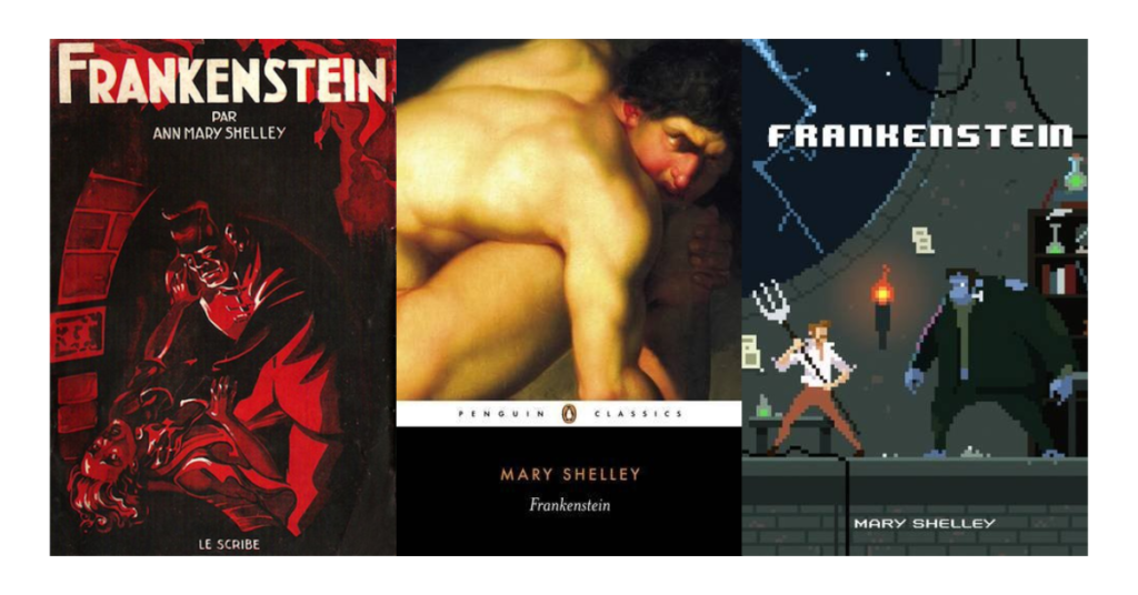
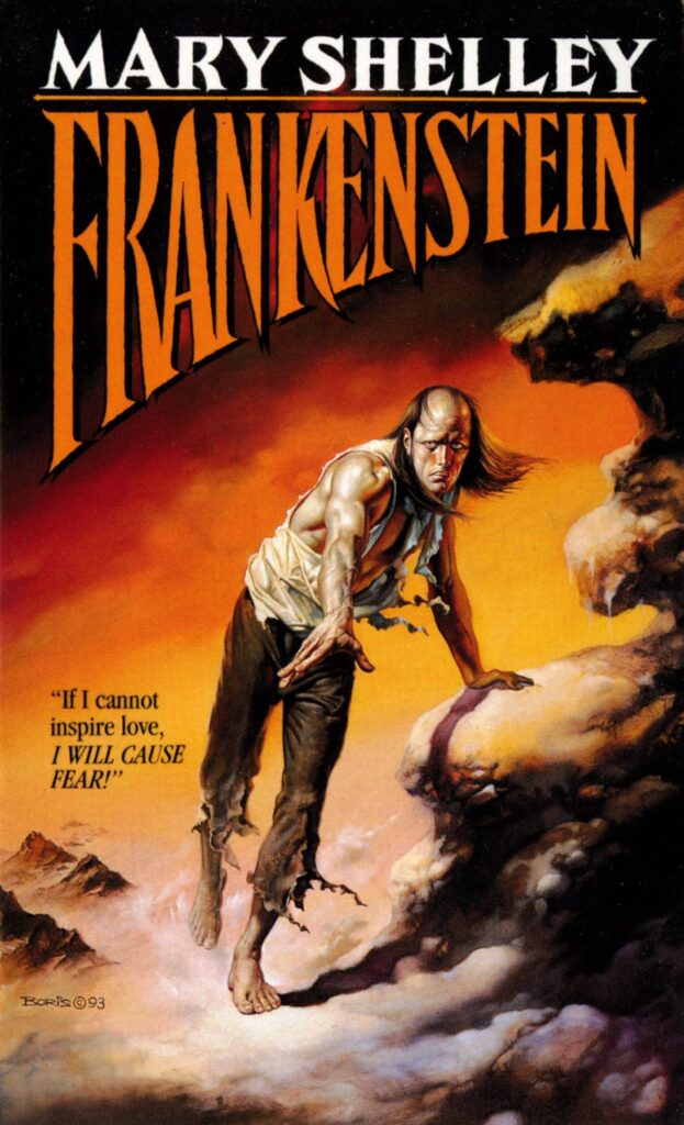
You can’t help but be drawn in by the cover of this 2003 edition. There’s such an infectious excitement about it! The design is broken into three main pieces. This engrossing illustration is top-of-the-top, featuring a muscular, stoic man holding up his leg. Underneath is a skinny white banner with the publisher’s name in a classic sans-serif; at the bottom, the title and author’s name pop against an inky black background. The format used for this edition’s text differs from most in this list, with the author’s name slightly more prominent than the title.
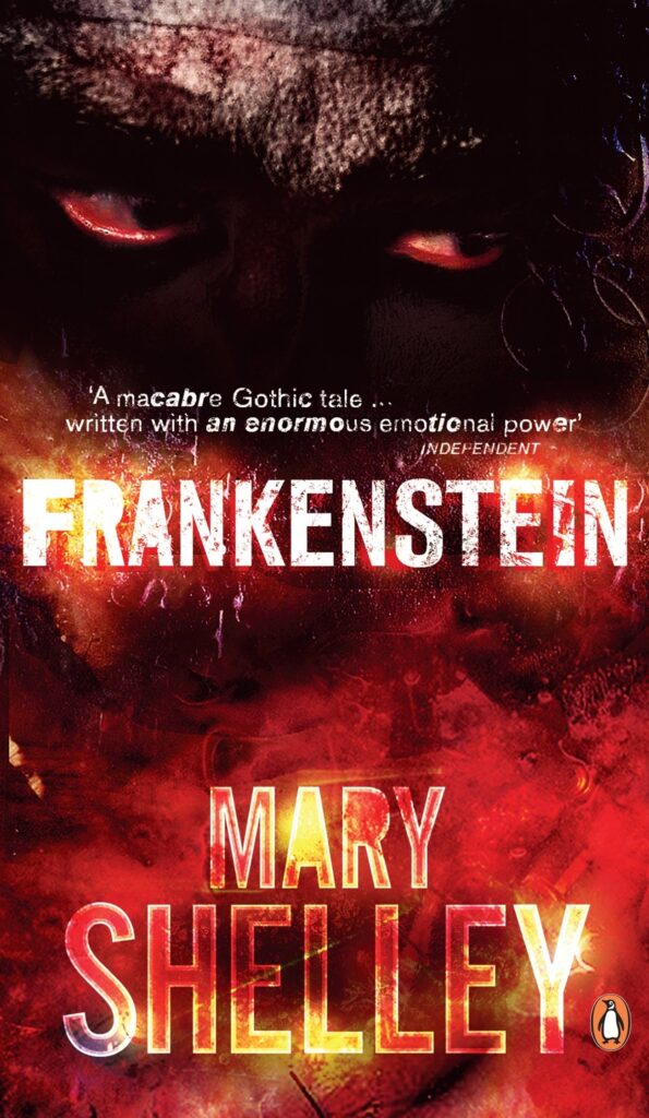
This edition’s book cover boasts a dark, creepy aesthetic that pulls readers in without prompting. With vibrant reds and murky blacks dominating its color scheme and menacing red eyes gazing into the distance, the artist almost flawlessly captured Mary Shelley’s Gothic vibe! Even further enhancing this dark aesthetic are titles and author names written across its surface while remaining true to its macabre theme; just looking at this design tells you this book promises an unsettling journey into shadowy depths!
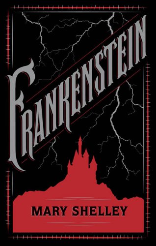
You can tell the designers of this Frankenstein book cover released in 2012 were going for an air of refined yet creepy mystery. The color scheme screams Goth Lit 101 – deep crimsons, funeral blacks, and foggy grays that look lifted straight from a horror film set. They kept the layout nice and clean, using refined lines to create the lightning bolts and the abandoned castle’s silhouette. This cover lives up to the timeless, creepy majesty of Shelley’s Frankenstein!
This cover has no fancy graphics or textures – just an open space and an overall minimalist aesthetic. This pared-down style gives it an elegantly straightforward look, like something you’d see in an art museum. At the center, you’ll find the Frankenstein monster’s head, staring straight ahead with its half-closed eyes. The lack of embellishment helps lookers to focus directly on the serif lettering for the title, the author’s name, and the haunting image of the Frankenstein monster. This understated cover will no doubt appeal to old and new Frankenstein fans alike!
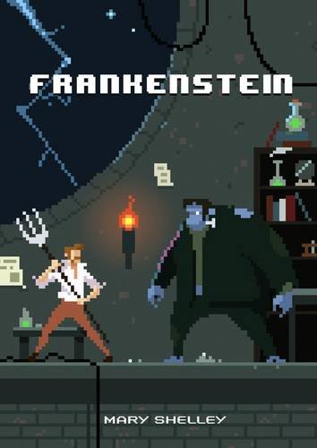
Get a load of the cool pixel art cover on the 2016 edition of Frankenstein! It’s like a funky retro video game version of the classic story. You’ve got Dr. Frankenstein holding a pitchfork in front of his lab experiment, his ominous monster standing as they face each other at his laboratory. The text also uses a typeface usually found in pixel games, with all letters in upper case. Seeing this pivotal moment from the book reimagined with old-school pixels is super creative and fun!

Most book covers these days are cluttered with flashy graphics trying to grab your attention. However, this design, published in 2020, is clean and focused – just the title and the author’s name in a classic serif font and a small illustration in the center. The only visual is a small, hazy illustration of what I’m guessing is the monster’s silhouette with the story’s setting filling its colors. By paring it down to the bare essentials, this cover pulls you in rather than assaulting your senses. It’s inviting in an understated way!
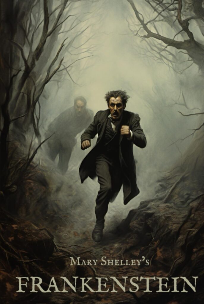
You can practically feel the desperation from the two men on the cover of the 2023 edition of Frankenstein. It’s a scene of pure panic – one man running for his life, the other close behind in frantic pursuit. The body language screams urgency and fear. These men are not just going for an evening jog! The dark, muted background encases the sprinting men, creating an aura of palpable danger. Complemented with classic serif font text, this cover effectively conveys Shelley’s classic Gothic tale in an arresting cinematic fashion.
An Insight About Mary Shelley’s Frankenstein
Mary Shelley wrote the classic horror novel Frankenstein way back in 1818, and it’s still wickedly popular today. It’s about a scientist named Victor who gets obsessed with creating life. He makes a monster out of corpse parts, but when the ugly creature comes alive, Victor freaks out and rejects his creation.
The angry monster decides to get revenge on Victor for abandoning him. This kicks off some tragic events as the bitter monster lashes out at his creator. Shelley explores thoughtful questions about science ethics and how ambitions can go too far. The book makes you ponder whether Victor should have made the monster first and if some science should be off-limits.
Frankenstein has been wildly popular ever since it was published in 1818. So many movie and book versions have been drawn from the original novel. Audiences can’t get enough of the creepy monster and his ambitious but misguided creator. The story has timeless messages about how far is too far when pushing boundaries in science. Shelley warned us that just because you can do something doesn’t always mean you should. Frankenstein shows how unchecked ambitions can cross ethical lines and spiral out of control. It’s a gripping, thoughtful tale that still totally resonates today!
FAQs about the Frankenstein Book Covers
Q: Why do Frankenstein book covers usually look all dark and creepy?
A: The spooky vibe on Frankenstein’s cover artwork matches the Gothic style of the book. Using a dark, mysterious look helps draw readers in and excites them about the suspenseful story. Making the covers look haunting and sinister helps sell the thriller ride that awaits when you crack open Frankenstein!
Q: What symbols do you usually see on Frankenstein book covers?
A: Some pretty typical images pop up! You’ve got lightning bolts to represent the whole “bringing the monster to life” thing. Creepy gothic buildings, labs with beakers, and science stuff tend to show up too. The eerie silhouette of the monster himself makes an appearance on a bunch of covers. You’ll also see a combo of dark, moody colors mixed with bright pops to capture that gothic vibe.
Q: Do any Frankenstein book covers spotlight the character Victor Frankenstein himself?
A: For sure, some covers feature Victor front and center! He’ll typically look like a young, driven scientist, ambitious and intense, often in a lab or workshop setting as he works on crafting his infamous monster. So, while many covers go for just the monster, you can find editions that directly spotlight the obsessive Dr. Frankenstein and his fateful experiments!
Q: Do the book covers for Frankenstein change significantly between editions from different times?
A: Yes, Frankenstein covers transform depending on when the edition was published. Old-school versions look more classic and moody, with paintings and a gothic vibe. But newer editions sometimes get modern and minimal, playing around with more straightforward, abstract designs.
Q: Can the book covers highlight different interpretations or themes from the novel?
A: For sure! Frankenstein covers can vary in what parts of the story they focus on. Some make the monster look straight-up horrifying to play up that element. Others might emphasize the deeper philosophical issues the book brings up. So, the cover art can push different angles of the themes and messages from the original novel. It’s incredible how the covers clue you into the vibe and interpretation you’ll get inside!
Conclusion
The alluring imagery of Frankenstein’s covers intrigues readers to explore Shelley’s gothic masterpiece anew. Each rendition proffers the creators’ singular perspectives, allowing diverse eras and tastes to find their way in. Thus, these works grant the novel an evolving vitality that spans two centuries.
If you need more inspiration for your book cover designs, check out our Book Cover Ideas Blog here! We have a collection of creative ideas you can use to make your own fresh, innovative covers. It’s the perfect resource to spark cover design creativity!