
Purple is an unusual color not often seen in nature. When purple is seen it can represent a large array of things to different people, but often it leads to extraordinary things. When used on a cover, because it is not an everyday color, it can become a very successful tool for gathering attention to a novel.
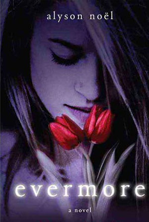 Evermore by Alyson NoelThis cover is just simply beautiful. From the girl to the flowers to the empowering influence of purple from top to bottom, side to side. The only thing that breaks it up is the bright white of the title and the starkly contrasting red of the flowers that the girl is holding. Both of these contrasts serve to break up the monotony of the purple and therefore become the focal point that will really reach out and grab the attention of the potential readers. This is an incredibly beautiful cover that has used contrast to really bring out the background of the purple in a wonderful way and creating an overall enchanting cover that ill demand a second look from passersby.
 This Lullaby by Sarah DessenWhen creating images and using a dominant color, there are two ways to outline the desired objects, and that is either by creating different shades of the same color, or to use a completely different color altogether. This cover has successfully used both techniques to really outline what the creators feel are the most important parts. First, the title has been made with very large, block letters and stand out from the background by using different shades of purple. Obviously this author is well known, not only because of the information stating that they are New York Times bestseller, but because their name has taken up most of the cover room; and is even bigger than the title itself. The second contrast is that of the guitar outline against the purple background, and then again of the purple heart-shaped guitar pick against the gold and black of the guitar itself. Both uses of contrast are more than successfully pulled off and create an impossible to ignore cover.
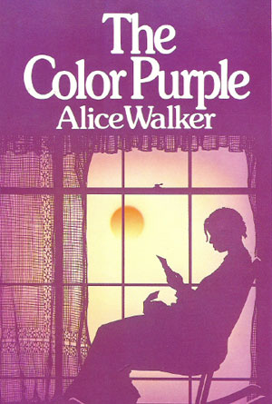 The Color Purple by Alice WalkerThis is an incredible literary classic, and even those that have never read the novel itself have at least heard of it. With this immediately familiarity, the cover doesn’t need much to make it stand out, but this particular design has gone out of its way to grab attention just in case someone might pass it by. The human brain tries to make associations, and that includes between an individual color and what objects may be that particular color. Here, the literal color purple has taken over the entire cover, broken only by the reddish sun in the background and the white letters on the top and bottom of the cover itself. The title helps to complete that association with the background by stating plainly what the reader has already seen: The Color Purple. This gives the color, and the cover, new and more important meaning, and gives the final touch to a powerful image using an unusual color.
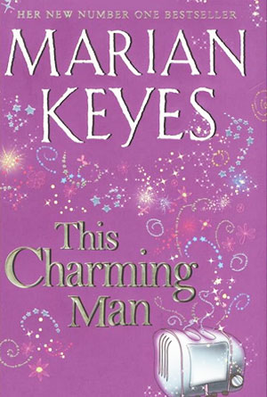 This Charming Man by Marian KeyesHere is a plum cover that creates the perfect background for the fireworks display that is covering it from corner to corner. This particular shade is almost pastel, calms and nothing that really jumps out at the reader, but when it is combined with the bright display of colors it transforms into something wonderfully captivating. It is because the background is so “plain” that the rest of the images are able to really stand out so much, and create their eye-catching effect. With nearly any other color, or even any other shade of purple itself, the effect wouldn’t be as successful. “This Charming Man” has a very charming cover as well.
 Fairystruck by J.L. BryanThis cover is a perfect example of using color in a cartoonish style to really capture the attention of those passing by. In general, book covers are done in a style that is more realistic. Because this has gone against that tradition, it has already created an aura of captivation. That idea is taken a step further by using a color that is not often seen or used, to create an image that is sure to grab the eye of anyone passing by. Of course there are other colors present, such as the white of the girl’s hair and the letters of the interesting font, and the pink of her wings, and the tiny little skulls and hearts floating around (another eye-catching effect). But each of these are illuminated perfectly by the purple of the background. This is really a great cover that actually demands to be seen.