Black is often coincided with thoughts of darkness, evil and things that should generally be kept away from. Though this is true in many situations, black doesn’t have to be a deterrent. Instead, with the right design and combined with the proper images and contrasted properly with other colors, it can transform a menacing image into something positive and captivating. Below are five such black book cover designs.
 The Faerie Ring by Kiki Hamilton
This cover has used a brilliant contrast of bright pink against a mostly black background. While the black may seem intimidating, it is pushed to the back and allows the beauty and luminescence of the pink light to take over the foreground. This sharp contrast of colors is immediately attention grabbing for those passing by, enough for them to take a closer look and see other details of the cover like the innocent looking girl fading into the back, the enchanting ring, and of course the title. Faerie Ring sounds anything but menacing, instead brings a completely different kind of image to mind, and with its white letters also contrasting the black background, completes the captivating effect of the cover overall.
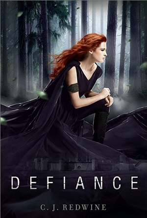
This is an incredible example of a black book cover used to represent good instead of something dark or evil. There is a beautiful young girl with bright, flowing red hair dressed completely in black from head to toe. Her stance mimics the title perfectly; and the title itself is impossible to ignore with bold white letters against the black of her clothing. Tall, dark trees stand still in the background, adding to the overall effect of her pose and the title combined. If she was wearing any other color, it would probably not have the captivating appeal that it commands on this cover, which is why the color black has been used so successfully here.
 Alice in Zombieland by Gena Showalter
This is another incredible example of contrasting a bright color against the darkness of a black background in order to really capture a potential reader’s attention. Here, the blackness not only creates a frame around the girl Alice, but casts an eerie background behind her as well. This is why Alice herself, in her iconic bright blue dress and ivory skin, stands out so well against this darkness. She becomes the focus, breaking up the black and the darkness with her brilliance. The readers no longer see the black except only as a surrounding aura to the beautiful girl sitting on the ground. Alice is such a recognizable figure too, that this cover has expertly used that familiarity to their advantage by putting her against the black background; she stands out that much more and really grabs the passerby’s attention.
Very rarely when people think of the black book covers do they associate them with food; and that is why this one is so fantastic. It uses the idea of contrast in two different ways: with color and with association. By placing the orange food in front of the black background, it immediately creates an image that is going to demand a second glance from casual browsers. The title, also in a contrasting bright color to the dark background, will hold that attention because the words “comfort” and “food” are not normally put into the same mental categories as the color black. This perfect combination of starkly contrasting ideas and colors will first grab a reader’s attention and then hold it more than long enough for the cover to be cracked open in order to learn more. A seemingly simple idea executed for a precise reaction, and very well done.


