
After the author write an action novel it is up to the designer to successfully convey that action in one image on the cover. This can be a difficult job as the term “action” usually depicts movement, and obviously a still image is not going to move. Below are a few action book cover designs that do a good job of depicting their action subject matter in a single still image.
 Tenth Man Down by Chris Ryan
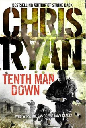
One picture can tell a powerful story, and a book cover can do the same thing. This designer has chosen a very dramatic scene to portray the contents of this novel on the cover. They have also wisely chosen to combine the visual power of the scene with the cognitive power of the title itself, making the entire cover one main attention grabbing piece. When the reader sees soldiers on the front, running from an unseen enemy with a graphic scene in the background, they will become immediately intrigued about what has brought these men to this current situation. Soldiers are obviously a great character choice when it comes to action novels, and this designer has made it abundantly clear about who the reader can expect to be reading about in this book. The added effects like camouflage through the author’s name and bullet holes add the intense feeling of the situation, and therefore the cover itself, making it a very successful design.
 The Bourne Ultimatum by Robert Ludlum
Thanks to Hollywood, the Bourne books have gained a wide audience of fans, both of the written version and the cinematic version. For those that may not be familiar with either of these versions, this particular cover design has been created to really pull them in. The background image of a man running, caught in mid-step is a great focus point for the cover, it draws the reader’s attention almost immediately. The title helps to keep that attention, as even if a reader has never actually read these books or seen the movie, the name itself is likely familiar. The large white letters of the title against the darker background, especially of “Bourne” in bold, help to stand out and make sure readers see exactly which book this is. And then the information at the top, again in white letters that easily stand out from the dark background, tell the reader that this book is a bestseller, and that it is also by the author of The Bourne Identity, as that is likely the title that they have heard before. Familiarity is the best part of this cover design, but the other elements come together nicely to stand out to any readers passing by.
 The Final Evolution by Jeff Somers
A collage of images is a good way of creating a master image that is going to really grab a reader’s attention. This cover has pulled off this technique perfectly with a motley assortment of images, each of which creates a small amount of curiosity in the reader, and when combined create an obvious portrayal of the action within the pages. The individual images – the DNA strand down the side, the computer chip of the background, the city skyline in the middle and of course the silhouette of a man with a gun in each hand looming over the entire picture – each of these mean very little by themselves, but when put together on they create an incredible master image that tells the reader that this book is absolutely worth your time and attention.
 Deep Water by Paul Bishop
If a designer can’t capture a perfect action moment in a still image, the next best thing would be to combine several still images. This cover has two very impossible-to-ignore images that not only convey that this is certainly an action novel, but also grab onto a potential reader’s attention. A beautiful woman pointing a gun in such a way that it looks like it’s actually pointing at the reader, and a boat caught in the ice, possibly sinking with a red target encircling one of its passengers. Both of these are still images, but both perfectly relate the potential action sequences that wait within the pages of this book. Instead of trying to find one action scene and finding that one perfect moment that still tells a story in a still image, this designer has chosen two still images that actually work better by being still. They combine to create an incredible cover that will be hard to miss by readers.
 The Matarese Circle by Robert Ludlum
The depiction of action can be done in many ways, but when it comes to a still image the possibilities are a little limited. That’s why a good cover designer has to get past that obstacle and still be able to convey the feeling of the novel. This cover does the trick nicely, with a man in mid-step, obviously running from what appears to be an explosion or some kind of nasty fireball behind him. The intensity of the moment can be felt as this man looks behind him at what could possibly be his demise. Action is very hard to capture in just a moment, but this designer has done so perfectly, with every little detail to really reel in the reader, and make them feel the heat of that fire just as the man on the cover certainly does. That intense feeling will transform into a need to know what happens next, as obviously a picture isn’t going to tell the whole story.