
The genre of post-apocalyptic has become increasingly more popular among the masses. This makes anyone writing these books more likely to be able to sell their own personal novels, but makes the cover designer’s job just a little bit harder because they now have more competition. In order to make one cover stand out over another, it has to not only get the message across, but be so stunning (without being revolting) that readers are just naturally drawn to it. Below are a few post-apocalyptic book cover designs that do this very well.
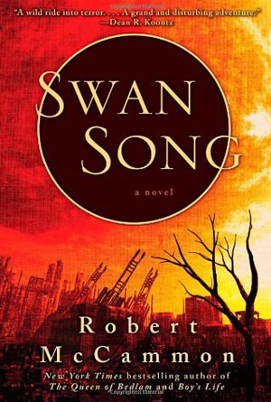 |
Swan Song by Robert McCammon
The title itself should really be enough to get the message across to readers that this is obviously a book about “the end”. The term “swan song” has long been understood to mean a final gesture, just before death. It is obviously by the image behind the title that the Earth has suffered an enormous tragedy; the ruins of a city lay crumbling in the background and a single, solitary dead tree stands ominously in the foreground. The sky is tinted with reds, oranges and yellows, giving only the slightest hint to the reader as to what could have possibly brought this image into being. And then there is the large, black circle framing the title in white letters; it is meant to stand out and meant to draw attention away from the disturbing scene of the image. The idea behind “swan song” gains more meaning as the reader combines it with the fallen city image, and then ideas start to form as to what the novel may be about. But the only way to find out, is to open the incredibly thought out cover, and read. |
| The First Days by Rhiannon Frater
More often than not, whenever there is any kind of situation in which someone needs to step up and lead, it is usually a male hero. This book’s cover automatically draws attention with two females on the cover, hinting that it is already stepping away from the norm by having heroines as the saviors instead of the typical male hero. Then the reader notices the title and ideas start to form about what this book is actually about. When it comes to post-apocalyptic books, they can be further split into many different sub-genres, but one of the most popular is whether the story takes place right after the end of civilization, or farther in the future. This book, by the title, is obviously about mankind’s survival in the first days after the apocalyptic event. Signs of civilization are still present, as is obvious with the gas station on the front, still alight with electricity. The normalcy of the image is interrupted by the ominous colors in the sky and the dead trees taking over the background. It’s as if the past and present are colliding on one image, brought perfectly together by this cover’s designer to provoke the reader into taking a closer look. |
 |
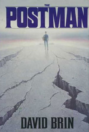 |
The Postman by David Brin
Many images that come to mind when people think of a post-apocalyptic world are bleak and barren lands, stretching forever into the horizon. This cover picture banks on that thought process perfectly, with a desolate landscape, obviously completely void of any kind of life, except for the one lone person standing in the distance. Taking a cue from the title, this must be “the postman”, apparently alone in a dead world. The image creates an incredible frame around this one lone figure, by using large, solid and dark letters for both the title and the author’s name combined with the scene; a bleak, crevasse filled ground leading to a white and dreary sky, and where they meet stands this one, lonely character. It all comes together perfectly to jump out at the reader and demand more than just a passing glance. |
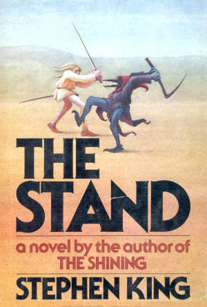
| The Stand by Stephen King
Sometimes, the more simple you can make something, the more effective it will be. This is the case with this book cover for Stephen King’s The Stand, his epic novel about the final showdown between the forces of good and evil. The book cover shows any potential readers the very basic information that they need: this is going to be a story about good vs. evil. With two characters frozen forever in the middle of a battle, one dressed in white to represent goodness, one dressed in black to represent evil, the desert their background to represent the desolateness of the earth after most of its inhabitants are swept away with disease. Even the font is simple; nothing fancy is needed because the picture gives you all the feeling you need for this novel. And to top it off, since this book was written before Stephen King became a household name, a small addition is made to let the reader know that if they enjoyed The Shining, then they will likely enjoy this novel as well. |
 |
 |
Ashes of the Earth by Eliot Pattison
Here is an interesting cover that creates more curiosity and intrigue in the reader than other covers that are just trying to shove images down in their faces. The chain link fence is an automatic clue that either something is being kept out, or something is being kept in. In this case, from the view point of the reader, it looks as if both are happening at once: the reader is kept from what appears to be a book and other scattered objects, and vice versa. That is of course, until the reader actually picks the book up and starts to read, thus figuratively allowing them passage through that gate. Other aspects of this cover that really help to secure that intrigue are the array of colors. Nothing too bright, but nothing dull and boring either, just the perfect blend of everyday colors arranged in a way to attract attention without being too loud. Then of course, there is the subtitle that tells the reader flat out that this book is about the mystery of the post-apocalyptic America. This is obviously the least subtle approach, but everything about this cover creates an intense curiosity that makes it hard to resist for those passing by. |