Young Adult Fiction book covers vary as much as the stories inside. In fact, they may or may not necessarily project “young adult”. While it can be effective to immediately attract or relate to the book’s target audience, with many older adults often reading young adult fiction as well, it can be beneficial to for the design to have a broader appeal and a sophisticated look.
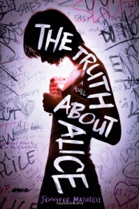 The Truth About Alice by Jennifer Mathieu
With a young girl at the center, surrounded by graffiti, this book cover design clearly represents the young adult genre, yet does so in a mature way. From the realism of the text and the use of photography, the reader can immediately imagine that this book likely deals with difficult, real-world teen issues. While the graffiti creates chaos in the background, contrast is used very effectively to make the title stand out clearly. The darkened silhouette of the young girl adds mystery, urging the reader to want to discover who Alice is. The handwritten type pairs well with the graffiti, and is effectively arranged to fill the space of the girl’s profile. The truth about her, or the discovery of that truth, seems to consume her.
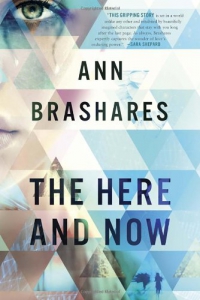 The Here and Now by Ann Brashares
This cover design combines young adult and science fiction genres. While a teary-eyed youthful face looks out at the reader in the upper left corner, a mosaic of abstract images and overlapping color suggest mixed up pieces of a puzzle. The clean black type complements the geometric pattern in terms of both placement and contrast. A cool color palette gives the feeling of drama. The combination of one simple typeface and the geometric pattern give this cover a very modern, even futuristic feel. The overall effect is very eye-catching and unique.
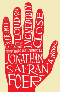 Extremely Loud and Incredibly Close by Jonathan Safran Foer
This book cover design is simple yet chaotic. A plain background and silhouette of a hand are the only elements aside from the text, and it is the text that adds character. The irregular, hand-written type is written in different directions and sizes. One has to take a second look in order to read it, but in this case, that works for, not against, the design. There is something very childlike about it as it reminds one of the hand tracings children often do. The red color against a plain ivory background is very bold and makes this cover stand out in a crowd. Even from a distance, the reader is enticed to read the mass of chaotic text inside the hand. The type also complements the title, as the words themselves seem loud and close.
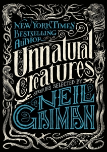 Unnatural Creatures: Stories Selected by Neil GaimanThis young adult fantasy book cover design has a very classic look to it. An intricate border of vines and branches seamlessly connects detailed illustrations of various creatures. Inside the border is the text in three unique, fantastical, distressed typefaces. The placement, varied sizing and slant of the text creates very little white space, yet the pop of blue color distinguishes each section, making it very readable. With all of the swirls and flourishes, the design is dark and creepy in a fun, whimsical way, just what the reader is looking for in bedtime stories. The repetition in the details and flourishes give this a classic, timeless look.