Flat design is trending, most notably in web design and mobile applications; however, there are many great examples of flat design in print and book cover design. Flat design is simplistic and modern, emphasizing shapes, colors, and typography, while avoiding the details that create realism, such as gradients, shadows, and photographs. Flat design provides visual clarity, a modern and clean feel, and can be beautifully minimalistic. When done right, flat design can grab the reader’s attention with visuals that seems to pop off the page.
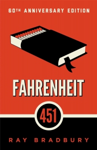 Fahrenheit 451 by Ray BradburyA great example of effective flat book cover design is this 60th anniversary edition of Fahrenheit 451. Here this classic novel appears modern and relevant. The imagery is very simple, yet it sends a clear message of what the book is about. The use of both color and contrast make the book attention-grabbing, and the orange color has particular relevance to the themes of the book, which, regardless of whether someone has read it or not, they can infer from the matches depicted in this cover. The sans-serif type pairs well with the simplistic illustration, and the word “Fahrenheit” particularly stands out. The color combination of orange, black, and white almost give a sense of unease, which only adds to the reader’s expectations of what is inside.
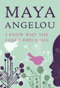 I Know Why the Caged Bird Sings by Maya AngelouThis autobiographical book chronicles Maya Angelou’s early years. The profile silhouette on the right subtly portrays young girlhood. Simple geometric shapes are used as branches to host two birds, relating to the title. Furthermore, the profile looks on at the birds, as if communicating with them and knowing some secret. The layered white patterns of branches seem to connect everything. Again, the flat design lends modernity to this classic book.
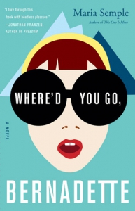 Where’d You Go, Bernadette by Maria SempleAt the center of this flat design is an eye-grabbing minimalist illustration containing the beginning of the title. The oversized sunglasses draw the viewer right in, and given the expression of the mouth, one can imagine widened eyes underneath, lending a bit of drama to this cover. The red lips and yellow headband contrast nicely with the background blues and teal. The modern, sans-serif type is clean and complements the illustration. Overall, the effect of the sunglasses and facial expression add mystery and entice the reader to want to find the answer to the question in the title.
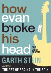 How Evan Broke His Head by Garth SteinThis flat design emphasizes type. Select letters are turned backwards which immediately relates to the title, as reading these letters gives the reader the feeling of a “broken head”. The large, rounded type really stands out and feels modern. Because of the overall simplistic design, even with each word of the title being a different color, it still has a clean look, and the varying colors just add a touch of madness. The guitar illustration complements the oversized text because of its simplicity, and the eye is still drawn to the higher contrasted title. The tag containing the words “a novel” cleverly merges the text and illustration. The colors are muted yet well contrasted.