
Yellow, like orange, is not a color that is often seen in everyday life. So when it is used in application such as book covers, it tends to stick out just because it is yellow. By adding in other elements such as designs or recognizable pictures, it turns an eye-catching cover into an interesting one.
 A Million Miles in a Thousand Years by Donald Miller Obviously the first thing that is going to catch a passerby’s attention is the fact that this cover is absolutely dominated by the color yellow. And not just some bright, painful kind of yellow; a calm, easy-on-the-eyes kind of yellow. And once a reader is lured in by the unusual color, they are further captivated by the familiar image of the inner part of a bicycle wheel. With the spokes scattering out in all directions and the chain wrapped around the gear, it almost creates an optical illusion from the corner of your eye that this wheel may actually be turning. And this may have something to do with the truly unusual title; because obviously no human being is going to live a thousand years, and certainly couldn’t go a million miles. So what is this book really about? The cover has created sufficient curiosity to open it up and find out.
 The Girl With The Dragon Tattoo by Stieg LarssonIt always helps a book’s popularity when Hollywood decides to take the story to the big screen, as has been done with this title. But even if a reader has never heard of this book, or the movie, they are still going to be grabbed by the truly unique yellow background with interesting pale green designs on the front. The black of the letters stands out brilliantly against the eye-catching yellow, making it impossible for a reader to not know what this book is, who wrote it, or that it is an international best seller. The hint of red outline around the entire outer border really adds to the originality of this cover, and tops off the overall effectiveness of its attention-capturing abilities.
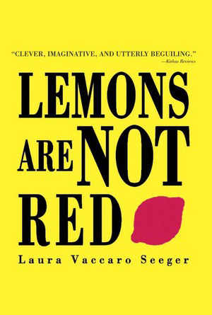 Lemons Are Not Red by Laura Vaccaro SeegerSometimes the simplest tricks are the most effective, like having a plain yellow background with contrasting colors for the font and picture. Nothing overdramatic or over-the-top, just an impossible to ignore yellow background that stretches from top to bottom, side to side, very large black letters which stand out perfectly against this yellow background, and a red lemon. And the red lemon may be what really captures readers’ attentions because one, it is a red shape against a yellow background and so stands out immediately. But also because obviously lemons are not red, as the title demands, and by having a red lemon on the cover, in direct contradiction to the title, adds a little bit of fun and mischief to the cover. This is the perfect example of “less is more”.
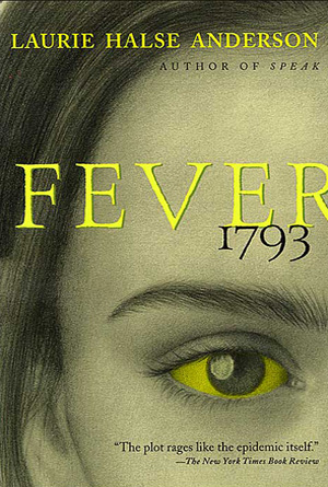 Fever 1793 by Laurie Halse AndersonThis is an intense image that uses the slightest bit of yellow in such an appropriate and captivating way that the covers becomes a focal point, and hard to look away from. The word “fever” automatically instills instant emotions in anyone who reads or hears it; we as a species associate fever with sickness and a general malaise, and so unpleasantness comes to mind. This doesn’t have a negative effect on the cover though, only intensifies it with the dingy looking hue of yellow that covers the person on the front. Their eye adds to the affect, looking jaundiced as every last bit that is supposed to be white has been saturated with the sickly yellow. Even the letters have an ill look to them, mimicking the dull color. This cover works great to pick at our emotions and cerebral associations, making it cleverly captivating.
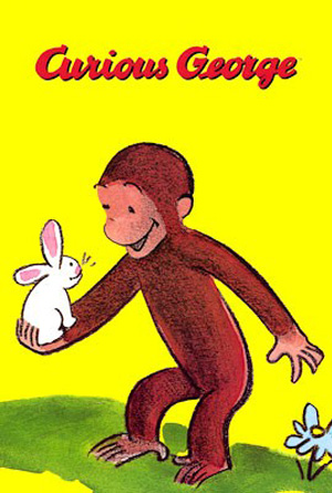 Curious George by H.A. ReyThe adorable little monkey has become an iconic figure in present day life, especially for new, younger generations that are coming across him for the very first time. The great thing about George is that his popularity has spread from the written word to the television screen, making the simple illustration even more recognizable. Just as iconic as the monkey himself is the bright yellow background that almost always accompanies his book covers. Much like headpiece of his companion, this specific shade of yellow, combined with a little monkey drawing has been instilled in our memories. What makes this cover great is that fact that it hasn’t changed in the years since its original inception, proving that you just don’t mess with perfection. Once you find a formula that really works, stick with it because people are more likely to come back to something they remember, than something entirely new.