
Worship and devotion book covers are commonly designed using images and colors that are considered uplifting and peaceful, although this can vary depending on a book’s audience. For instance the covers of men’s, women’s, teen’s, and children’s devotionals will vary considerably in appearance. Nature photographs depicting trees that symbolize life and growth, or water that represents grace and calmness, are common on both worship and devotional book covers. Below are some examples of covers from worship and devotion books that are geared toward different audiences.
1. Not by Sight by Jon Bloom
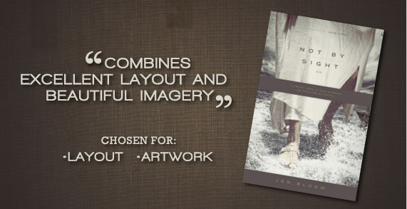
A book cover that combines excellent layout and beautiful imagery, Jon Bloom’s Not by Sight has a cover that is not only aesthetic but also appropriate for the content of the book.
The two best features of the cover are:
Layout – The design layout of Not by Sight incorporates excellent use of hierarchy between the title, subtitle, and author. The large image in the background overlaid with darker blocks of color containing the subtitle and author add dimension to the layout in addition to the depth implied in the imagery through the boat and sky in the distance with Jesus walking forward.
Artwork – The imagery effectively uses the gestalt principle, as many are aware of the biblical account of Jesus walking on water and the test of Peter’s faith in Christ in the midst of a storm. The presence of the front of a fishing boat in the image also adds to an implication that the picture depicts the biblical account of Jesus and Peter walking on water. An excellent use of depth is used in the image, as Jesus’ feet on the water are clearly visible in the foreground, with the boat and sky deep in the background.
2. 65 Promises from God for Your Child: Powerful Prayers for Supernatural Results
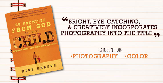
The cover of 65 Promises from God for Your Child by Mike Shreve is bright, eye-catching, and creatively incorporates photography into the title. As a cover for a book directed toward parents, the design also does an excellent job at appealing to the intended audience.
Two great features of this book cover are:
Photography – Photographs were creatively incorporated into the title of this book cover by having multiple pictures of children set into the word child. The photographs not only add dimension to the title, but also add expression and personality while drawing attention to the focus of the book.
Color – The use of color was handled very well on this cover. The similar tones and limited color palette make the design unified and keep the cover from looking too busy. The choice of bright oranges and yellows also makes the cover stand out and look child-friendly.
3. One Thousand Gifts Devotional: Reflections on Finding Everyday Graces by Ann Voskamp

The cover of Ann Voskamp’s One Thousand Gifts Devotional has a beautiful cover design that is feminine and reflects the joyful content of the book. The choice of typography, photographs, and soft colors work well together for the cover of a women’s devotional.
The best features of this book cover are:
Layout – The use of two photographs on the book cover work so well together because of the excellent layout. The elements containing the title and subtitle help to break up the page while tying the images together. The addition of a texture on the left side of the cover also adds diversity by having the element vertical as opposed to horizontal as the other elements in the design.
Color – The soft hues of green, blue, and tan are an excellent choice for the cover of this devotional. Limiting the color palette to these tones also aids in unifying the cover design and making it look professional.
4. The Furious Longing of God by Brennan Manning
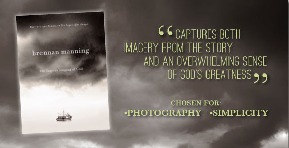
The large dark cloud hovering over a lonely boat at sea evokes feelings of curiosity and wonder as to what the author intends to present as the furious longing of God. A book that includes the personal story as to how a man caught in a storm at sea eventually came to understand the vast love of God, the cover captures both imagery from the story and an overwhelming sense of God’s greatness.
Two excellent features of the book cover are:
Photography – The unique photograph used on the cover captures two themes from the book in one image, making it strong and successful imagery for the cover. It clearly reflects the story of the author who had been caught in the storm at sea, at the same time implying the furious longing of God as a large, vast cloud hovering over and contrasted with the small boat.
Simplicity – The simple typography and color scheme of the cover photograph work together to create a strong and successful cover design. The cover effectively uses simplicity as it communicates the theme of the book while remaining minimal in design.