
Ministry and church leadership books cover a wide range of books from children’s ministry and women’s ministry to church planting and church growth. An important aspect to express in any kind of ministry or church leadership book cover is that the cover design be relatable to the targeted audience. Especially in books dealing with ministry, if a reader is seeking out a book that can provide help or direction them in a certain area, they will want a book that looks relatable to him or her. Below are some covers that do an excellent job at relating the content of the book to the audience through the cover designs.
1. Redemption: Freed by Jesus from the Idols We Worship and the Wounds We Carry by Mike Wilkerson
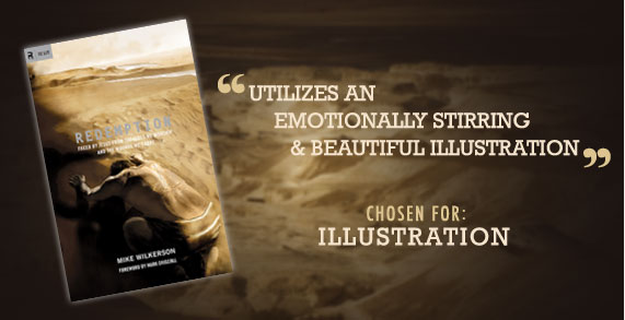
The cover of Mike Wilkerson’s book, Redemption, utilizes an emotionally stirring and beautiful illustration that excellently handles portraying the content of the book. The cover reflects the author’s connection of the biblical account of God’s redemption of His people from slavery in Egypt to Jesus’ redemption of sinners through His death from modern idols today. Although the title is a little difficult to read because of the size and color, this is easily made up for by the strength of the illustration used on the cover.
The best feature of this book Cover is:
Illustration – The illustration on this cover book cover is what makes it so eye-catching. The brown and golden hues as well as deep contrasts between light and dark make this illustration stunning. A key reason for the strength of the illustration is its ability to tie in both the portrayal of the wilderness that the Israelites wandered in after their redemption from Egypt and Jesus Christ, with whip lashes on his back symbolizing his approaching death to redeem sinners.
2. On the Spot: No Prep Games for Youth Ministry Edited by Steve Parolini
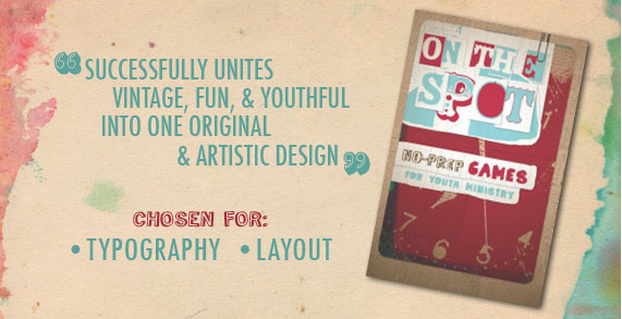
The book cover of On the Spot: No Prep Games for Youth Ministry successfully unites vintage, fun, and youthful into one original and artistic design. Such characteristics are perfectly fitting for reflecting the inner content of the book.
Two great elements of the book cover are:
Typography – The unique and bold font choices for the cover are ideal for a fun-focused youth ministry book. The subtitle particularly stands out as a font that is relatable to contemporary teens, as handwritten fonts have become highly popular today.
Layout – The textures and implied layers on the cover give the appearance of a 3D image. Layers of old paper, a playing card shape, paperclip, and lined paper are all creative elements that make the layout original and artistic.
3. Center Church: Doing Balanced, Gospel-Centered Ministry in Your City by Timothy Keller

The use of a bright red circle containing the title on the cover of Center Church by Timothy Keller provides an eye-catching, aesthetic design while effectively presenting the content of the book.
An excellent feature of this book cover is:
Photography – The photograph chosen for the cover of this book is an excellent photograph in itself, beautifully capturing the contrast between shadows and sunlight. As the book focuses on church ministry in cities, the photograph of a city intersection is distinctly fitting for the book and has the capability of drawing attention from leaders in city churches. In addition, the red circle and title of the book has been incorporated into the photograph, fitting pleasantly within the center of circular intersection in the image.
4. Sticky Church by Larry Osborne
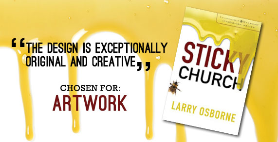
Who doesn’t think of honey when they hear the word sticky? The clean yet creative cover of Sticky Church by Larry Osborne does an excellent job at portraying sticky, a theme that he communicates throughout the book to represent building churches with members that stick. The design is exceptionally original and creative, yet stays within the parameters of being related to the book’s content.
A great feature of this book cover is:
Artwork – What particularly stands out in the artwork of this cover is the realistic honey dripping down the front of the book. The honey works well combined with the dark, bold title against a stark white background. The bee on the left-hand side of the cover was also intentionally placed to balance out the majority of honey dripping down the right side. The artwork does an excellent job at communicating the theme of church members that stick, something that most pastors undoubtedly desire for their congregations.