
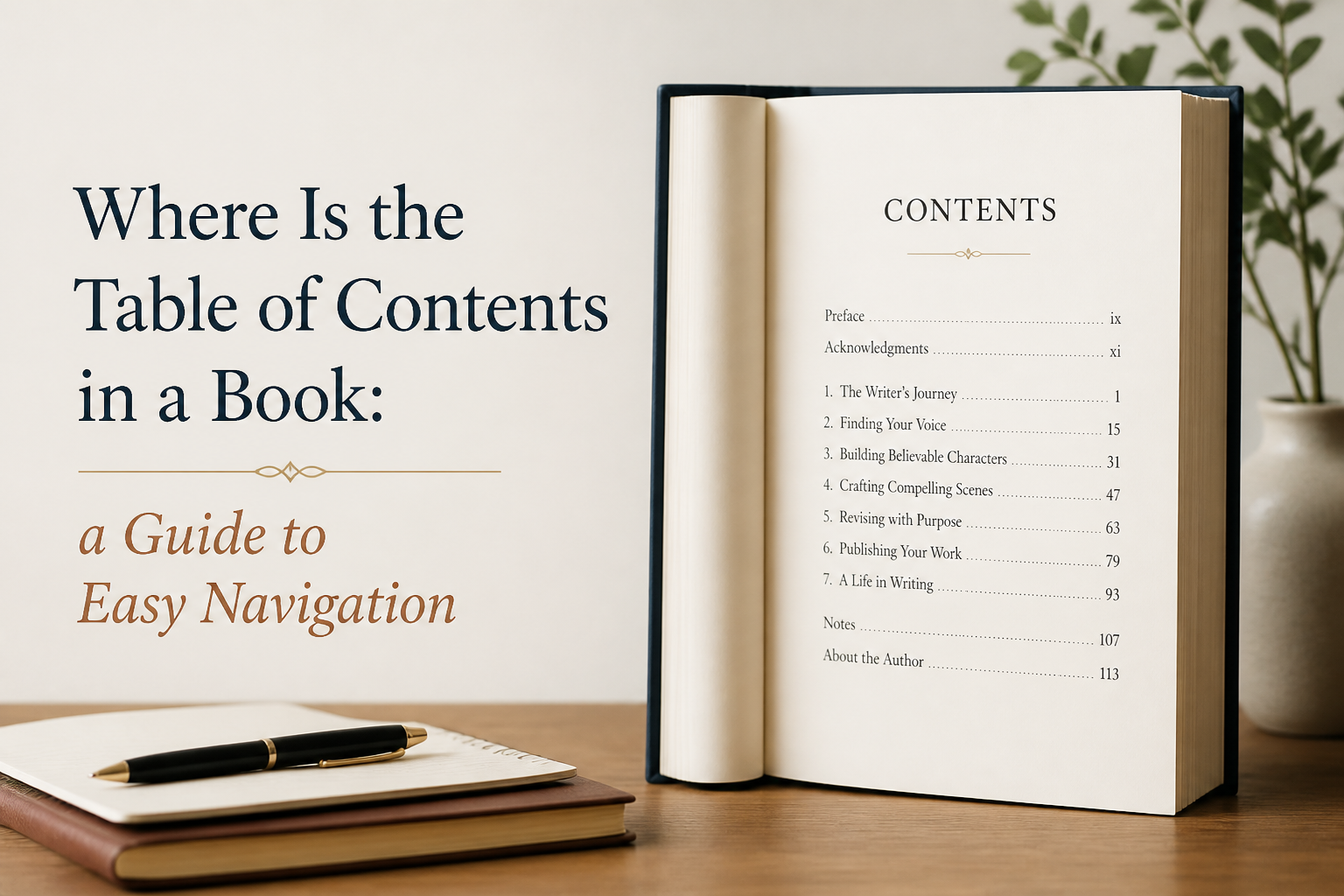
If you have ever asked, “Where is the table of contents in a book?” you are already thinking like an editor, which is good news for your readers. The table of contents is a promise that your book can be used, referenced, and reread without friction, and in publishing, friction is where abandoned reading sessions are born.
For authors, the placement of the table of contents is not a trivia question. It is a formatting decision with real downstream effects on print layout, ebook linking, retailer previews, accessibility, and even how reviewers quote you. If you place it wrong, you create tiny annoyances that pile up, especially in nonfiction and any fiction that leans on maps, epigraphs, or multi-part structure.
I am going to tell you where the table of contents normally goes, when to break the rule, and how to set it up so it works on Amazon KDP paperbacks, hardcovers, and Kindle ebooks.
Table of Contents
The Standard Location in Print Books
In a traditionally formatted print book, the table of contents lives in the front matter, after the title page and copyright page, and before the main text. In most cases, it lands right after any dedication and epigraph, and right before the foreword, preface, or introduction if you have those sections.
That location is not arbitrary. Front matter exists to orient the reader, and the table of contents is the most practical orientation tool you can give them. When you move it deeper into the book, the reader already had to do the work you were supposed to make easier.
Typical Front Matter Order
If you want the standard order that will not surprise anyone in print, I use this sequence as a default:
- Half title
- Title page
- Copyright page
- Dedication
- Epigraph or opening quote if used
- Table of contents
- Foreword, preface, introduction
- Main text begins at Chapter 1 or Part 1
You do not need every one of these pieces, but the table of contents nearly always belongs before the text where the reader starts learning, or the story begins.
Page Numbering and Why It Matters
Print books usually number front matter pages with lowercase Roman numerals (i, ii, iii) and begin Arabic numerals (1, 2, 3) on the first page of the main text. This convention makes your table of contents more readable by separating “setup pages” from “the book.” It also prevents the awkward moment where your introduction is “page 1” and Chapter 1 starts on page 17, which looks wrong to many readers and reviewers.
If you are publishing through KDP or IngramSpark, your interior tool or template will usually handle this. If you are doing layout yourself in Word, Atticus, or Vellum, check that your section breaks are correct so the numbering resets at the right spot.
When Print Books Put It Somewhere Else
There are a few legitimate exceptions, and you have probably seen them even if you never named them.
- Very short books. A 40-page poetry chapbook or a short children’s book may skip a table of contents entirely, or place a simple contents list on the back or inside cover.
- Highly designed art and photography books. Sometimes the first visual spread is part of the experience, and the contents moves later or becomes a separate index-like section.
- Reference books with heavy indexing. Some technical manuals emphasize an index at the back and keep the contents minimal up front, but there is still usually a contents page early on.
If you are writing fiction, the most common choice is simple: include a table of contents only if the structure gives the reader a real reason to use it. Multi-part fantasy epics, anthologies, and epistolary novels benefit from this. Meanwhile, a straightforward romance with 45 numbered chapters rarely needs one in print.

The Standard Location in Ebooks and Why It Is Different
Ebooks complicate this because there are two “tables of contents” that matter: the visible one you design inside the book, and the navigation table of contents that the reading app generates from your file’s structure. You need both working, even if one is invisible.
Kindle and EPUB reading systems treat navigation like a function, not a page. A contents list buried deep in the front matter can still work, but you are missing the real advantage of ebooks, which is instant jumping.
The Visible Contents Page
The visible table of contents in an ebook usually appears near the beginning, similar to print. I put it after the copyright page and before any foreword or introduction, because the reader is still orienting themselves.
For ebooks, I also keep it clean. A clickable list of Parts and Chapters is enough. If you list every subheading in a nonfiction book, you can turn the contents into a scroll-fest that is harder to use than the text itself.
The Navigation Contents Used by Kindle and Apple Books
The more important ebook version is the “navigation” TOC. In EPUB, this is handled in the file structure, and in Kindle it is built from the same underlying HTML and metadata. When it is missing or broken, readers notice because the “Go To” menu becomes useless.
Amazon has specific documentation for this because it affects customer experience and can trigger quality warnings if your navigation is messy. If you publish to KDP, follow the guidance in Amazon KDP’s section on Kindle navigation and verify the “Go to Table of Contents” option works on a real device or the Kindle Previewer.
What Retailer Previews and Samples Do to Your Front Matter
Retailer previews often show the first 5 to 10 percent of your book. That preview can be eaten alive by bloated front matter. The table of contents is one of the few front-matter elements that earns its keep in a sample because it shows the reader what they are getting and how the book is organized.
If your sample opens with ten pages of praise quotes, a long author bio, and a sprawling contents that lists every subsection, the reader still has not reached your actual writing. Cut that down. The contents should help the preview, not suffocate it.
What Your Table of Contents Should Include by Genre
The best contents page is honest about the reading experience your book delivers. The worst one is either so vague it adds nothing or so detailed it reads like a technical manual nobody asked for. What you include depends on how readers use your book.
Nonfiction That Gets Used Like a Tool
If you write business, health, craft, or any how-to nonfiction, readers treat your book like a reference. They flip, skim, return, and reread. Your table of contents should support that behavior.
- Include Parts and Chapters.
- Include meaningful chapter titles, not just “Chapter 7.”
- Consider adding one level of subheadings if it improves findability. Keep it consistent.
I also recommend writing chapter titles that work as signposts. “Chapter 4: Drafting” tells me nothing. “Chapter 4: Draft Fast Without Writing Garbage” tells me why I should turn to that page.
Fiction With Clear Structural Milestones
Many novels do not need a table of contents in print. In ebooks, a navigation TOC still exists and should list chapters for functional jumping, but the visible contents page is optional.
Where fiction tables of contents shine is when structure is part of the pleasure. Think multi-part epic fantasy, a novel-in-stories collection, an anthology with multiple authors, or a book with named chapters that are meant to be remembered. If your readers talk about “the Trial chapter” or “Part Two when everything breaks,” your contents page supports that conversation.
Children’s Books, Poetry, and Collections
In collections, the table of contents pulls serious weight. For poetry, essays, and short stories, it is one of the main tools for browsing. If the book is meant to be dipped into, the table of contents becomes the book’s storefront window.
For children’s books, it depends on format. Early readers and chapter books benefit from a simple contents. Picture books rarely need one. When in doubt, look at the bestselling comparables in your category and match the expectation.
Common Placement and Formatting Mistakes I See Authors Make
These mistakes are easy to miss when you are close to your manuscript, and they are annoying enough that readers complain in reviews, especially in nonfiction.
Burying the Contents After the Introduction
If the reader has to read 10 pages before they can see how the book is organized, you lost the main benefit of having a contents page. Put it before the introduction. The introduction can sell the approach and set tone, but the contents gives the map first.
Listing Everything and Turning It Into Noise
A table of contents is not your outline. When you include every single subheading, you create a two-page wall of text that readers scroll past. I keep it to one or two levels of hierarchy unless the book truly functions like a manual.
If you want deep findability, that is what an index is for. Just be honest about the work and cost of an index. A real index is labor, and it is worth it only when readers will use it.
Non-Clickable Ebook Contents
This mistake costs you refunds. When a reader taps a chapter and nothing happens, they assume the book is sloppy. That assumption spreads to your writing even if your prose is strong.
Test your ebook. Do not trust your export button. Load the file into Kindle Previewer and Apple Books, click every link, and use the app’s navigation menu. Fix it before you publish.
Chapter Titles That Do Not Match the Text
If your table of contents lists “Chapter 12: The Escape” and your chapter heading reads “12” with no title, your reader’s brain catches the mismatch. Consistency is part of perceived professionalism.
Choose a scheme and stick to it. If you use numbered chapters with no titles in the body, do the same in the contents. If you use titled chapters, use the same titles everywhere.
A Practical Setup for Print and Ebook That Works on KDP
You can build a table of contents in a few different tools, but the same principles apply: structure first, cosmetics second. When I help authors format books, I focus on reliable navigation before I fuss with typography.
Word and Google Docs Workflows
If you format in Microsoft Word, use built-in heading styles for Parts and Chapters. That structure is what allows Word to generate a table of contents that stays up to date as pages shift. If you hand-type the contents, it will be wrong the moment you change a font size or add a paragraph.
After you generate it, lock in your front matter section and verify page numbering. Then export to PDF for print and to a clean format for ebook conversion. If you are converting through KDP, you will still want to validate the Kindle navigation in Previewer.
Atticus, Vellum, and Layout Tools
Dedicated book formatting tools tend to handle TOCs better because they build navigation based on the book structure. If you are publishing often, that reliability is worth paying for because it reduces formatting surprises right before launch.
I build books with the assumption that changes will happen late. A tool that regenerates a correct table of contents after a late edit saves your sanity.
How Adazing Tools Fit Into the Process
At Adazing, I think about navigation the same way I think about covers and blurbs. It is a sales and satisfaction tool, not a decorative one. If you use Adazing tools like QuickWrite to draft faster, you still need a clean production pass at the end where you confirm the reader experience on real devices. Drafting speed is great. Broken navigation is expensive.
My practical recommendation is simple: finish the manuscript, do one structural pass where you confirm the hierarchy of Parts, Chapters, and sections, then generate the table of contents from that structure. After that, test the exported files the way a reader uses them, tapping and flipping, not staring at a file folder.
FAQs for Where Is the Table of Contents in a Book: A Guide to Easy Navigation
Should the table of contents come before the foreword or introduction?
Yes, in almost every case. Put the table of contents before the foreword, preface, and introduction so the reader sees the map before they start reading. The only time I move it is in a highly designed book where the opening sequence is part of the experience, and the audience expects that design-first approach.
Do novels need a table of contents?
Many print novels do not need a visible table of contents, especially if the chapters are just numbers and the book is meant to be read straight through. Ebooks still need a working navigation TOC so readers can jump between chapters and use the device menu. Collections, anthologies, and multi-part novels benefit from a visible contents page in both formats.
How do I add a clickable table of contents to a Kindle ebook?
Start by structuring your manuscript with consistent chapter headings so your formatting tool can generate navigation correctly. Then verify the Kindle navigation in Kindle Previewer and test the “Go to Table of Contents” function plus several chapter jumps. If links fail, fix the heading structure and re-export rather than patching individual links.
A Clean Table of Contents Is Reader Respect
Your table of contents belongs where it can do its job, early enough to orient the reader and structured enough to stay correct as the layout changes. Place it in the front matter for print, build proper navigation for ebooks, and keep the level of detail aligned with how readers navigate your genre.
If you treat the contents page as part of the reading experience instead of an afterthought, you will ship a book that feels professionally made, and your readers will move through it with confidence.
