The Outsiders Book Covers have evolved, perfectly embodying S.E. Hinton’s timeless classic in their unique ways. Since 1967 and into modern-day publishing, these covers have played an invaluable role in marketing the novel to new generations of readers – as they draw them into Ponyboy Curtis and his world with striking visuals, vibrant colors, and sometimes minimalist designs that capture its theme of friendship, loyalty and overcoming hardship; making the novel perennially beloved.
Table of Contents
The Outsiders Book Covers

From its first publication in 1967 to its contemporary editions, The Outsiders has been graced by an abundance of visually arresting book covers that perfectly encapsulate its narrative. Each one offers an individual interpretation of themes such as identity and rebellion and the struggles of adolescence, with illustrations depicting close-knit gangs or photographs expressing intense emotions experienced by the characters. Each cover represents S.E. Hinton’s timeless masterpiece perfectly!
Explore The Outsiders visually through our carefully curated book covers! Each cover in our list shows an artistic representation of this classic novel. From the classic designs from its time as written to modern interpretations that give its narrative new life, there will surely be an aesthetic piece here for every reader – take an immersive visual journey through S.E. Hinton’s powerful tale!

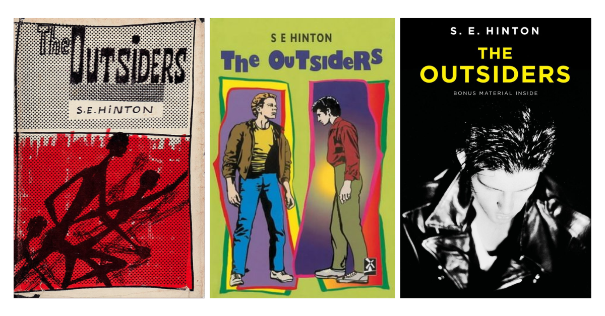
You couldn’t miss that arresting cover when The Outsiders first hit shelves in ’67. One glimpse at the bold art, and you just knew this wasn’t your typical teen novel. The illustration grabs your attention – three dark silhouettes barreling forward, the red background blazing behind them like the city streets. Sparse on details, but the message is loud and clear: this story captures raw, gritty life. Scrawled by hand in black against a faded white or cream backdrop, the title font adds to the cover’s gripping, graphic feel.

This paperback edition, released in 2003, featured three teenage boys sitting through an open window facing away from viewers while sporting clothing and hairstyles reflective of both period and rebellious tendencies. This simple yet striking design captures friendship and unity among the characters of this novel; bold typography displays “The Outsiders” at its forefront while S.E. Hinton is listed with a smaller white font below. Black and white color schemes add visual depth as well.

Hinton’s novel features an iconic cover design in its 2005 paperback release: set against an atmospheric black background. The cover depicts four teenagers; some faces fade into the distance while some other features stand out against it. Imagery such as this speaks of isolation and disenfranchisement felt by the characters within this narrative. At the same time, the author’s name takes pride in the cover design of this edition of his story. The title is presented using an alternative typeface, emphasizing its gritty realism. This design offers skillful graphic treatment and thoughtful composition, an impactful cover perfectly capturing its essence when released.

Dark and minimalist are among the words you can use to describe the cover design of the paperback edition released in 2006. It’s an iconic book cover pulls potential readers into the story without overflowing the design with too much detail. The central black-and-white image shows a teenage boy wearing a leather jacket and sporting greased-back hair. The typography is straightforward: a plain sans serif font with the title in vibrant yellow (which stands out against the black and white color scheme) and the rest of the text in white. It’s incredible how much emotion and attitude a simple cover design like this can convey!
Mass Market Paperback Edition

The intense close-up of the boy on this 1988 mass-market paperback cover of The Outsiders pulls you right into the emotional core of Hinton’s coming-of-age classic. With a weathered leather jacket collar turned up and hints of bare neck exposed, he embodies that feeling of having to act tougher than you feel as a teen outsider desperate to prove you can walk tall while struggling to find where you fit in a divided world. Stacked stark white letters dramatically spelling out “The Outsiders” against the void of black behind it makes the title painfully apt, while the title is in red, contrasting the black background. Raw, honest, and demanding your attention, this cover reflects the emotional essence facing many teens in that profound period of deciding who they are when they feel no one else understands.

This iconic image of the five greasers standing as one in The Outsiders’ 1993 paperback pulls you into the intensity of their bond. Shoulder to shoulder, they front solidarity so palpable you can nearly feel the chip on their collective shoulder. Fists tucked into belt loops, jawlines set, they dare the world to cross them if it dares. The towering font screaming “The Outsiders” makes their outlier status plain. Yet, in their unity, these young men have found identity and belonging with each other. There’s an inherent tension in how they project don’t-mess-with-me toughness yet huddle close like a chosen family against forces they cannot control. Overall, this cover reflects the haunting push-and-pull of external tough armor created to hide internal fears no one should face alone.
Hardcover Edition

This arresting cover image from the hardcover edition released in 1996 brings the central characters of Hinton’s coming-of-age classic to life in vivid color. Two boys burst across the frame, frozen as if the camera captured a rare, unguarded moment of play. The color scheme is striking, incorporating vivid hues that exude energy and youthfulness. The sans serif font used for “The Outsiders” is placed alternatively higher or lower than its next one, which reminds us how those typecast rebels crave connection under hardened nonconformity.

This weathered leather jacket splayed across the lower half of the cover of the 2016 hardcover edition is an apt symbol of the battered resilience facing the greasers in Hinton’s classic. One imagines the jacket’s owner – hard-scrabble but vulnerable. Stacked in blunt yellow block letters against void black, “THE OUTSIDERS” stands tall, uncompromising in its presence, with the author’s name at the lower portion of the page and in white. True to its visuals, this boldly stark cover amplifies the defiant essence of Hinton’s coming-of-age classic with crisp simplicity.
An Insight About S. E. Hinton’s The Outsiders
S. E. Hinton’s classic coming-of-age novel, The Outsiders (1967), examines identity, friendship, and class disparity.
The Outsiders is an iconic 1960s Oklahoma drama about two rival factions – the Greasers and Socs – set against one another. Told through Ponyboy Curtis’ perspective as an idealistic teenager searching for his place, The Outsiders provides an inspiring depiction of teenage turmoil and social frictions as part of its story arc; its strength lies in depicting human existence and resilience with each thread of narration spanning a single narrative thread.
The Outsiders has become an acclaimed classic among young adult readers since its release in 1967, becoming a beloved classic. Francis Ford Coppola directed an equally successful adaptation into a film adaptation, which broadened its impact and reached more people. At its heart lies its honest depiction of teenage life with relatable characters who illuminate youth experiences universally.
FAQs About The Outsiders Book Covers
Q: Are there different editions of The Outsiders with varied covers?
A: For sure! Publishers have put out versions over time with unique cover designs. They likely refresh it to keep attracting new readers. The images visualize some element of the story itself – maybe through colors, characters, or symbolic details.
Q: Do the covers stay the same across different countries?
A: Not necessarily. International publishers tailor covers for their local markets. So you may see editions abroad with visuals that resonate more with those cultures or teens there. The core of the book doesn’t change though.
Q: Why might specific covers use symbolic images?
A: Great question! The symbols often underscore key themes or ideas from the narrative. They give readers a glimpse into the tone or significance. A dramatic sunset could represent tension, while a switchblade suggests danger and rebellion. These details draw you in!
Q: Can different covers change how people interpret the story?
A: Covers grab your initial attention, so they introduce some bias potentially. But the writing itself guides the core takeaways – and that remains constant across editions. Responsible publishers try to ensure covers still capture the spirit of the whole work.
Q: Have special or limited editions been made?
A: For big milestones and anniversaries, they’ve put out collectible versions with bonus materials inside. These showcase custom cover art and commemorate the novel’s lasting importance. True fans love them!
Conclusion
The Outsiders book covers are an impressive display of visual storytelling. Each design draws readers deeper into S.E. Hinton’s world with minimalist designs capturing teenage rebellion or intricate illustrations bringing characters to life.
Studying The Outsiders book covers provides an aspiring author or illustrator an excellent opportunity to hone the art of depicting narrative within a single image. Each cover offers something distinctive, inviting readers deeper into its raw emotions and profound themes.
Visit our Book Cover Ideas Blog for further insight and ideas regarding book cover design. Discover all of its infinite potential while discovering how best to capture the spirit of your literary masterpiece!