Treasure Island, the enduring adventure novel by Robert Louis Stevenson, has enthralled literary enthusiasts for over a century. A potent instrument propelling the writing’s popularity resides in the discerningly crafted book covers, designed to elicit curiosity and allure in prospective readers via vivid depictions of pirate vessels, treasure maps, and symbolic skull and crossbones imagery. By subtly evoking longings for escapism and an age-old charm associated with piracy’s zenith, these Treasure Island book covers, which evolve through time, cleverly intrigue new generations, perpetuating the enduring success of Stevenson’s Treasure Island.
Table of Contents
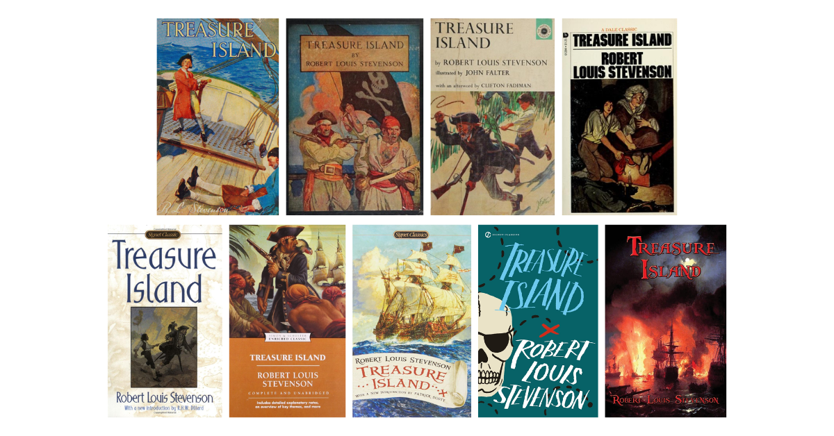
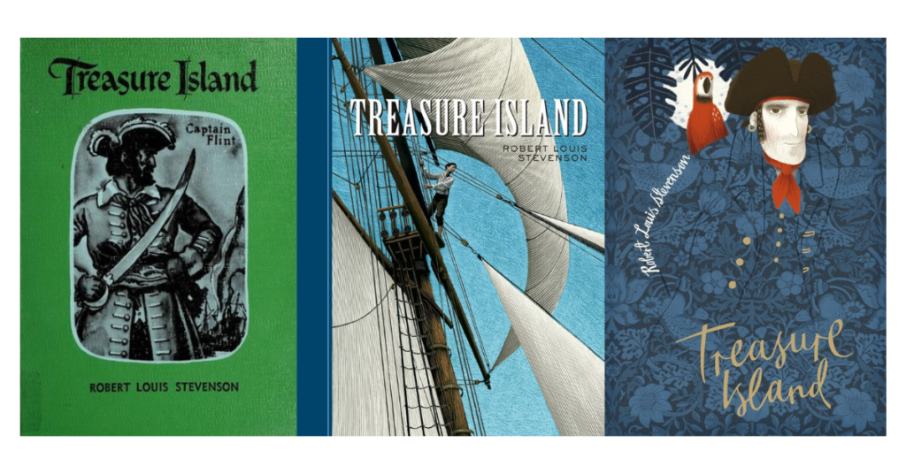
Treasure Island Book Covers
Treasure Island, the venerable adventure novel by Robert Louis Stevenson, has spawned a myriad of captivating cover designs that chronicle the shifting sentiments and perceptions surrounding this legendary adventure.
These book covers, acting as an effective marketing tool, ingeniously encapsulate the very essence of the story and deftly convey it visually to pique the curiosity of potential readers. Embellished with essential motifs like gleaming treasure chests, menacing pirate flags, or stately vessels, they instill intrigue, enticing adventure-seeking readers. From the classic depictions of treasure maps and pirate ships to avant-garde and stylized artistic expressions, each cover imparts a distinctive visual that beckons the brave souls yearning to embark on the thrilling odyssey within Treasure Island’s pages.
Amidst the veritable sea of 10,000 editions on Goodreads, we have meticulously curated this selection to present both classical renditions and contemporary reinterpretations of Stevenson’s timeless classic.

Most books in the 1800s used cloth for covers as this is much cheaper than leather. Testimony to this is the first edition of Treasure Island, which was released in 1883. This edition was released in various colors of cloth, including brick-red and sage green cloth versions, all with gilt lettering on the spine showing the book’s title and author name.
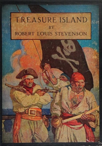
Blackie & Son Limited’s version of Treasure Island released in 1894 showcased an exquisitely designed book cover adorned with vibrant color hues. A finely detailed illustration captures the theme and symbols of this novel – including pirates, ships, and the high seas – while typography remains straightforward; titles use yellow serif font with blue borders, while author’s names appear as white script. This cover exudes nostalgic charm from times past while inviting readers on an exciting voyage through its depths!
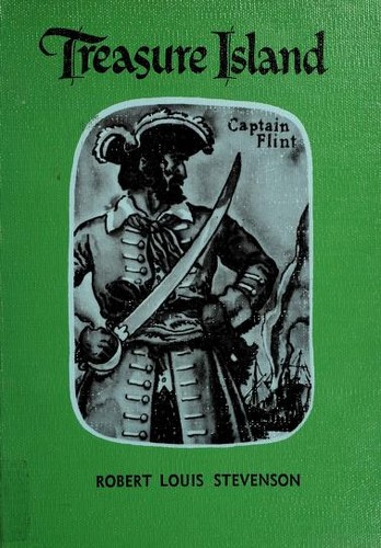
Rand McNally & Company’s edition of Treasure Island, released in 1993, features an uncluttered cover design. Set against a vibrant green background, a captivating portrait of pirate Captain Flint takes center stage. His rugged features and weathered expression reflect life at sea, not to mention his long sword in hand. A classic calligraphic font used for the title adds sophistication. At the same time, the author’s name appears below the illustration in a sans-serif font. While it’s a book cover with a few details to focus on, it still effectively brings readers an idea of what to await in the pages of this novel.
Charles Scribner’s Sons has released an edition of Treasure Island that provides readers a captivating glimpse into pirate life on the high seas. The illustration at the core of this cover design depicts pirates sailing bravely amid turbulent waves while boldly defying an unknown danger. With vintage allure and vibrant hues that speak of timeless adventures in harmony with timeless adventures in the story, its cover beautifully captures life at sea as seen through pirate eyes! Additionally, “Treasure Island” and the author’s name were placed inside a brown rectangle with black borders at its center top. Readers will embark on an engaging voyage upon seeing this cover design!
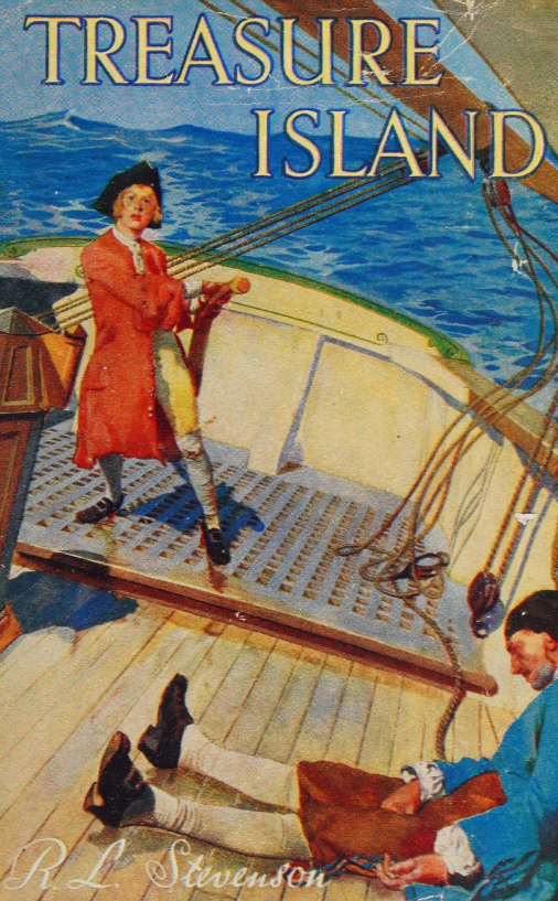
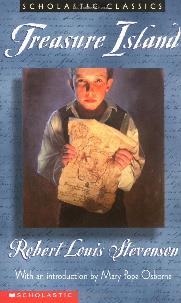
The paperback edition of Treasure Island, published by Scholastic Book Services in 1961, showcases an alluring book cover that instantly immerses readers into the swashbuckling world of adventure. The cover, set within a secluded tropical isle, splendidly highlights the pivotal figures of the narrative: Jim Hawkins, the brave young protagonist exuding dauntless determination with his wide-eyed countenance, and the enigmatic peg-legged pirate, Long John Silver, whose insidious cunning and treacherous nature have yet to unfold fully. Vibrantly displayed in an orange hue and striking font, the book’s title resides atop the cover. At the same time, the author’s name discreetly lingers at the bottom in a small serif font in black.
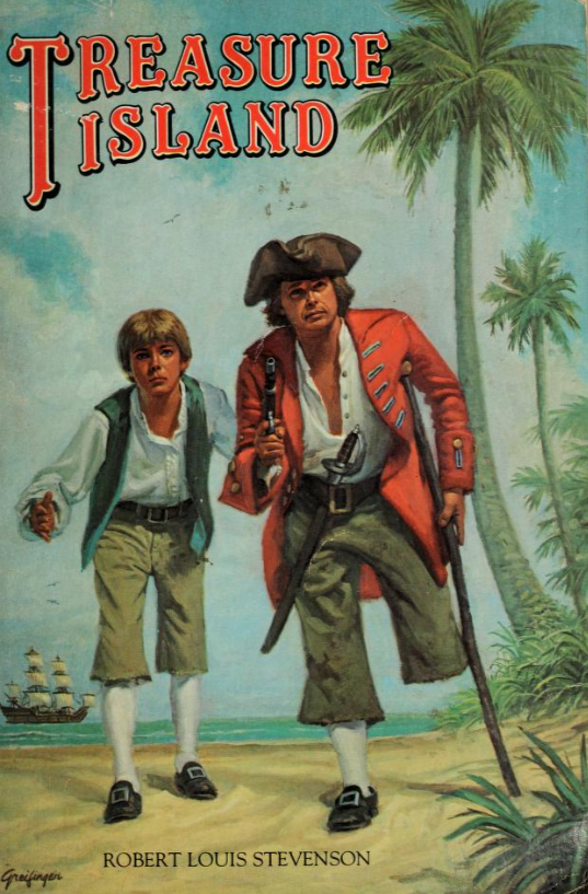
Next to this list is the edition released by Macmillan Company in 1963, which features a unique design divided into two striking parts. The uppermost section showcases the venerable title “Treasure Island,” displayed in black serif font against a cream-colored backdrop. This title is in bigger font size than the other text in this area, and it includes the names of the people who contributed to the creation of the text and illustration of this edition. However, the lower domain is unequivocally dominated by an illustrative marvel akin to a splendid painted landscape. It features a tropical island teeming with viridian verdure and an arresting tableau of renowned protagonists Jim Hawkins and the legendary Long John Silver, briskly embarking upon a mutual trajectory.
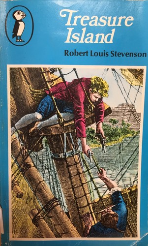
Let us delve into the splendor of Puffin Books’ 1976 release – the treasure trove that is their rendition of Treasure Island! The cover design contains what typical compositions have: the title, author’s name, illustration, and the addition of the publisher’s logo on the top left. Most of the text was in the uppermost section, with the title in fancy white lettering and the author’s name in a smaller black typeface. A vivid artwork unfolds beneath and over the blue background, painting a captivating picture of two characters on a ship, one of which held guns in his hand pointed toward the other.

This 1978 release by Dale as part of their classics collection showcases a distinct cover design that diverges from the typical motifs seen in this list. Rather than incorporating swashbuckling pirates or maritime scenes, the central illustration centers on a young lad and a lady, potentially the story’s protagonist and his mother. Their attentive gazes fix on a distant point while the room surrounding them bears evident disarray, with scattered garments and belongings hinting at their plight or flight from imminent danger. The color palette predominantly consists of black, white, and brown tones, imparting a somber ambiance. Notably, the font style and size remain consistent for the title and author’s name, deviating from the norm observed in the series (where the title is usually bigger and fancier than the author’s name). This composition exudes simplicity with a hint of uniqueness, setting it apart from its counterparts.
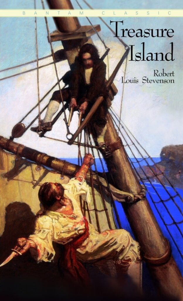
The splendid book cover of Treasure Island, unveiled in 1982, captivates readers with its artistic visuals. Embellished upon its surface, a mélange of vivid hues begets a palpable sense of adventure betwixt the intersection of light and shadow. It’s an artwork with incredibly lifelike attributes, invoking a profound intrigue as two men, at the pinnacle of their journey, navigate treacherous waters and fight against themselves. The text isn’t that prominent but still readable in the top right corner with its thin black serif font. A thin ribbon also stays on the page with the text “Bantam Classic.” Overall, this strikingly detailed illustration depicts a thrilling scene from what appears to be an action-packed novel set at sea during pirate times.
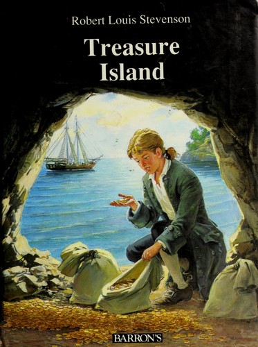
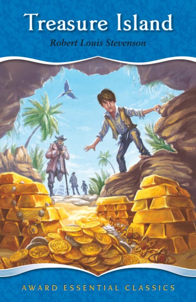
Barron’s 1989 edition of Treasure Island has a book cover that encapsulates the novel’s genre: young adult and adventure. The cover is drenched in a captivating palette of opulent hues. It is illustration-focused, quickly showing readers the story’s prominent themes, such as the journey to the sea, pirates, and treasure-finding escapades. The artwork shows a young lad inside a small cave surrounded by golden coins and filled with bags. There’s also a ship afloat in the ocean in the distance. The cover’s intricate illustration delicately renders the treacherous voyage to the coveted isle and, finally, the discovery of the hidden treasure. Since it’s focused on the illustration, the title, and author’s name weren’t designed to take up a vast space of the design as they lie on top and in a white serif font.
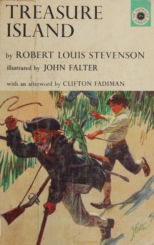
The book cover of the Treasure Island in Mass Market Paperback in 1998 enthralls readers with its imagery, skillfully orchestrated to captivate the onlooker’s gaze. The illustrator’s deft brushstrokes intricately depict a young lad, a pirate, and his trusty parrot companion. They’re illustrated as if running somewhere on an island. Whites and browns dominate the overall color scheme of this image – fitting for its nautical theme. The book’s title is across the top of the cover, and the author’s name, J.K. Rowling, is below—in the same color and typeface but in different sizes.
This mass-market paperback edition released in 2002 features a beguiling portrayal of the book’s main character, Jim Hawkins. In this oil-painting-like artwork, he’s standing while gripping a treasure map tightly; his face is serious, possibly curious, determined, or nervous because of the potential that he’ll embark on some critical journey or task. The colors in the image are mostly dark, with a pop of orange, yellows, and purples, which stands out against the blue background. No other people or notable landmarks are visible, which rightfully places the focus on the main character himself. This remarkable embodiment of the splendid classic also uses a graceful white typeface for the book’s title and author’s name.
The meticulously produced hardcover edition, published in 2004, takes readers on an unforgettable voyage through a thrilling maritime odyssey. Jim Hawkins stands proudly upon the cover, wearing an exquisite nautical attire reminiscent of those commonly worn by intrepid mariners. He deftly grasps a sturdy rope on his ship’s sail. This artistic representation makes this cover design captivating and pleasing on all fronts. The leftmost border of this cover features an extravagantly deep blue hue for added personality. Elegantly centered atop its upper expanse is the book title, inscribed in a white serif font. At the same time, the author’s name is below it in black sans-serif font typeface.
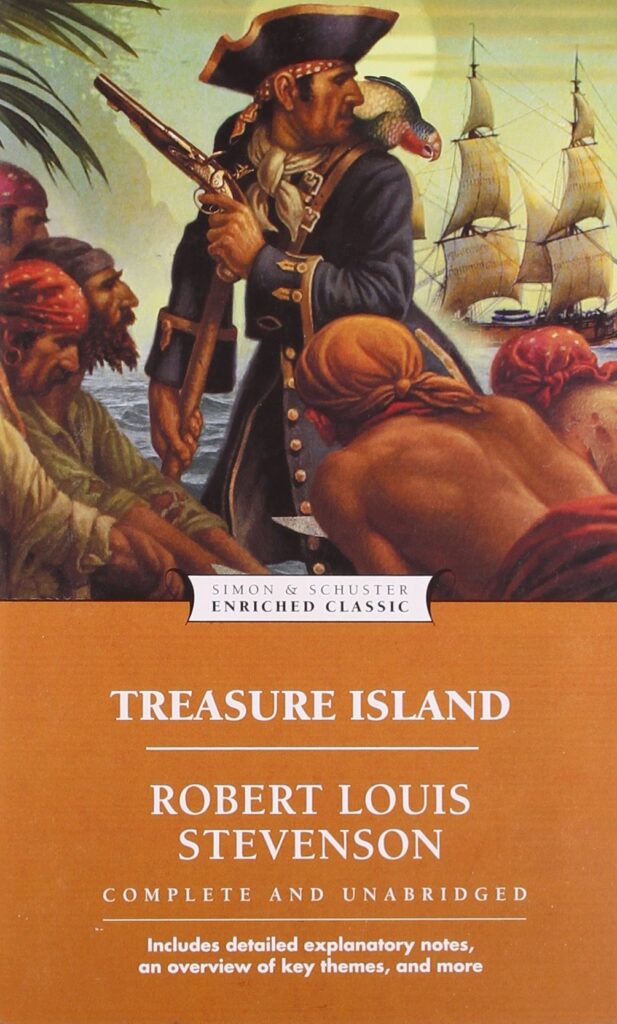
Pocket Publishing released this adventure novel as part of its Enriched Classics collection on May 24, 2005. Its cover design is divided into two distinct parts, the upper dominated by an illustration and the lower by text. The top area features a striking illustration with a much more contemporary art style, depicting several pirates led by one in dark blue attire with gold accents. A rugged pirate ship is sailing through rough waters, waves crashing against its sturdy hull. On the lower section, text appears in serif and sans serif fonts, with the title in bold white serif font and the author name below, followed by additional text with other text beneath in bold but smaller sans serif font.

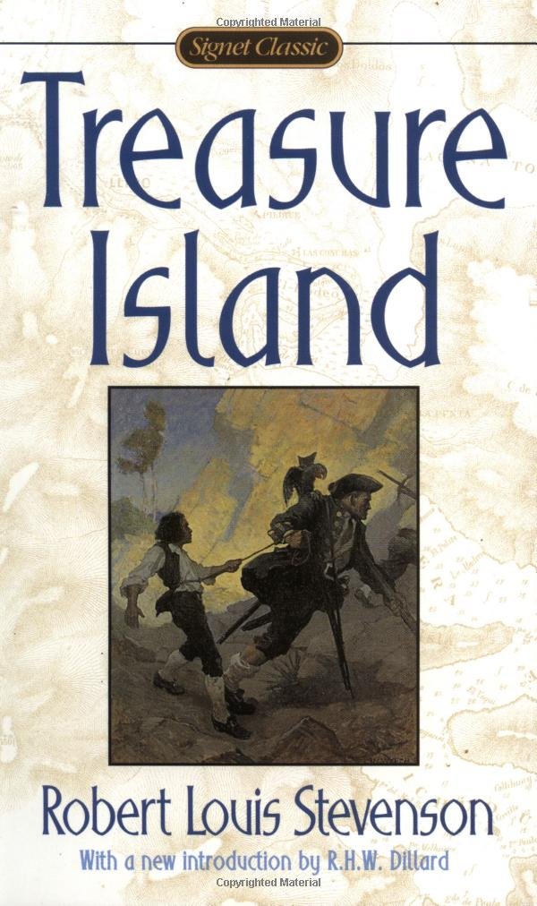
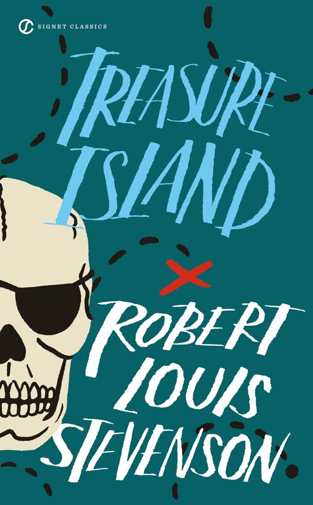
Calling this book’s visual presentation an aesthetic masterpiece would be understating it! Created by Penguin Group USA Inc. as part of their Signet Classics Collection, released in 2008, it’s a cover featuring an exquisite nautical motif depicted through the pirate ship sailing over turbulent waters with billowing sails in an unpredictable breeze on an otherwise peaceful day. Each aspect of the vessel details meticulous artistry, as though you were witnessing first-hand what awaits inside its pages! Text placement elevates it even further – almost making the title, author name, and additional text look like written treasure map text!
The edition, published in 2016, features an adorable cartoonish design that perfectly captures the very essence of this beloved classic. Displayed prominently on the left side is a skull-wearing pirate patch. There are also bold dashes against the turquoise background reminiscent of those in treasure maps. At the same time, the central placement of an x-mark separates the title and author, which uses the same typeface but in different colors.
This edition, published in 2017, features a cover that wonderfully reflects the imagination of contemporary young adults. An interesting picture shows the scene where characters find hidden treasures, like shiny gold bars, shining coins, and beautiful jewelry. This artwork is also placed within the ornate blue frames with white borders that separate the text from the artwork. This cover is attractive to young readers because of its modern design, which simultaneously appeals to the taste of its audience!

Publishers incorporate modern art styles into book covers to keep up with design trends. For example, this cover released in 2018 uses an ornate background, similar to those you’ll find in mandalas in many art forms. There’s also a pirate in this artwork, whose outfit camouflages with the background and is accompanied by his reliable red feathered friends. The typography used is elegant and delicate, further softening the features of this book cover, which was popular during its time.
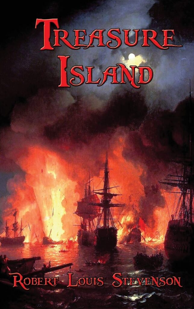
At the end of our list sits an exquisite book cover released in 2022! The artwork exudes a contemporary aesthetic filled with vivid hues and mesmerizing visual depictions. The attention to detail is stunning – one might mistake this work of art for a painting or photograph. It shows various pirate ships with pirates aboard and fire and smoke billowing out across the night sky; text rendered bold typographically has damaged edges, giving off vibes from times long past, thus promising an engaging journey filled with intrigue and exhilaration!
An Insight About Robert Louis Stevenson’s Treasure Island
Treasure Island by Robert Louis Stevenson remains an entertaining adventure novel that has held up over time.
Jim Hawkins’ courage as he embarks on a dangerous quest to uncover long-hidden pirate treasure is at the forefront of this exciting tale set on an uncharted seas voyage, transporting readers on an exciting adventure through greed, loyalty, and good versus evil themes. Of course, the book would only be complete with the treacherous pirates, secrets long buried, and swashbuckling adventures the protagonist faces.
Since its publication in 1883, Treasure Island has reigned triumphant, sparking a creative wildfire that has birthed countless adaptations spanning an array of artistic media. From spellbinding theatrical spectacles and resounding radio renditions to sprawling blockbuster films and animated series, this novel has avidly captured the collective imagination of an international audience. The unwavering success of this revered treasure resides in its unparalleled ability to whisk ardent readers away to a world teeming with audacious escapades and latent riches, firmly establishing Treasure Island as an indelible repository of literary excellence.
FAQs About Treasure Island Book Covers
Q: Why are there different book covers for Treasure Island?
A: Each publisher often creates a new book cover for their edition of Treasure Island. Doing so not only captivates readers but also differentiates their version of the novel from others based on the design trends during publication, artistic interpretation, target audience, or reading level.
Q: How do book covers of Treasure Island vary?
A: There exists a gamut of artistic styles, color palettes, imagery, and typographic choices regarding book covers for Treasure Island. Some designs may chronicle a specific scene or character, while others adopt a more abstract or enigmatic approach. The overall tone and mood range from exciting and swashbuckling to dark and ominous.
Q: Do Treasure Island book covers differ across countries or editions?
A: Yes, the covers of Treasure Island can diverge significantly across distinct regions, editions, publishers, cultural influences, and preferences of the intended readership. Such factors engender myriad unique interpretations and designs for this cherished adventure novel.
Q: Are there any prevalent symbols or imagery on Treasure Island book covers?
A: Treasure Island’s book covers frequently showcase imagery and symbols connected to pivotal themes in the narrative, such as adventure, piracy, hidden fortunes, map enigmas, and treacherous waters. One might encounter Jolly Roger flags, shipwrecks, treasure chests, compass dividers, or visual depictions of the main characters embarking on their perilous voyage – among many other vibrant allusions that capture the quintessence of this timeless tale.
Q: Where might one find a collection of diverse Treasure Island book covers?
A: To explore an eclectic assortment of Treasure Island book covers, one can explore many avenues, including local bookstores, libraries, or reputable online retailers like Amazon. Online platforms like Goodreads also serve as a valuable resource, often showcasing a multitude of editions alongside their respective cover designs, offering a comprehensive visual feast for enthusiasts of this literary gem.
Conclusion
Treasure Island, penned by the literary genius Robert Louis Stevenson, continues to enchant audiences as an immortal masterpiece, with distinct book covers curated by various publishers heightening its perennial charm. These meticulously crafted covers, infused with tender artistry, beautifully encapsulate the very essence of the tale, catering to an array of readerships by employing remarkable typographical finesse, evocative illustrations, potent symbolism, and exquisite palettes that provide invaluable insights into the narrative’s allure.
Our Treasure Island book covers collection delivers excellent inspiration. These cover designs can serve as transformative catalysts that unlock curiosity and imagination. Studying each from our list kindles the creative flames of aspiring authors, ignites the imaginations of gifted illustrators, and empowers shrewd publishers with invaluable marketing acumen.
If you seek further inspiration for book cover designs, we invite you to explore our Book Cover Ideas Blog here. Venture forth and unlock a world of creativity and imagination!