
Summer is a great time to get lost in a great story, a time when we would love nothing more than to grab a book and sit outside on a porch swing, or on a beach, or during a quiet night under the warm glow of a reading lamp with a window open letting in the gentle sound of crickets. A good summer book cover design will evoke these same images while remaining appropriate to its genre. Colors tend to mirror nature of the season and include a range of blues, greens, and yellows.
 We Were Liars by E. Lockhart
A bright sun shining on turquoise water instantly evokes summer in this book cover design; yet, the unfocused, painterly effect adds a bit of mystery. Further adding to the mystery is the title treatment. The large type is dominating the image while at the same time blending into it, and sketchy, semitransparent, widely spaced letters make one think of evidence that is being erased. As a whole, the design projects a summery feel as well as drama and intrigue.
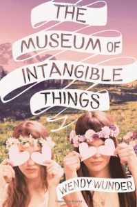 The Museum of Intangible Things by Wendy Wunder Bright colors, sun shining on a field, and flowers all say summer in this book cover design. The typeface combined with the ribbon illustration on the title and author name call to mind a school notebook doodle, and paired with the two young girls, strongly suggest a coming-of-age tale. The girls shown at play in a field prompts the reader to imagine their adventures together even before the first page is turned. The colors, most notably the purple sky, give the effect of a vintage photograph and make this cover all the more eye-catching.
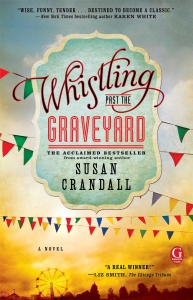 Whistling Past the Graveyard by Susan CrandallHere, summer takes the form of a carnival motif. The varied typefaces of the title have a lot of character, mix well and are inviting. The placement of the text on the carnival sign is eye-catching, and the flags nicely lead the eye down to the Ferris wheel scene in the distance. Meanwhile, the distressed, vintage look gives the cover an edge. It looks weathered, asking the reader to imagine a significant journey of the characters conjured in its pages. Overall, this cover design has a classic feel, while the colors and imagery remind one of summer.
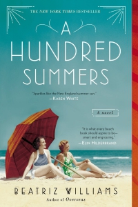 A Hundred Summers by Beatriz WilliamsA beach scene makes this cover design unmistakably summer, while complementary colors pop and draw the reader in. With a vintage photo and art deco influenced typography, one instantly imagines a historical setting. Clean and elegant decorative elements complement the typeface and give the design a classic look. The wide spacing of the title seems to reflect the epic timeline that “a hundred summers” evokes. Overall, the design exudes summer while being elegant and sophisticated.