
The 1990s seemed to center around the young adult genre, with many popular books targeting this younger generation. From problematic issues that most teenagers are hopefully lucky enough to avoid, to the inspiration of magic to be had, this decade dug deep into the subconscious and searched out our fears and nightmares, our dreams and greatest aspirations.
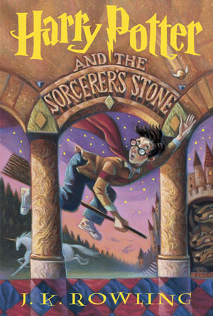 Harry Potter and the Sorcerer’s Stone by J.K. RowlingIf there had to be one book, or rather a series of books, that had to be chosen as the most popular in the past twenty years, chances are that the Harry Potter series would be the winner. The epic story that spanned across seven incredible novels and was eventually transformed on film all began with the first book, and the first cover. With its cartoonish illustration, this cover immediately captured the attention of people passing by with subtle colors expertly painting an incredible image: a boy with glasses, flying on a broom and trying to catch some strange sort of device. In the background the magic continues with a unicorn running towards the immense forest, an equally impressive castle that looks like it might go on forever, and some very large heads poking their way out to see the boy on the broom. This illustration is wonderful because even though it is a simplistic interpretation of what can only be assumed to be part of the story, it is incredible effective because it has combined so many magical elements as to make it impossible not to want to pick this book up. Anticipation is a highly useful tool when it comes to marketing, and if for no other reason, readers will want to know if he, the boy on the broom, actually catches the strange winged object he is reaching for.
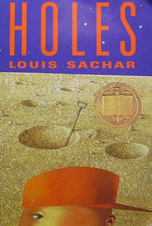 Holes by Louis SacharA hole in the ground may not seem like something that would make for an interesting novel topic, but apparently many readers disagreed when they flocked to the shelves and picked this one up. Word of mouth can help a books success, as can awards (like the one seen on this cover) but sometimes it’s just going to come down having a curiosity-inspiring cover to really bring those first readers in. This is a perfect example of a cover that uses basic human curiosity to its advantage. If you’re walking down the street and you happen to see a hole in the ground, you might not think very much of it. After all, animals make holes for their homes, kids dig holes for fun, and sometimes holes are even necessary for certain studies. But, if you were to walk down the street, and see dozens of holes, like this picture suggests, your curiosity is going to demand that you stop and take a closer look. Which is exactly what will happen to readers that are walking by this book: they are going to see barren land, covered in holes, and their curiosity is going to take over to find out more about this book. People are inquisitive creatures, and when something out of the ordinary is presented to them, they are naturally going to want to find out more about it, which is what makes this cover so successful.
 Speak by Laurie Halse AndersonThere are many different ways to capture the attention of a potential reader, and this cover has used strange images combined with familiar ones to create a visual that is immediately captivating. The familiar image is that of the two eyes and nose which make up the main parts of face, but without a mouth to be seen. This is what makes this image so useful, because the title is “speak”, and yet this person, whoever they are, seem to be unable to do so. In the foreground are the strange images: what appears to be a tree-like structure extending into multiple branches, each of which has its own odd leaf-like structure at the end of it. But on second glance, the potential reader sees that maybe those are in fact not leaves; maybe they are actually mouths. This unsettling idea only adds to the strangeness of the image, which further enhances its attention grabbing effect. This is a perfect example of a cover using somewhat shocking images to grab a reader and make them interesting in the book.
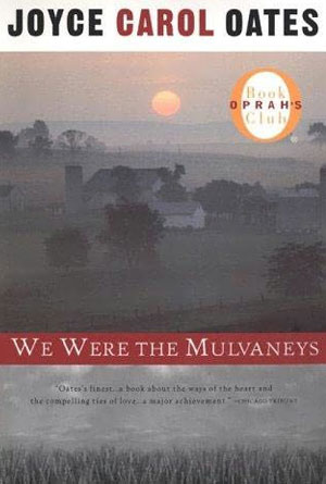 We Were the Mulvaneys by Joyce Carol OatesAnother effective way to grab a reader’s attention is with a hint of mystery, as this cover has used. The title and background picture combine beautifully to portray an obvious air of mystery that surround the cover and obviously penetrates into the story itself. The title has been written in white letters across a red background strip which makes it stand out as one of the first things to be noticed. The red background then greatly contrasts against the dulled gray of the background image to further make the title stand apart and really grab the attention of the reader. Because this is the likely the first thing that they will see, it acts as an intriguing lead to the picture. By stating that “we were” instead of “we are”, it makes the reader question why this family is no longer who they used to be. Something major must have really happened in order for an entire family to lose its identity. This idea of being lost in further enhanced by the picture, which shows a large home in the middle of a field, obscured by a hazy fog that seems to touch everything. This fogginess adds to the idea of mystery, and with the title creates a fantastic cover that will really be attention grabbing. One last thing that definitely makes this book more likely to be picked up than the ones on either side of it: the small yet very noticeable “seal of approval” in the upper right hand corner that tells readers that this is an Oprah’s Book Club book. This is going to grab those readers that may not have given it a second glance otherwise, because sometimes people need a famous person to let them know what to read.
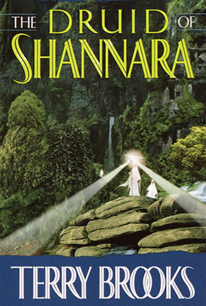 The Druid of Shannara by Terry BrooksThis cover relies on an imagination stirring image to really become eye-catching to potential readers. The name of the author may be familiar to fantasy readers, but may not be enticing enough to those that are unfamiliar with their work. The title itself captures some attention because it is not every day that readers come across the word “druid.” Though they may know the meaning and have an image come to mind when they do read it, it is definitely not one of those words that usually invades daily vocabulary, and that is why it stands out. The words on this cover are not particularly made to stand out more than that: they have been made in a thin font with a white cover that blends more with the background that really stands out from it. That’s why so much more effort has gone into the illustration. The picture uses a wide array of colors: blues, whites, greens, grays and browns are blended beautifully to form a visually striking illustration that instantly transports potential readers to a wilderness. The strange figure, emanating a white light that seems to be searching for something like the lighthouse on the shore, serves as a captivating focal point for the entire beauty of the picture.