
Young adult books are becoming increasingly popular, and also more readily available. With more competition out there, a young adult book cover has to really grab a reader’s attention in order to have any chance of actually being read. The following five covers definitely catch the eye of someone passing by.
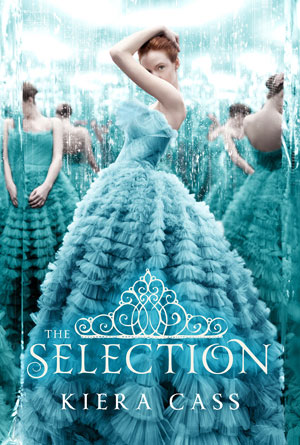 Selection: Kiera Cass
The bright, aqua blue of the dresses is hard to miss, even if you weren’t looking right at it. Second, once a reader picks it up and takes a closer look, their curiosity will be sparked by the multitude of seemingly different girls, all dressed in the exact same striking dress. The white title with its elegant font stands out just enough so that you can read it, but without taking away from the stunning image behind. The crown-like illustration above the title sparks even further curiosity combined with the attention grabbing statement at the very top. Every piece of this cover has been created to make readers just curious enough to want to read and find out what it is all about.
 Everything I Was: Corinne Demas
This cover is simplicity at its finest. When looking at it, readers see a young woman, possibly just a girl, with her back turned to them. Because of this, it immediately incites a wonder about her: who is she, what does she look like, is she happy or sad? The title doesn’t help to answer these questions, because “everything I was” could mean that she was something she hated and is now free of, or was something that she longs to return to. Curiosity is further prodded with the image of this girl walking her bike down what seems like an endless road into a blank horizon. This asks more questions than answers them: where is she going, is she running away from something or toward something else, and why is she walking instead of riding the bike? One simple picture, a dozen questions that can only be answered by opening this incredible cover and reading to find.
 Beckoning Light: Alyssa Rose Ivy
With many covers, it’s usually a good idea to make your title small and your picture big in order to attract potential readers because many people will see the picture before they see the words. This cover manages to do both at once, with an eye-catching picture that spans the entire surface, and a title that takes up nearly a third of that picture. This is made possible because the title has actually become a part of the picture instead of being apart from it. With the strange, white light peeking through the entanglement of leaves, and the white lettering of a thin font; they merge into one another as one part, the word and the image of “beckoning light”. Even the author’s name blends nicely with the picture instead of standing in contrast to it. And then there is the image itself; beautiful white light trying to pierce an obviously heavy foliage that has surrounded an iron gate of some kind. What is being kept inside, and should you follow that beckoning light? This cover is a beautiful mastery of attention grabbing graphics.
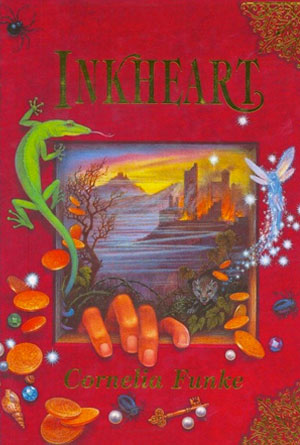 Inkheart: Corneliu Funke
There isn’t much on this cover that isn’t going to spark curiosity and imagination. It has been brilliantly made to look like an old fashioned book, with a leather face and tough binding for the spine and corners. This effect immediately makes readers believe that this is a story that will be different from others. And if that doesn’t do it, the artwork on the front certainly will. With square opening that has been made to look like the story itself is actually leaking from within, readers can practically feel themselves being drawn to it. A beautiful, picturesque landscape graces the little window, with a fairy that has escaped. Already the reader knows there will be magic, and they know there will be an adventure because of the burning city in the background. Every last piece of this cover has been beautifully drawn to entice the reader’s imagination, which is what makes it so successful.
 Pure: Julianna Baggott
There may be several elements of this cover that will catch a reader’s eye. At first it may seem that the incredible darkness that makes up most of the image would mean that most people would pass it by without a second glance. And that might be true if it wasn’t for the vibrant blue butterfly that brilliantly cuts through all that darkness and stands out. Everything else on this cover tries to fade into the background, from the strange dome and whatever it holds, to the small print of the author at the bottom. The two things that refuse to fade away are the bright blue butterfly, and the large white letters of the title. The title itself is eye-catching, not just in its elegant font and brightly colored letters, but because of the very word itself. What is pure? Is it the butterfly, is it the dome? Curiosity is a powerful thing when it comes to successful book covers and this one has just enough to entice readers to crack it open and find out.