
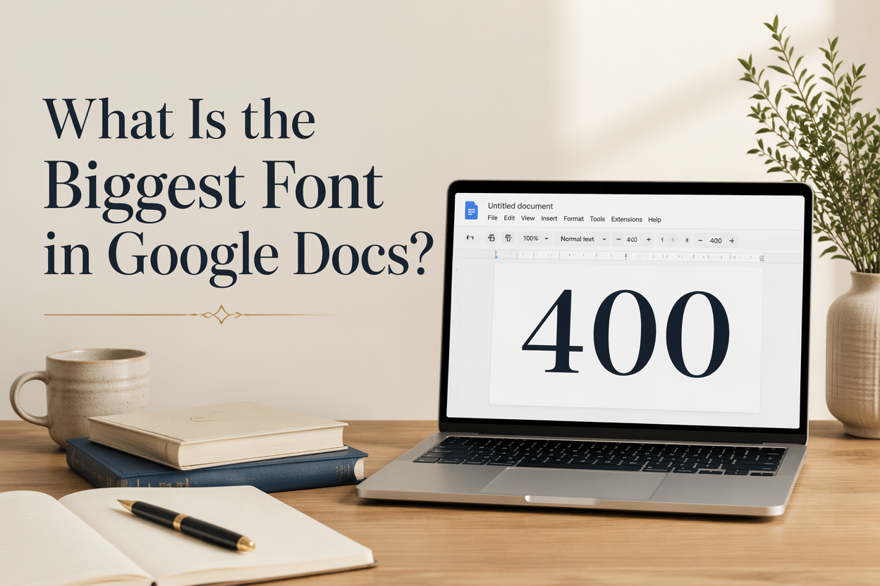
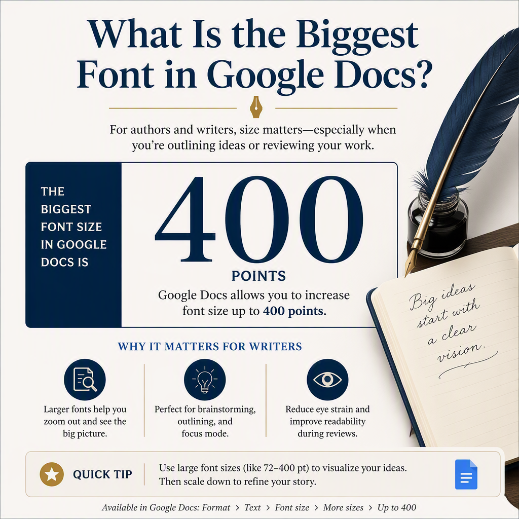
If you ask “What is the biggest font in Google Docs?”, the practical answer is 400 pt, because that is the top end of the font size box you can type into. Google Docs will also sometimes let you type a larger number, but 400 is the reliable ceiling that behaves consistently across browsers and exports.
For an author, the bigger issue has less to do with the number itself and more with recognizing when oversized type earns its place (workbooks, signage, large-print interiors, title pages) and when it is a trap that creates layout chaos the second you move your manuscript into Vellum, Atticus, InDesign, or Amazon KDP.
I am going to give you the real limits in Google Docs, show you how to set sizes beyond the dropdown, and then translate that into what matters for publishing: clean, predictable typography that survives the trip to PDF and print.
Table of Contents
The Real Maximum Font Size in Google Docs
The font size dropdown tops out at 72 pt. That is just the menu, not the software limit. In Google Docs, you can click the font size field and type a number directly; 400 pt is the largest value Google Docs supports in a stable, expected way.
Here is what I see authors miss. They test 200 pt or 300 pt for a title page; it looks fine on screen, and they assume the file is publication-ready. Then they export to PDF, open it on another machine, and the spacing changes. Big type magnifies every little issue with line spacing, margins, and page breaks.
Why The Dropdown Stops At 72
The dropdown is built for everyday document formatting, which is why it ends at 72 pt. It is meant for letters, school papers, and business docs, not book interiors. Book layout tools treat type size as part of a system: trim size, margins, leading, hyphenation, widows and orphans, and style rules all work together.
How To Set 400 Pt
Highlight the text, click inside the font size box in the toolbar, type 400, then press Enter. If you do not press Enter, Docs may revert to the previous size. If the text jumps off the page, that is normal at that scale. You are pushing display typography inside a tool that is not designed to manage it gracefully.
What Happens If You Type Above 400
Depending on your browser and the document’s state, Google Docs may accept a value larger than 400 in the field. In my experience, that is where behavior gets inconsistent: the view can lag, page rendering can glitch, and exports can get strange. For anything you plan to print or share professionally, I treat 400 as the hard stop.

When Huge Fonts Actually Help Authors
Most manuscripts should never need anything near 400 pt. Yet authors do have legitimate reasons to push font sizes far past normal body text. The trick is to separate drafting needs from production needs.
Large-Print Drafting And Readability Passes
If you are doing an editing pass for rhythm, repeated words, or missing beats, increasing font size can force you to slow down and see the page differently. A 16 to 20 pt draft is common for that kind of pass, especially if you print it. This is also useful for co-authors or beta readers who prefer larger text.
Workbooks, Classroom Handouts, And Slides
If you write nonfiction and you are building companion materials, Google Docs can be a fast place to draft worksheets, checklists, and simple slides. Big type is practical for headings, prompts, and fill-in sections. I still recommend finishing those files in a design tool if you are selling them, but Docs is fine for the writing and structure.
Interior Title Pages And Part Openers
Authors often try to mimic traditionally published title pages by making the title huge. That is fine as a visual test, but it is usually better handled later in your layout tool. Google Docs does not give you the same control over spacing, optical centering, and font rendering that a real layout environment does.
The Trade-Off You Pay For Massive Font Sizes
When your font size gets extreme, your formatting problems scale up with it. This is where authors lose hours to “why is this page breaking weird” instead of writing and revising.
Leading And Line Height Go Sideways
Google Docs manages line spacing in a way that is comfortable for general documents, not precision typography. When you push type into very large sizes, the default line spacing can create awkward overlaps or huge gaps. You can adjust this under Format, then Line and paragraph spacing, but you are still working inside a tool that does not think like a book compositor.
Margins And Page Breaks Become Unpredictable
A 200-pt line of text can quickly exceed the usable area of the page, especially on the Letter size with default margins. The result is clipped text, orphaned lines, and blank pages that appear because one oversized element forces a spillover. This becomes a nightmare when you later change page size or export settings.
Export Differences Between DOCX and PDF
If you are preparing anything for print, exporting to PDF is usually the safer output than DOCX. But even those exports can vary if your chosen font fails to embed cleanly or if the system substitutes a similar font. Google’s own documentation explains that you can download Google Docs files as a PDF or Microsoft Word file. However, it stops short of guaranteeing that typography will match a professional layout tool. At large sizes, tiny substitution differences become obvious.
What I Recommend For Book-Ready Typography
If your end goal is a book interior, I recommend using Google Docs for drafting and revision, then handing off to a layout tool for final typography. You will save time, and your book will look like it belongs on a shelf next to traditionally produced titles.
Use Styles For Everything That Matters
In Google Docs, use paragraph styles for headings, subheadings, and body text. If you keep direct formatting to a minimum, your manuscript transfers more cleanly into other tools. Set Normal text for your body, use Heading 1 and Heading 2 for structure, and avoid manually changing font sizes throughout the document just because something “looks right” in the moment.
This practice pays off when you convert the draft into an ebook or a print-ready interior, because structure is preserved even if appearance changes.
Choose Book-Safe Body Sizes Early
For most novels, 10.5-12 pt is a common print body range depending on trim size and font. For nonfiction, 11-12 pt is common, and you may push larger for workbooks. If you are building large print editions, you will often be in the 14-18 pt range. The National Library Service defines large print as 14-point type or larger, which gives you a real benchmark instead of vibes.
Even if you draft at a comfortable size, pick a target print size early and do a spot check in a proper layout preview later. Drafting at 11 pt and publishing at 13.5 pt changes page count, spine width, and print cost.
Draft In Google Docs, Finish In A Layout Tool
If you are publishing through Amazon KDP, you eventually need a PDF for print. KDP’s own guidance is clear that print books require a print-ready PDF for most workflows. Google Docs can output a PDF, but it is not a book layout system. You will fight widows, orphans, hyphenation, chapter openers, and running heads.
For the authors I talk to, the cleanest path is to draft in Docs, revise in Docs, then move to a dedicated layout tool for the final interior. If you already use Adazing tools for covers, promos, and writing support, treat your interior with the same respect you treat your cover. Readers notice when the book feels amateur inside, even if they cannot name why.
Fast Ways To Get Big Text Without Breaking Your Draft
If you need very large text for a specific purpose, you can do it without trashing your manuscript formatting.
Create A Separate “Display Pages” Document
If you are mocking up a title page, part opener, or a promotional quote page, do it in a separate Google Doc. Copy the final text over when it is approved. This keeps your manuscript clean and prevents random 120 pt headings from contaminating your styles and spacing.
Use A Table For Simple Layout Control
Google Docs tables can provide a crude grid for centering and spacing large type. Insert a 1×1 table, remove the border, and use the cell’s padding and alignment controls to position the text. It is not elegant, but it is more predictable than hammering the Enter key fifty times.
Switch To Google Slides For Posters And Graphics
If you are making a teaser graphic, a sign for a book signing, or a simple social quote image, Google Slides handles large type better than Docs. Slides is built around objects and positioning. Docs is built around flowing text. You will spend less time wrestling the page.
FAQs for What Is the Biggest Font in Google Docs?
What is the largest font size available in the Google Docs font menu?
The dropdown menu tops out at 72 pt. You can go larger by typing a number directly into the font size box.
Can Google Docs really do 400-point font?
Yes. Type 400 into the font size field and press Enter. I treat 400 as the practical maximum because behavior above that can get inconsistent across browsers and exports.
Should I format my book interior in Google Docs?
I would not for a professional release. Draft and revise in Google Docs, then move the final manuscript into a layout tool to produce a print-ready PDF for KDP or any other printer.
Where This Leaves Your Manuscript
If you need the biggest type Google Docs can handle, use 400 pt and keep it in a separate document or a small set of pages. For everything that affects a real book interior, keep your draft clean, rely on styles, and plan to finish in a layout tool built for print typography. Your reader will never thank you for it, but they will feel the difference on page one.
