Best publishing websites
All publishers around the world have the same job, produce, print and distribute books. However, every one has a unique way of conveying this message. For a job that requires creativity, it is easy to understand the importance of a well designed and easy to use website. Well organized, unique, modern, trendy… viewing the design of a publisher’s website can tell you a lot about the company, it’s priorities and sometimes even the personality of the owners. Below are some of the best publishing website designs that excel in both design, navigation and usability:
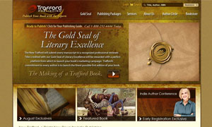
Trafford Publishing has instant creative flair, with the use of brown paired with gold, giving it a feel of grandeur. An inspirational video ties the concept of the website together. The stimulating design yet easy to use menus make it stand out from others.
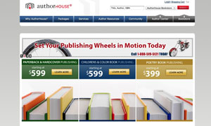
The Author House uses vibrant colors, and a playful feel that makes this website look really artful. Step by step tutorials, and easy to navigate prices are great additional features. The pop out menus makes it super easy to navigate.
Tate Publishing uses clean lines with white and bold red to give the website a sophisticated feel. Easy to use menus, and text buttons give it an added professional feel.
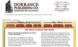
The Dorrance Publishing website although simple, has a corporate feel to it with the use of brown, paired with elegant ivory. This is a well organized website that helps the users to navigate around easily.
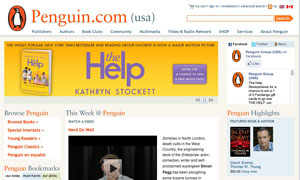
The Penguin Group website has vibrant yellow with bold black that makes an interesting website for the viewers. Thanks to the easy to use menu buttons, the user can instantly find whatever they are looking for.
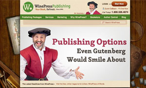
WinePress Publishing is a fun and light hearted site. WinePress does a great job at highlighting featured pages with the entire the content section scrolling to provide new information.
Dog Ear Publishing makes use of bright colors to engage the user and relies on large pictures and product shots to relay a message of trust and quality.
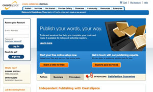
Create Space has at creative feel that relies on interesting pictures and pointers about their benefits.
Infinity Publishing is a clean modern site that makes use of its browns and reds with small accents of yellow to make the page pop. The page distributes the multiple calls to action among several aesthetic boxes.
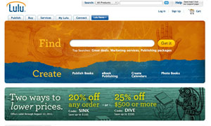
Lulu is an easy to use website, with the menus right upfront. Various shades of blue gives it a pleasing effect.


