10 Best Interior Design Websites
When we consider improving our home interiors with new furniture, ornaments and general furnishings, the aesthetic of the store we visit to purchase our desired goods can have a huge influence on whether or not we choose to eventually shop there. The same aesthetic first impression is much the same for online stores; if you’re looking for stylish and quality products, you’ll want to purchase them from a website with a design that says “style and quality”, and with style and quality, innately comes an impression of professionalism.
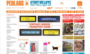
Pedlars – Bold and Retro
The design for the home interiors store Pedlars has a definite retro feel to it. The strong and bold 1970s orange of the logo and the category banners along the top of the page offer an immediate and unmissable form of navigation. There’s also a nice mix of font / typeface usage, which really breaks up any otherwise unused white space.
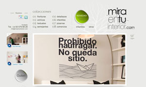
Miraentu Interior – Wall Art Styling
The Spanish Miraentu Interior website offers various types of wall art and decals, and the overall design of the website really reflects the product, with bold bordered images enhanced with the use of a soft drop shadow. This really gives the impression of art hanging on a wall, much the same as the products they sell.
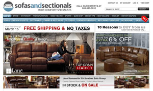
Sofas and Sectionals – Great Content Management
Sofas and Sectionals is a great example of how to manage the presentation of a huge amount of store stock. The navigation bar along the top of the page immediately allows you to choose from everything from sofa types to brands and styles, meaning you can find what you were looking for swiftly. The large images of the choice sofas available also add a splash of color to the design.
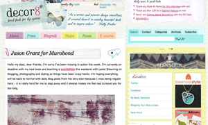
Decor8 – The Scrap Book Look
The Decor8 Blog has a quaint scrap book feel to it, and although it doesn’t specifically retail products, is a collection of featured home interior products. This scrap book design is perfect for what the blog aims to achieve, with page after page of bright and interesting style ideas for the home.
Bouf and Mooch – The Importance of Corporate Colors
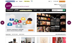
Bouf offer everything from home ware to clothing, and the simplistic yet bold design of their site really showcases all the items on sale. The sparing use of their corporate color, a deep plum, is a great way to make certain desired aspects of the website stand out. On the Bouf website, this plum color is used not only for the logo, but also for important navigational details such as a help section and the product gallery on the home page.
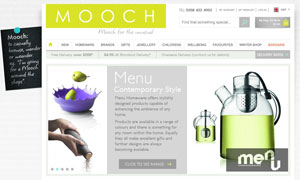
Another somewhat simplistic yet bold website design can be seen on the Mooch home ware and gifts page. The text-textured, gradient background gives a great depth of field to the top layer of content, that being the navigation and showcase products. The strong chartreuse green of the Mooch logo is reflected again, as with Bouf, in the navigational rollovers and any icons that need to be immediate to the customer (such as the shopping cart).
J Design Group – Stylish and Contemporary
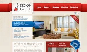
The bold red theme of the J Design Group website gives a serious yet stylish first impression, and the use of alpha / opacity on the banner of the website, along with the subtly textured background really gives this website a tactile feel. This overall serious, bold and somewhat corporate design definitely reflects their aim to appeal to a high-end and commercial customer base.
My Living Space – Dual Purpose Bold Graphics
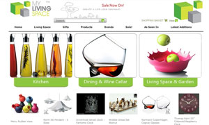
The My Living Space website offers a fun and bright first impression, with the main three, bold graphics acting as the site navigation when the mouse is rolled over. However, a more functional and intricate navigation is also available in the traditional placement at the top of the page, meaning easier usability.
Bokja Design – Using Flash to Showcase Products
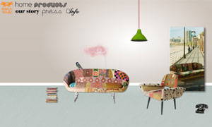
The Beirut based Bokja Design website is Flash based, and really utilizes the animation capabilities of Flash to showcase their quirky design ideas. There is a strong vintage / retro influence to their product designs, and this is clearly expressed through the website design. The products on offer are incredibly bold and almost brash, which is why the neutral, pastel colors of the background are a perfect canvas for showcasing them.
Orla Kiely – Minimalism When Products Speak For Themselves
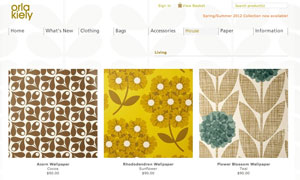
One of the most talked about home interior product designers at this time is Orla Kiely, whom takes from the bold geometric prints of the past to produce beautiful home ware and clothing. Her designs are always amazingly uncomplicated yet at the same time eye catching, and the design of her web store offers the perfect muted setting, allowing her print work to stand out from the page. Her signature colors are also used for the drop down menus, as a simple but effective hint to her products.

