The main focus of a restaurant is obviously its food, but also the atmosphere it has to its customers. A restaurant’s website design should focus on giving off their unique feel while showcasing their food, locations, and coupons in a pleasing and easy to navigate manner. This following restaurant website list accomplishes that very well, making them some of the best restaurant websites around.
10 Amazing Restaurant Website Designs
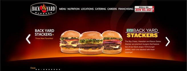
The Backyard Burgers restaurant website gives a very modern, clean feel. Every menu item has its own picture, and they all look like they have been prepared fresh and hot. The nice black and red background give the feeling of warmth and flames, which fit in perfectly with the backyard grill theme they have.
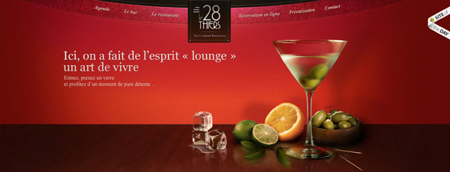
Le 28 Thiers design just yells ‘classy’. The rich reds paired with the darker colors give off a comfortable, fancy, and up class feeling. The interactivity with the different menu items is nice and all the photographs used are professional and appealing.
Bertoldi’s restaurant website is clean and simple, giving off a sophisticated air. The menus are nice and easy to navigate, although there are no pictures to show off the products of each page. Their design works perfectly for Italian cuisine.

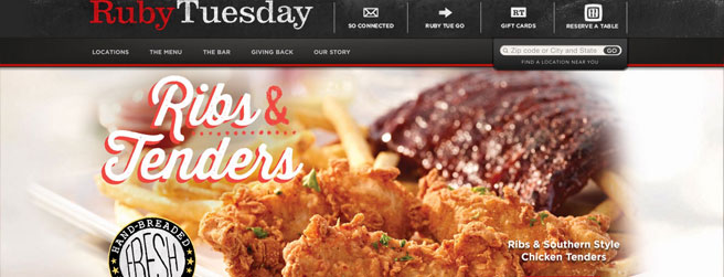
Ruby Tuesday uses a lot of light colors that gives it plenty of room to breathe. The whole design just feels airy and loose and is a real treat to look through. It’s easy to navigate and it showcases several very appetizing photos.
This year’s list of 50 Best Restaurants in Charlotte is live on the @CharlotteMag website! https://t.co/j6uSxq7paK
— Kristen Wile 🍾 (@kristenwile) December 20, 2017
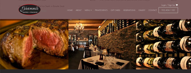
Giannis Steakhouse restaurant website does a very good job of developing a unique theme. The background, the board, and the paper stapled to it all fit together very well and is easy to look at. The only negative thing about this one is their use of scroll bars, which makes parts of the site annoying to navigate.
Café Rouge is another classy restaurant website on this list it gives the feel of an upscale, extravagant restaurant that only serves the best. The simple white, red and yellows harmonize in a way that makes me think of dinner and wine. Animated pictures above each section just give it that extra bit of flare.

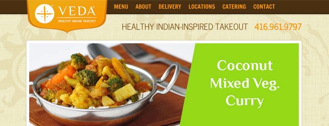
Colors and texture of Veda Takeout give it a definite natural rustic feel, which is exactly what ‘healthy Indian food’ is supposed feel like. The menu is nicely designed with a very nicely designed preview image for each page.
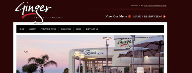
Ginger is simple and straight forward, which fits their style. The interactive menu is very nice, although hard to read the small text. Their photos are nice, and their site is a breeze to use.
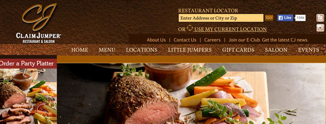
Claim Jumper’s design fits very well with the rustic theme that they have going. All of their photographs are very professional and beyond appetizing. Their menu is easy to use and their whole site is very nice to look at.
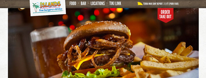
Islands is another restaurant website that’s theme fits very well. The wood grain background is definitely island like, although the pattern running up and down the sides is a little overkill. All of their photos are very nice and their menu is very easy to read.
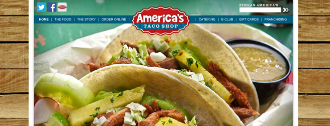
Americas Taco Shop restaurant website has a great name and a great website. The website has a classic American feel with entree photos that give it that little kick of spice. It’s hard to get everything on the front page of a website without it feeling cluttered, but America’s Taco Shop not only pulls off some great food options and an about us blurb, but they somehow manage to give franchising opportunities a decent shout out without the page feeling crowded.
Top 10 Best Restaurants of the World
Based on Elite Traveller’s most esteemed restaurants of 2018, these tasty destinations should be on everyone’s bucket list.
Read Next Article: “Free & Discounted Christian Books” is locked

