Every hospital performs the same job, but that doesn’t necessarily mean that they are all the same. Each hospital has a unique feeling in how they operate and and provide their services. The same holds true to their websites, the following ten are some examples of hospital website design that does a great job at providing the information and features needed in a high quality hospital website.
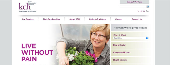
The header image on Kane Community Hospital’s website is absolutely gorgeous. The rich reds and mellow cream colors they use fit each other perfectly and make the site pleasing to look at. They use a drop down menu along the top for their main points, and a side menu for all related points that make this site super easy to navigate.
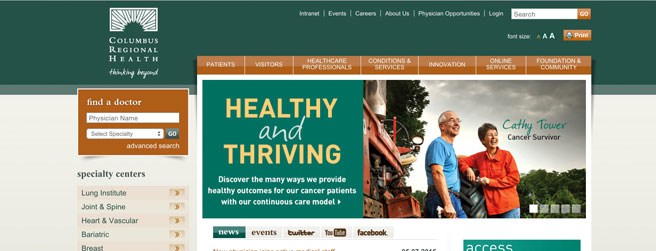
Columbus Regional Hospital makes use of a deep and calming green alongside a pleasing cream and a contrasting orange to bring together a distinct and very nice color scheme. Instead of having a separate menu for related items, this website makes use of a tab system that organizes everything perfectly.
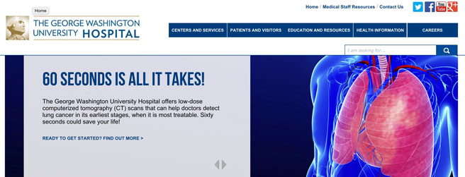
Instead of a menu bar that runs over the top of the content, The George Washington University Hospital has opted for one that runs along the left side which works well for all the information that they’ve put into it. They’ve managed to organize a lot of information in such a way that the links always lead you to where you want to go.
Virtua’s website uses lighter colors and lots of white space for a light and airy feel. They use easy to navigate menus and organize things in a way that you find exactly what you’re looking for. Their pictures that head each section are well taken and nice to look at, giving the website an extra oomph.
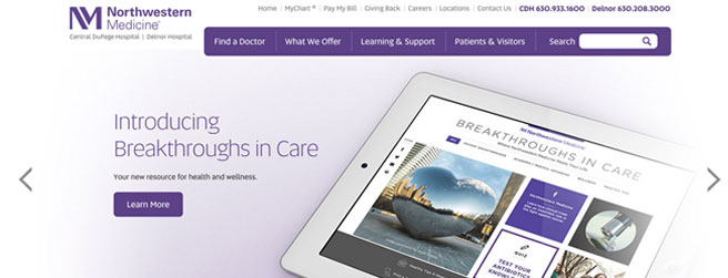
Northwestern Medicine’s website has a very professional look to it thanks to the nice menu and the background color. The orange on the tabs in the menu contrast nicely with the blue in the background bringing your eye straight to the navigation. All of their information is nicely organized, making use of a side menu.
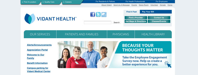
Vidant Health’s website is very easy to use, the menu buttons and text are large and easy to read, and the various shades of blue used make the site pleasing to look at. They’ve organized everything very well to where any information is easy to find.
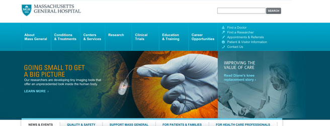
Massachusetts General Hospital has a very nice scientific feel to it thanks to the blues it uses in its menu. Their navigation is simple and effective, making it easy to find what you’re looking for.
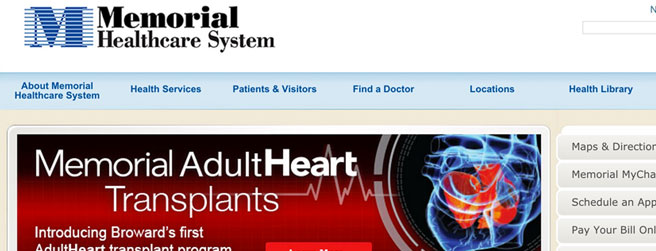
Memorial Healthcare uses light colors that offer a soothing effect which is appropriate for a hospital. This hospital website uses drop down menus to make navigating easy and convenient, they also give related links so you can find what you’re looking for with ease.
Children’s Healthcare of Atlanta has an almost playful feel to it’s website due to it’s use of saturated colors. There are no sharp corners in any part of this website, making it feel more kid friendly and streamlined. The menus are a breeze to use and all the information is organized very well.
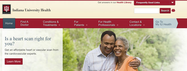
Indiana University Health has a very nice cream color with a rich red to give it a sophisticated feeling. Their menus are nice and easy to navigate, and their pictures are well done and pleasing to look at.
Want Your Hospital’s Website Design to Shine?
The secret isn’t found in any template – it’s in the authority and trust your site communicates to your visitors.
Our team of expert web strategists can help you craft that message and translate it into a winning enrollment formula. Fill out the short form below and you’ll get:
• A 30-minute conversation with an experienced web strategist
• A powerful, in-depth analysis of your current website
• A list of customized suggestions tailored to your goals


