Since the internet has nearly replaced the yellow pages, everyone needs a website, not just pencil pushers. The following 9 websites highlight the hard working men and women that make up our Top 10 Blue Collar list. They consist of industries that spread all across the country, from large million-dollar companies to small local family-owned businesses.
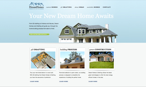
Dream Homes and Drafting clearly provides great service, but the people who designed and built this website deserve the same credit. The color gradient in the header is visually appealing, but what captures your eye the most is the logo and menu bar; the creativeness that went into these two elements makes this website what it is.
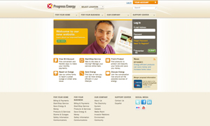
Progress Energy has an amazing design. When web designers use shades of oranges and browns I can’t help but take a second look. I love how this clean and organized website has so much depth. The clear navigation makes this site extremely user friendly.

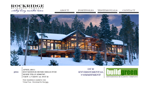
At first glance, Rockridge Building Company looks like a professional photographer’s website. But after digging deeper you begin to notice that these eye-catching photos aren’t just pretty pictures but examples of a building company. This design is unique and easy to look at. The simple design of the white reflects wonderfully with the snow on the home page. A lot of thought went into the creation of this website; any “less” simpler and it would have felt incomplete. All in all, a flawless design.
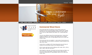
Another one of those “did I click on the right site?” designs. But it works for the Houston Starr Company! It gets more and more important for blue collar companies to find ways to relate with their target audience, and with websites like this they most certainly can. The sharp edges of this design are very modern and clean.
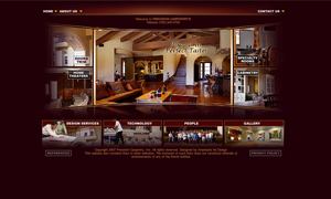
I won’t easily forget the website of Precision Carpentry! This edgy blue collar website makes you feel like you just walked into the workshop of a master craftsman. The great use of color and pictures immediately takes center stage. The curvature of the middle area gives the website a very unique and creative feeling. The use of the reflection for the slideshow is a great touch of class.
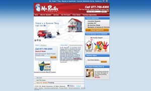
The banner and logo is just fantastic looking, and makes this website stand out from the others. Even though it’s a national chain, Mr. Rooter Plumbing has a fun, artistic and bold design. The pictures cycling in the slideshow reflect the fun and unique side of this blue collar company.
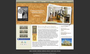
With the large, easy-to-read menu bar at the top of the page, the Structures Building Company website is easy to navigate. Glancing around the site, it’s obvious that the home page is not only easy to use, but also very well built. The header is clean and beautiful and adds character to the design while making good use of a slideshow to highlight their main services.
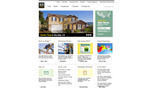
KB Home has a very professional look with a nicely done slideshow and well-placed photos. The elements of this website help enhance the design: the pictures offer a modern look while the logo and menu contrast very well.
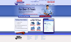
Roto-Rooter has it all! I think a design should have great elements that contrast, and not every design can do it successfully. The use of the shades of purple are bold and strong. This site is professional with a touch of creativity.