
Have you wondered where is text effects and typography in Word? Microsoft hides these in plain sight, and that matters when you are preparing a manuscript that needs to look clean for agents, editors, or Amazon KDP. Word can create fancy type, yet most book workflows punish fancy type because it breaks when you export, reflow, or hand the file to someone else.
If you are looking for the buttons because you want your chapter titles to feel more “bookish,” I get it. I also want your manuscript to read like a professionally typeset book. The trick is knowing where Word hides these tools, and when to leave them alone and solve the problem with styles, spacing, and fonts that behave.
Here are the exact menus, along with what to do with them without sabotaging your print PDF, your EPUB, or your editor’s sanity.

Table of Contents
Where Text Effects Live in Word
Word has two different places that look like “typography.” One is legitimate formatting that usually survives export. The other is decorative effects built for flyers, not book interiors. You need to know the difference before you touch anything.
The Text Effects Button in the Home Tab
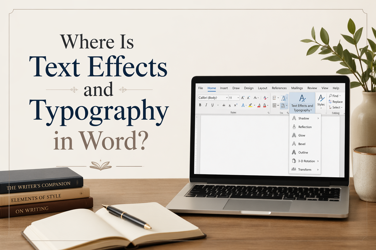
If you are on Windows, go to the Home tab, look at the Font group, and find the icon that looks like a glowing blue A. That is Text Effects and Typography. On Mac, you will usually find comparable options under Format and the Font panel, though the exact label can vary by version.
Clicking that icon gives you options like Outline, Shadow, Reflection, and Glow. It can also expose typography-related toggles such as ligatures and stylistic sets, when the current font supports them. In practice, most authors click this because they want a nicer chapter heading. For book interiors, those glow and shadow effects are where files go to die, especially when you later convert to EPUB or upload to KDP.
Font Dialog Box Controls That Behave Better
The safer controls are in the Font dialog. Open it by clicking the tiny diagonal arrow in the bottom-right of the Font group on the Home tab. This dialog gives you core options like small caps, character spacing, font kerning, plus advanced settings that tend to export more predictably than decorative effects.
If your goal is professional-looking headers, I would rather you lean on font choice, size, the spacing before and after, and true small caps than on WordArt-style decoration.
Why You Cannot Find It in Some Views
Word changes what it shows based on your ribbon layout, window width, and whether the Simplified Ribbon is active. When the window is narrow, Word collapses groups and hides buttons behind a small dropdown. If you do not see the glowing A icon, widen the window or click the Font group dropdown to reveal hidden controls.
And if your ribbon has been customized, the button can be removed. You can restore it in File > Options > Customize Ribbon on Windows, or Word > Preferences > Ribbon & Toolbar on Mac.
Where Real Typography Controls Hide
When authors say “typography,” they often mean readable pages, consistent headings, and a manuscript that looks intentional. Word can help with that, but most of the controls live in places you would not guess, and they work best when you drive them through styles.
Advanced Font Features Like Ligatures and Stylistic Sets
Some OpenType fonts include ligatures, stylistic alternates, and number styles. Word can toggle these if the font supports them. You usually reach them via the Text Effects and Typography menu or through the Font dialog, depending on version.
Here is my honest warning: those features can look beautiful in print, only to vanish or mutate in EPUB conversion. Reflowable ebooks often substitute fonts, and even when they do not, they do not always honor the same OpenType settings. If you plan to publish an ebook, I would treat these features as print-PDF-only polish.
Paragraph Typography That Matters More Than Fancy Letters
The typography readers actually notice is mostly at the paragraph-level. Line spacing, space before and after, indents, widow and orphan control, and hyphenation influence how “professional” your pages look far more than a drop shadow on a heading.
Open the Paragraph dialog box and look for:
First line indents (for body text), spacing before and after (for scene breaks and headings), and line spacing. If you are building a print interior in Word, also look at widow and orphan control and keep lines together options. Those settings are not glamorous. They are the difference between pages that look typeset and pages that look like a school report.
Styles as Typography, Not Decoration
If you want consistent typography across 70,000 words, manual formatting will beat you. Word is built around styles for a reason. Use Heading 1 for chapter titles, Normal for body, and create custom styles when your book needs them. When you later generate a table of contents, export, or hand your file to a formatter, styles are the map.
In my experience, most manuscript “design” problems vanish once the author stops touching the toolbar and starts editing the style definitions.
When Text Effects Help and When They Hurt in Publishing
Text effects have a place. It is rarely inside your book interior. The moment you move beyond Word as a drafting tool and into production, your priorities change.
Book Covers and Promo Graphics Are the Right Use Case
If you are making a social graphic, an ad image, or a temporary launch banner, Word text effects can be passable. For covers, I would not use Word at all. You want software built for layered design, kerning control, and export reliability.
This is where Adazing tools tend to fit more naturally into an author’s workflow. If your goal is a cover that passes the thumbnail test and does not look like a template, a dedicated cover maker gives you more control over typography and hierarchy than Word can.
Manuscripts and Interiors Have Different Rules
A manuscript is a working document. An interior PDF is a production artifact. Decorative effects in the manuscript create friction for editors and proofreaders, and they create risk when you export. If you use text effects for chapter titles, you might get away with it in a print PDF, then discover that your EPUB conversion turns the heading into a rasterized blob or strips the effect and changes the spacing.
Amazon KDP is clear that ebook rendering varies by device and settings. Amazon also notes that Kindle uses publisher fonts only when they are embedded and supported, and readers can override fonts and layout in many cases. See Amazon KDP guidance on Kindle format and fonts for the practical limits you are working within.
The Trade-Off: Visual Flair Versus File Stability
You are choosing between “looks cool on my laptop” and “behaves everywhere.” For book interiors, file stability wins. Your reader does not care that your chapter title has a subtle glow. Your reader does notice when headings shift, page numbers creep, or the ebook layout breaks mid-chapter.
If you want a distinctive interior, you will get more mileage from a good typeface, a clean trim size, sane margins, and consistent spacing than from Word effects.
How I Would Format Book Text in Word Without Breaking Exports
If you are formatting in Word as part of a lean indie workflow, I respect that. I have seen Word produce usable print interiors when the author keeps it disciplined. The point is to limit yourself to features that translate.
Set Up Styles First and Stop Formatting by Hand
Start with these styles and lock them down:
Normal for body text. Set your font, font size, first-line indent, and line spacing here. Heading 1 for chapter titles. Build in space before so you do not add blank lines. If you need scene breaks, create a custom style for a centered ornament or three asterisks.
Once the styles are set, format the entire manuscript by applying styles only. If you later change your mind about type size, you change it once in the style definition and the whole book updates. That is the closest Word gets to real typesetting behavior.
Use Typography Features That Survive Print PDF
For print, I am comfortable with:
Small caps, italic and bold, spacing adjustments, and simple rules like keeping headings with the next paragraph. I avoid WordArt, shadows, reflections, and anything that looks like a flyer. Hyphenation can help spacing in justified text, but it needs proofreading because Word will make choices you would never make in a finished book.
If you must use ligatures or stylistic sets, do so only in headings, and proofread the exported PDF at 100% size. Some fonts render those features inconsistently when embedded.
Export and Proofread Like a Publisher
Word on screen is not the product. Your PDF or your EPUB is, so export early, then proofread. For print, check for widows, orphans, awkward hyphenation, and headings stranded at the bottom of a page. For ebooks, open the file on at least two different apps or devices.
If you are publishing on KDP, use Amazon KDP’s Kindle Previewer guidance and check multiple device profiles. If a typography trick looks good only on one preview, treat it as unreliable and remove it.
Typography Choices That Actually Help Your Book Sell
Authors often hunt for typography controls in Word to make the book feel professional. Professional typography does not start in Word. It starts with decisions about readability, genre expectations, and how your packaging reads at a glance.
Readability Beats Clever Formatting
For interiors, a reader wants effortless pages. That means generous line spacing, sane margins, and a typeface that fits the genre. For example, romance and fantasy often tolerate more decorative chapter heads. Meanwhile, business books usually need strict clarity, charts, and consistent hierarchy. Your interior needs to match the promise of your cover and blurb.
If you are tempted to add effects because the page looks plain, check whether the real issue is spacing. Flat pages are often a spacing problem, not a decoration problem.
Cover Typography Is a Different Skill Than Word Typography
Cover type has one job: communicate genre and hook in about three seconds as a thumbnail. That is marketing typography, and it lives in kerning, hierarchy, contrast, and legibility at small sizes. Word does not give you the control you need.
This is where Adazing is built to help. If you are assembling a cover, use tools that let you control font pairing, alignment, and layout with intent. Treat Word as your manuscript tool, then hand the cover to software designed for cover design.
When to Hand Off to a Formatter
If you are wide publishing, producing print plus ebook, or running a backlist that you update over time, hiring a formatter often pays for itself. The hidden cost of doing it yourself is the time spent chasing weird line breaks and export problems. When your series is earning, your time is better spent writing the next book and marketing the catalog.
If you are early in your career and you want to keep costs low, you can do a respectable job in Word with strict styles and conservative typography. Just do not chase decorative effects as a substitute for clean layout.
FAQs for Where Is Text Effects and Typography in Word?
Why do I not see the Text Effects and Typography button in Word?
Your window may be too narrow, Word may be collapsing the Font group, or you are using the Simplified Ribbon. Widen the Word window, expand the Font group dropdown, or restore the command through Ribbon customization in Options or Preferences.
Do text effects like drop shadows and outer glow print correctly in a book interior?
Sometimes they print, yet they cause problems during export, and they can rasterize or render inconsistently. For print interiors, I stick to typography that behaves, like font choice, spacing, and styles. If you still use an effect, proofread the exported PDF at full size and check for artifacts.
Will Word typography features carry over to Kindle ebooks?
Some basic formatting carries over, while many typography features do not. Kindle devices and apps can override fonts and layout, and advanced OpenType settings may not render. Follow Amazon’s guidance on supported formatting and proofread in Kindle Previewer before you publish.
A Practical Way to Think About Word Typography
Word gives you access to text effects and typography controls, yet the best-looking books usually rely on restraint. If your goal is a clean, professional manuscript and an interior that exports without surprises, use styles, spacing, and readable fonts, then proofread the output files like a publisher. Save the decorative type play for covers and marketing graphics, where it belongs and where tools like Adazing can carry more of the design weight.
