The color pink is often associated with girls and anything girly. For this reason it can used to pique the interest of women passing by in the book store, but what about men? Though it is true that more often than not, a book with a pink cover is going to target the female gender, there are a few exceptions in which pink can be used to successfully pull in anyone, regardless of their chromosomes.
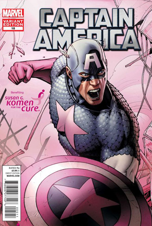 Captain America by Marvel ComicsYes, this is a comic book and not a book in the classic sense of the term, but the use of pink is too good to ignore. This is an iconic figure that has been a part of American culture, through comic books and now with movies, for decades. It would be very hard to find someone who doesn’t at least know who this character is, even if they know absolutely nothing else about him. They also know that Captain America is always in a red, white, and blue outfit, as is fitting for his name. This comic has used pink to shade the character, his shield, and the background entirely in pink, making this cover literally impossible to ignore. If it were just a regular image of Captain America, chances are people would pass by without a second glace. But because this extremely familiar character has been created with intensely unfamiliar colors, it really makes this cover jump out a reader. This is a perfect example of using color to make an otherwise familiar and ordinary object into something that demands more than a passing glance.
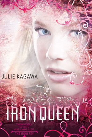 Iron Queen by Julie KagawaWe see so many things without ever really looking at them, so in order for a cover to really grab someone’s attention, the designer has to come up with a way for our eyes to want to stop on one image instead of continuing to browse. This cover has done a magnificent job of that, by using pink as the dominant cover and then adding the image of a beautiful girl. The border that takes up three quarters of the edges is a lovely shade of pink that is neither too bright nor too dull, and is filled with intricate design work that is automatically eye-catching in itself. Then with the image of the girl, slightly obscured by this artistic border and in a pink haze herself, there is a new focal point within the same moment as the eye transverses from the border to that which is being bordered. This is a beautiful and truly artistic design that is immediately captivating.
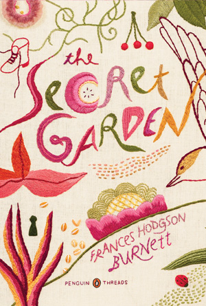 The Secret Garden by Frances Hodgson There are so many delightful images on this cover, both front and back, that it is hard to determine which one is really the best attention getter. But without a doubt, the overall cover design is a splendid example of using both an unusual color and unique design to create something that is impossible to ignore. From front to back there are fun little drawings of a plants and flowers, with a person seemingly walking through it all; even the letters written a plant-like font. Almost everything is pink or has some pink in it, and it is all in front of a pale pink background; and even though by putting so much of the same color onto one canvas the designer runs the risk of images blending instead of standing out, this design has been created just right so that each individual piece has a small life of its own. This is truly a wonderfully creative and obviously captivating cover.
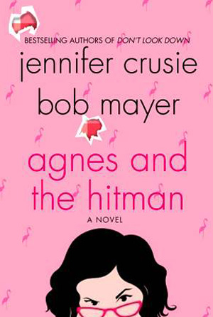 Agnes and the Hitman by Jennifer CrusieThe juxtaposition of two things that are complete opposites of one another is a sure fire way to draw in immediate attention, where either of them standing alone may be passed by. This is a great example of that side by side comparison, with an innocent pink background and title font, and the simple word “hitman”. Of course people have their own ideas when they see, hear or read pink, but there is little doubt that any of the things that do come to mind have anything to do with a hitman, and that is exactly why this cover is so great. It plays on that familiarity, twisting and turning it until the reader has no choice but to take a closer look, if only to find out if that is really what they saw. And in that instant, enough curiosity has been created for them to look even further, past the cover itself, and into the story.
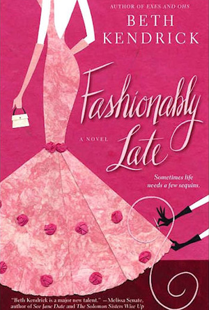 Fashionably Late by Beth KendrickA solid pink book cover is sure to gather the attention of anyone passing by, male or female. It is such an unusual color, and one that is not often seen in the natural world that it immediately becomes eye-catching. This cover has used varying shades of pink in order to create its artwork, and by doing so has fully expanded on the eye-catching appeal of this particular color. The only objects that aren’t pink is the little hand back, both people’s kin, and the black gloves, which makes these objects stand out even more against the pink images. The same is true of the white lettering of the title, author’s name and book information; the contrast of the white letters against the pink background make them easier to see and therefore to ‘s attention.