Book covers are often our first glimpse into a story’s world, visually captivating readers before they dive into a literary adventure. John Green’s “Paper Towns” proves this point. The Paper Towns book covers give readers a tantalizing preview into its journey of self-discovery, friendship, and finding an authentic identity through symbolic figures related to the novel. Whether or not you enjoy reading stories similar to this novel, just gazing upon its many book covers can give an understanding of why so many readers worldwide have connected to its narrative!
Table of Contents
The Paper Towns Book Covers
“Paper Towns” book covers have undergone spectacular transformations since its inception, serving as unique visual interpretations of the book’s themes and narrative. Each “Paper Towns” book cover exhibit creativity and versatility. Despite becoming distinctive in style and design, all book covers work to entice readers to discover Paper Town’s characters and their journeys.
No matter where your passions lie – on novelist John Green’s fiction or the world of book cover design – our Paper Town book cover gallery promises to deliver captivating visuals for authors, illustrators, and readers to learn from in terms of the book’s cover.
1. Paperback Editions
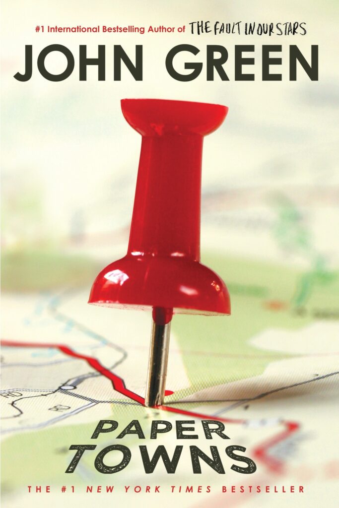
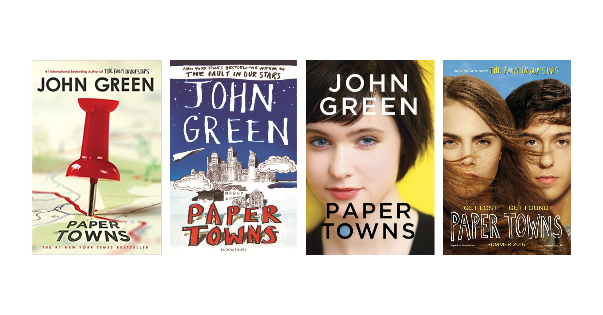
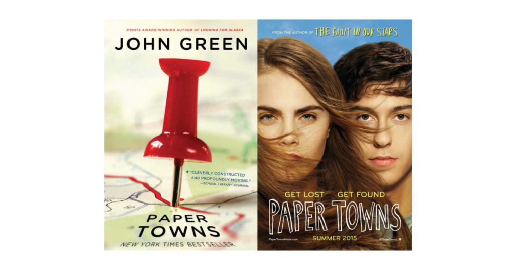
Published in September 2009, the book cover for the paperback edition of Paper Towns immediately tells you that the novel has something to do with places. A giant pushpin is on a blurry map as if pinned on the words “Paper Towns,” which is also the novel’s title. It’s a creative way to exhibit the book’s essence in a striking image, making potential readers wonder if “Paper Towns” is real or fictional. As for the typography, the title reflects the handwriting of a young explorer, marking its destination on a map, giving the book cover a personal touch.
Overall, this book cover immediately hints to the readers that a mystery is afoot—an incredible way to entice readers to figure out the meaning behind the elements that make up this book cover.

The re-issue released by BLOOMSBURY in December 2013 embraced the concept of Paper Towns differently, in a literal sense. Over a backdrop of a midnight blue sky filled with stars appears a hand-drawn cityscape constructed from delicate paper cutouts. There are more cutouts throughout the cover, such as clouds, rural houses, and a paper plane. Even the title, “Paper Towns,” is a paper cutout! Moreover, the interplay of light and shadows gives the illusion of depth and texture, making it seem like each cutout is floating or standing on its own.
Meanwhile, the typography used for the rest of the text appears handwritten, possibly by a young explorer who seeks adventure.
This book covers offers a unique take on the book’s title and themes, effectively capturing the allure and mystery of John Green’s thought-provoking tale.

The paperback edition published by Dutton Books in October 2008 is simple and fun at the same time. The bright yellow background depicts a light feeling which the playful font style complements. If the first book covers used maps and paper cutouts as symbolism, this version used a car, hinting at a possible trip within the story.
Everything in this Paper Towns book cover completes the overall look it aims to achieve, making it eye-catching for the target audience: young adults.
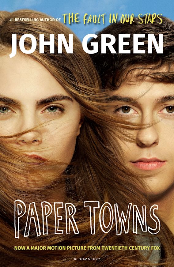
Paper Towns’ film version’s release date was in 2015. By then, Bloomsbury also released a paperback edition that used the movie poster as its cover. It features Cara Delevingne and Nat Wolff, who both starred as the main characters in the film. Their faces come side-by-side, with Cara’s hair flowing towards her face and Nat’s. The author’s name lies on top in a bold sans serif font, while the book’s title is at the bottom part, written like a doodle.

This minimalist edition uses only a few elements to form an intriguing book cover. Shades of blue, black, and white decorate the whole artwork, from the background, the silhouette of a city and the text. It may appear too simple, but it effectively captures enough of the themes in the novel, not giving too much but not giving too little.
2. Hardcover Edition

This hardcover edition of “Paper Towns,” published in October 2008 by Dutton Juvenile, boasts a simple yet striking book cover that invites readers to explore the mysterious world within the novel. It mixes a bright yellow background with a delighted girl, whose emotion through the aura of her eyes and lips hints at fun or possibly mischief. The author’s name in white sans serif font is placed on top, while the book’s name in black sans serif font lies at the bottom of the page.
The portrait of the girl, combined with the text and color choices, worked well together, tempting readers to discover the story behind the girl’s mischievous smile and how this design choice is significant to the novel.
3. Audio CD
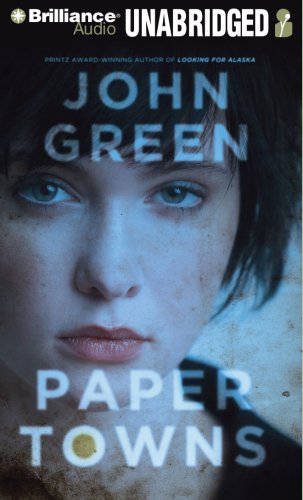
This book cover for the novel’s audio CD version, first released by Brilliance Audio in October 2008, shows a portrait of a girl beneath a faded blue color. The girl’s expression reflects the emotion especially seen through her eyes, and the audience automatically sees her sadness. Other elements in this minimalistic cover include the text showing the title and author of the book.
The portrait of the girl, paired with the choice of text and color, worked together cohesively, enticing readers to find out how this lady and the title, Paper Towns, connect and if this novel has a dramatic turn of events.
An Insight About John Green’s Paper Towns
John Green’s Paper Towns has quickly won worldwide critical acclaim since its publication in 2008. Since reaching number five on The New York Times Best Seller List upon publication, Paper Towns has also been translated into numerous other languages for worldwide reading enjoyment and continues to unite readers from diverse backgrounds across nations and languages alike.
Green’s ability to depict teenage life with all its ups and downs resonated powerfully across generations of readers, garnering him praise from critics and readers.
Paper Towns is more than a novel; in 2015, it jumped into film form as Nat Wolff and Cara Delevingne led an excellent cast in an adaptation that received positive reviews, further solidifying Paper Towns’ lasting legacy.
Young adult literature fans love Paper Towns because of the emotional resonance it generates with readers. John Green’s captivating exploration of adolescence, self-discovery, and authentic relationships has touched readers worldwide – cementing Paper Towns as one of the classic works in recent YA lit.
FAQs about the Paper Town Book Covers
Q: To what extent do the book covers of Paper Towns reflect its themes and atmosphere?
A: The Paper Towns book covers are artistic expressions that capture its themes and atmosphere through creative choices and symbolism, often featuring maps, cityscapes, or road signs to represent characters’ search for meaning or self-discovery – often leading to feelings of mystery or intrigue as these covers showcase lead character’s journey.
Q: Are there different editions of the novel’s book covers?
A: Yes, depending on your publisher or country. Some editions feature alternative designs or typography, which offers new perspectives to the story – something familiar with books since multiple covers serve various markets or target audiences.
Q. Have the book covers for Paper Towns changed over time?
A: Paper Towns’ book covers have evolved throughout its publication timeline to meet changing design trends and marketing strategies. Initial editions often featured bold typography with compelling images to convey its narrative mystery and adventure. On the other hand, later editions adopted minimalist approaches utilizing symbolism and typography more, evoking introspection rather than visual effects alone. Such changes show the author/publisher’s desire to engage readers in various ways.
Q: Do the book covers differ depending on my country of residence or translation?
A: Yes. The covers for this novel may differ between countries or translations. Publishers frequently tailor book covers to specific markets or reflect local design preferences based on cultural considerations or marketing strategies. For example, cultural influences often lead to color schemes, imagery, and typography choices.
Q. Can the book covers of Paper Towns impact my overall reading experience?
A: Yes, but not significantly. The book covers of Paper Towns are vital components of an enjoyable reading experience, captivating potential readers’ curiosity and engaging them as readers. Since they’re what we first see, they can draw readers further into John Green’s world while stirring emotions and sparking intrigue. Then again, remember that the book covers shouldn’t affect the story’s narrative!
Conclusion
The Paper Towns book covers are an outstanding demonstration of how effective book covers can be when it comes to conveying a novel’s spirit to readers. The artistic choices, symbolism, and eye-catching visuals are essential in drawing readers in and inviting them to the novel’s pages for further discovery and inspiration.
Authors and illustrators (and readers) can take inspiration from the Paper Towns book covers. Studying our list will help you recognize the power of visual storytelling in influencing readers’ perceptions, including how to design book covers that effectively portray the essence of their stories while engaging potential readers and improving overall reading experiences.
Are you seeking additional book cover design inspiration? See our Book Cover Ideas Blog here.