
The color blue is often associated with certain objects like water, as well as specific emotions like sadness. Well done covers can expand on these expectations or they can go in the opposite direction. Either approach, if done right, can work to successfully capture the attention of the reader.
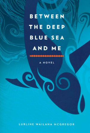 |
Between the Deep Blue Sea and Me by Lurline Wailana McGregor
A cover doesn’t have to have contrasting colors in order to successfully create an eye-catching image, and this cover is the perfect example. Different shades of blue have been expertly crafted together to create a coherent image that is instantly recognizable as a sea creature jumping from the swirling waves of the ocean. The only contrasting colors are the white of the very small letters used to make the title, and they don’t create as captivating an effect as the different shades of the elegant whale “swimming” across the cover. This is a beautiful and alluring cover that is sure to capture attention. |
| Blue Mars by Kim Stanley Robinson
Here is a good example of using people’s pre-conceived notions of what a color should represent and contrasting it with words and images in order to create a cover that is immediately eye-catching. Everyone knows that Mars is a red planet, which is why when the title states “Blue Mars” is bright blue, large letters, it really reaches out to grab the reader. The image below, which upon first glance one would assume is just a picture of Earth, when combined with the title allows potential readers to realize that it is in fact the red planet, somehow become blue. The slide of images to the side and the spaceship on its way to the strange-looking planet adds to the mysterious idea of Mars as blue, and clues readers into the fact that this is obviously a science-fiction novel. The use of blue in the title, the background, and the many images, going against concreted ideas about fact, combine wonderfully to really create an attention grabbing cover. |
 |
 |
Just Breathe by Kendall Grey
This cover has blended blue images expertly to create a breath-taking image that is sure to grab a passerby’s attention. The calm blue sky creates a background for the moving blue seas in which a blue fin can be seen diving into the depths. In the foreground, tow people hold hands, one of which has amazing blue tattoos scattered up the forearms; more images of the sea and sky that illuminate behind them. The only thing that contrasts against this beautiful blue picture is the white of the letters, and with their font they really add to the overall image instead of distracting away from it. This is an enchanting image that has been designed into a very successful cover that will capture the attention of those passing by. |
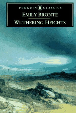
| Wuthering Heights by Emily Bronte
Here is a classic novel with a truly classic cover that has expertly blended the dominant color of blue with other landscape colors to create a beautiful image. Regardless if readers recognize the author or the title, which is in a black box contrasting the blue sky with white letters to contrast against the box itself for those that will recognize the title or author, the picturesque sky above a barren landscape is sure to bring them in. Though there are other colors present in the landscape, it is the blue of the sky, the mountains, the clouds and even the slight hues in the rocks that really dominates the picture and makes it so beautiful. This is truly captivating cover for a true classic novel. |
 |
 |
Firefly Lane by Kristin Hannah
Water and sky are two of the most popular things that come to mind when people think of things that are blue. This cover uses the sky as its focal point to really use blue to its maximum potential. The darker blue of the night sky stretches across the top of the cover, while a light blue cuts across the horizon, still slightly illuminated by the leaving sun. These two halves of a beautiful sky are only interrupted by a contrasting white in order to make the title, also in light blue lettering, stand out even more. To ensure that the tranquility of the image is not completely interrupted, the people in the background are faded and blurred, so that the reader can instead focus on the fireflies and the jar that they have apparently escaped from. The jar itself reflects the blue of the sky, and the tablecloth too is a checkerboard pattern of whites and blues. Everything on this cover blends together perfectly and uses two well known ideas about blue, representation of the sky and the feeling of calm, to create an incredible overall effect that is immediately captivating. |