
I have used WordArt in Word when I need a piece of text to look like a design, without opening Photoshop or hiring a cover designer for every little asset. WordArt helps me a lot as long as I treat it like a fast lettering tool for internal and promotional materials rather than a substitute for professional cover typography. When you keep that boundary clear, WordArt becomes a practical part of your author toolkit for bookmarks, chapter-part dividers, newsletter headers, quote graphics, and rough mockups you can hand to a designer.
Table of Contents
When WordArt Is The Right Tool For Authors
Readers are keen on clarity and professionalism. WordArt works best when the design stakes are medium, and the distribution format is forgiving, such as a PDF reader magnet, a handout at a signing, or an internal style guide for your pen name.
I also like WordArt for early-stage cover and ad experiments. If you are testing title phrasing and hierarchy, WordArt is good enough to answer the question, “Does this read at a glance?” That test matters because people process big visual features first, and readability drops hard when type gets busy or low-contrast. The Nielsen Norman Group’s research on how users read on the web has long documented that people scan pages and focus on visual cues rather than reading line by line, which is exactly why clean typographic hierarchy pulls its weight in marketing materials.
Places I Actually Recommend WordArt
I recommend WordArt for three author tasks. First, interior book assets like section openers, part titles, and simple ornamental text for special editions. Second, social media quote graphics where the goal is legibility on a phone screen, not typographic originality. Third, mockups for ads and covers where you are exploring size, placement, and contrast before you commit money to final art.
If you are building a reader magnet, you can set a strong title treatment in WordArt, export it, and drop it into Canva or a cover tool later. That is a sensible way to separate concept from execution.
Situations Where WordArt Costs You
I stop authors from using WordArt for final book covers, Amazon ad creatives, and anything that needs to look like it belongs beside a professionally produced title. WordArt effects have a recognizable “office document” flavor, and the font control is limited compared to pro tools. You also cannot do the kind of kerning, tracking, and optical alignment that makes type look expensive.
If you are publishing wide and you need consistency across retailers, those small typographic weaknesses multiply. A cover that is “fine” at full size turns into a muddy thumbnail, and the thumbnail is where your book lives most of its life.

How To Build Clean WordArt That Looks Like Publishing, Not A Flyer
Most WordArt looks bad for the same reason most amateur covers look bad. It tries to be decorative before it is readable. If you want WordArt to pass as competent design, you need to prioritize contrast, spacing, and restraint.
Font Choices That Do Not Embarrass You
Start with fonts that were designed for text, then push them slightly for display. If you have access to fonts like Garamond, Georgia, Gill Sans, Calibri, or Arial, you can still produce clean results. You are aiming for a shape that reads instantly, not a font that performs tricks.
One practical rule I use is to keep the number of fonts to one, maybe two if you are pairing a serif and a sans. WordArt becomes chaotic fast when you stack multiple novelty fonts, outlines, glows, shadows, and 3D effects. Your reader will not interpret that as “creative.” They interpret it as “I do not know what I am doing.”
Effects That Stay Professional
Stick to three effects, and treat them like seasoning. A simple fill color, a subtle outline, and a light shadow are usually enough. If bevels, gradients, and rotations are tempting to you, use them only when you have a strong reason that fits your genre. For example, a cozy mystery can support a softer, playful treatment. A business book usually cannot.
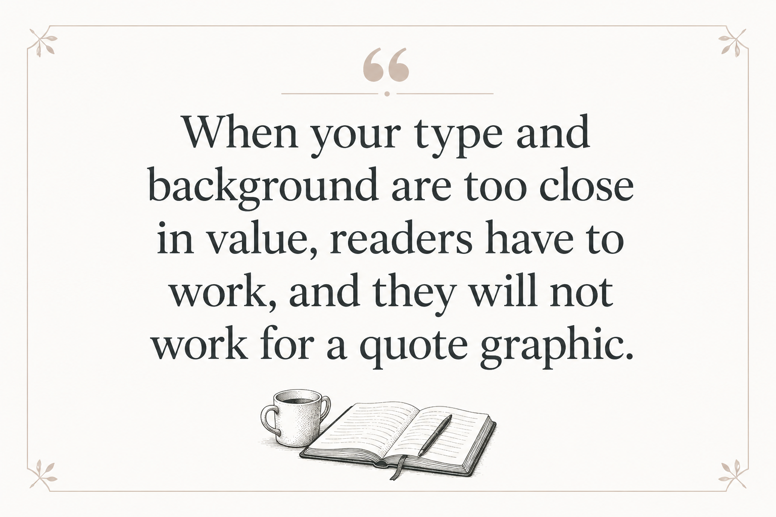
Contrast carries the whole piece. The Web Content Accessibility Guidelines explain contrast as a readability issue, and even though you are not building a website, the principle is the same for print and images. When your type and background are too close in value, readers have to work, and they will not work for a quote graphic.
Spacing And Alignment That Fix 80 Percent Of The Look
WordArt is not a kerning tool, so you have to fake professional spacing with a few habits. Keep your letter spacing normal unless you have a specific reason to open it up for a short title. Do not stretch WordArt horizontally or vertically. That distortion is one of the fastest ways to make type look cheap.
Align WordArt to something real, not to your feelings. Use Word’s alignment guides. If the text is centered, center it to the page margins, not roughly in the middle of your screen. If it is left-aligned, line it up with the left margin of your body text or your image boundary.
A Step-by-Step Workflow In Microsoft Word
I am going to assume you want a repeatable method you can use for your author assets, not a one-off experiment. This workflow keeps your file clean and reduces the “why did everything move” problem that Word loves.
Inserting WordArt And Setting The Base
Go to Insert, then WordArt, and pick the plainest style. Start boring on purpose. Type your text, then immediately set the font and size from the Home tab. I do not rely on the preset WordArt styles because they bake in effects you usually have to undo.
Next, open Shape Format. Set Text Fill to a solid color. Set Text Outline to either no outline or a thin outline in a slightly darker version of your fill. Then add a shadow only if it improves readability against the background. If it does not, delete it.
Wrapping, Anchoring, And Keeping Word From Wrecking Your Layout
Right-click the WordArt and choose Wrap Text. For most author assets, I set it to In Front of Text so I can place it precisely. Then I right-click again, go to More Layout Options, and check “Lock anchor.” That simple move reduces the odds that Word will shove your WordArt into a new zip code when you edit a paragraph.
If you are placing WordArt over an image, insert the image first, set the image Wrap Text to Behind Text or In Front of Text, then position your WordArt on top. Group them only after you are happy with placement. Grouping too early makes small adjustments annoying.
Exporting WordArt For Covers, Ads, And Social Graphics
When you need the WordArt outside Word, do not screenshot. Screenshots create fuzzy edges and weird scaling problems. Instead, select the WordArt, right-click, and choose Save as Picture. Pick PNG for transparency when layering it over another design.
If Word refuses to give you clean export options, I use a workaround. Paste the WordArt into PowerPoint, then right-click and Save as Picture as PNG. PowerPoint tends to export cleaner text objects than Word.
Author Use Cases That Pay Off Fast
You will get the most value from WordArt when you tie it to tasks that directly affect visibility or reader experience. If the asset does not help discovery, conversion, or the reading process, it is probably busywork in a different outfit.
Reader Magnets And Newsletter Branding
A reader magnet cover or header does not need to win a design award. It needs to look consistent with your author brand and readable at phone size. Use WordArt to build a clean title lockup, then reuse it across your welcome sequence headers and your magnet PDF.
If you want to take it further, I often suggest authors build a small brand kit. Pick two fonts and two colors, then keep using them. That kind of repetition is what makes a pen name feel real to strangers.
Quote Graphics That Do Not Look Like A Homework Assignment
WordArt can produce simple pull-quote typography that you can drop onto a background in Canva. The trick is to keep the quote short enough to breathe. If you are forcing 60 words into a square graphic, no font effect will save it.
When you test these, test them like an ad. Shrink the graphic to thumbnail size on your phone. If you cannot read it without squinting, your followers cannot either.
Mockups For Designers And Ad Testing
WordArt is surprisingly useful for rough cover comps. If you are hiring a designer, you can show what you mean by hierarchy and emphasis. “Big title, small author name, series badge top right” is clearer when you send a simple visual.
This is also a smart way to test ad hooks. Write five variations of your tagline, build five WordArt treatments, and see which one survives the thumbnail test. I do a version of this inside Adazing tools too. When I am brainstorming titles or taglines with a generator, I still want to see what the words look like as design.
Knowing When To Graduate Past WordArt
There is a moment when WordArt stops being frugal and becomes expensive, because it costs you conversion. If you are running Amazon Ads, if you are scaling a series, or if you are trying to compete in a tight genre, weak typography is a tax you pay every day.
Professional cover type is not fancy because designers are bored. It is fancy because good letterforms, spacing, and hierarchy are what make a cover readable at one inch tall.
Signs Your Typography Is Hurting Sales
If your cover looks fine at full size but your title disappears in a search grid, that is a problem you can measure. If readers consistently misread your title or your author name, that is a signal too. Another sign is when your cover looks off-genre even though the imagery is right. Typography is a genre marker, and readers use it to decide what kind of promise you are making.
You can test this without guesswork. Put your cover thumbnail next to the top 20 in your category. If your type looks softer, busier, or less legible than the competition, fix the type first.
Better Tools For Book-Grade Typography
If you want free tools, I point authors to GIMP or Inkscape. If you want the industry standard, that is Adobe Photoshop and Illustrator. If you want a fast web tool, Canva is fine for ads and social assets, though it still has limits for high-end cover typography.
At Adazing, I build tools for authors who need speed without surrendering control. A good cover maker or typography-focused design workflow is a better long-term solution than trying to force WordArt to behave like a design suite. Use WordArt for drafts and simple assets, then graduate the final files to a tool that respects type.
FAQs for WordArt in Word
Can I use WordArt to design a book cover title?
You can use WordArt to mock up a cover title and test hierarchy and readability, and that is where it shines. I do not recommend WordArt for your final cover type if you are selling commercially, because you cannot control kerning and other details that make typography look professional. If your book is a personal project or a low-stakes internal booklet, WordArt can be enough.
How do I save WordArt as a transparent PNG?
Select the WordArt, right-click, and choose “Save as Picture,” then select PNG. If the exported edges look rough, paste the WordArt into PowerPoint and export as PNG there. PowerPoint often produces cleaner transparency for text objects.
Why does my WordArt move when I edit the document?
Word treats WordArt like a floating object tied to an anchor in your text. Set Wrap Text to “In Front of Text” and then lock the anchor in Layout Options so Word does not reposition it every time you add or delete paragraphs. If the document is still unstable, put WordArt on its own page or inside a text box you control.
A Practical Way To Use WordArt Without Regretting It
WordArt is a decent tool when you use it like a scalpel, not like a costume box. Keep it simple, test at thumbnail size, and export cleanly. If you are building real commercial assets, treat WordArt as the draft stage, then move the final typography into tools built for book marketing and covers, because your reader will judge your professionalism before they read your first line.
