
If your next editorial checklist calls for the tick symbol in Word, choosing the right insertion method now can spare you hours of cleanup later. A check mark gives readers a quick visual signal that a task, requirement, or choice is complete. That signal has to hold up when you export your manuscript to PDF, upload it to KDP, or send it to an editor.
Clarity matters in my own production schedules, revision lists, workbook pages, and author questionnaires, all of which rely on check marks. The right method depends on whether you need one symbol for a single document or a repeatable system across a book. Word offers several ways to insert it, each with different advantages for speed, appearance, and reliability.
The safest choice for most authors is a standard Unicode check mark in a dependable font, tested on the device your reader will use. That test matters because a symbol that looks polished in your draft can turn into a square, a missing character, or an inconsistent glyph after conversion.
Table of Contents
Choosing The Right Check Mark
Word offers several characters that look similar at a glance. The familiar check mark is usually U+2713, which displays as ✓. Its heavier counterpart, U+2714, appears as ✔. Wingdings and Webdings also contain check-style symbols. Those characters depend on a special font, so they can cause trouble when you share the file.
Because of that font dependence, I recommend a Unicode character for a book manuscript, workbook, or reader download. Unicode assigns each character a consistent code point, giving modern applications a better chance of preserving it across platforms. The Unicode chart for Dingbats lists U+2713 and U+2714 as check mark characters.
Standard Check Marks
Between those two characters, the lighter ✓ works well in a clean checklist or a small table. In contrast, the heavier ✔ carries more visual weight and suits a printed workbook where thin lines may lose clarity. Whichever you choose should follow the typography of the page, since a heavy symbol beside delicate body text can look like a design error.
To judge that balance, try both characters at the final size of your book. A check mark that looks distinct at 18 points on your monitor may disappear at 9 points in a paperback interior. For that reason, I place the symbol beside the actual text it will accompany and print one page or view the PDF at 100 percent.
Font-Based Symbols
Wingdings can be fast when you already know the font and the document never leaves your own workflow. Trouble starts when a collaborator opens the file, a font fails to embed, or you convert the document in another application. At that point, a reader may open a page where your completed tasks now appear as little boxes.
To avoid those boxes, use a font-based symbol only when you control the entire production path and have checked the final export. For a public-facing book, Unicode is the safer choice.

Using Word’s Symbol Menu
The Symbol menu is the most dependable visual method because you can inspect the character before inserting it. Microsoft’s support page on inserting a check mark symbol follows the same route. Menu labels vary slightly by Word version, so treat the steps below as a guide to the general process.
- Place your cursor where you want the check mark.
- Open the Insert tab on the ribbon.
- Select Symbol and choose More Symbols.
- Choose a font with a check mark you like. Segoe UI Symbol, Arial Unicode MS, and similar Unicode-capable fonts are useful starting points.
- Find the check mark in the character grid. If the dialog shows a Character code box, enter 2713 and set the from list to Unicode (hex).
- Click Insert, and select Close to dismiss the dialog.
Once the mark is in place, check its font. Word may substitute a different typeface when the chosen one lacks that glyph, so select the mark and confirm that it matches the surrounding text or the visual system of your page.
For a nonfiction workbook, I often place the check mark in a narrow table column beside a wider one that holds the task. That arrangement aligns the symbol across several lines and gives the reader a clear place to record completion. A novel manuscript works differently, since check marks there usually belong in your private revision notes.
Finding A Symbol By Character Code
Character codes save time when you insert the same symbol repeatedly, since typing 2713 calls up the standard check mark. The dialog’s settings still determine whether Word reads that number as Unicode or as an older symbol code, so check the character preview before inserting it.
To make those codes easy to reuse, maintain a short reference list in your production notes. I record the character, the font, and the intended use. A typical entry might pair ✓ in Segoe UI Symbol with a checklist, or ✔ in a display font with a section opener. That small record spares a later formatting session from becoming guesswork.
Using Keyboard Shortcuts
Once you know your operating system and Word version, a keyboard shortcut speeds things up even more. In Word for Windows, you can insert a Unicode character by typing its code and pressing Alt+X. Type 2713, press Alt+X, and the code converts into a check mark. The same steps with 2714 produce the heavier version.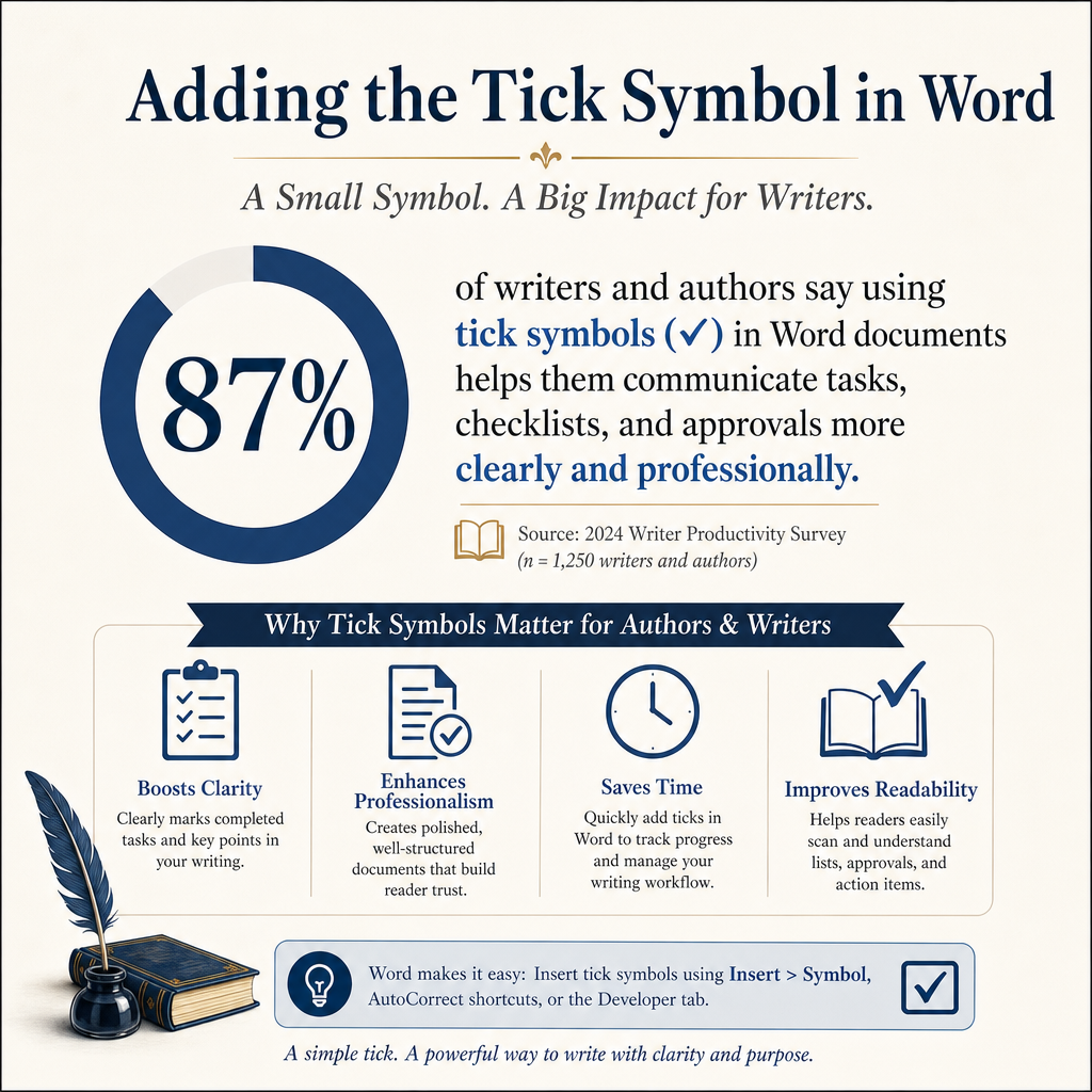
This method works best when your cursor sits in the document body, and you enter the code as plain text. If the conversion fails, check whether the code touches other letters or numbers, since Word can read that surrounding text as part of the code when the characters run together. To fix it, select only the code and press Alt+X again.
Windows Keyboard Options
Windows also offers character tools outside Word. The Character Map application lets you search installed fonts, pick a tick symbol, copy it, and paste it into your manuscript. Microsoft covers the broader Windows character-entry options in its guide to ASCII and Unicode character codes.
Character Map helps most when Word’s Symbol dialog makes the right glyph difficult to find. If the application supports character names, search for “check.” You can also browse the symbol font you plan to use. Once you find the right mark, paste a single copy into the document and inspect the result at your final body-text size.
Mac Keyboard Options
On a Mac, press Control+Command+Space to open the Character Viewer and search for “check mark.” Selecting the symbol inserts it into Word. Because the viewer also shows variations, related symbols, and recently used characters, you can return to a favorite mark in seconds during later edits.
Those variations depend partly on fonts, since Mac and Windows can display the same Unicode character with different glyph designs. That difference matters when you are matching a carefully designed interior. To control the result, choose the actual font in Word and avoid relying on the operating system’s preview.
Creating A Reusable Check Mark System
One inserted symbol solves one problem. A full book multiplies those problems, so it calls for a reusable system. Before you build a page of checklists, decide what the symbol means, where it appears, and how readers will interact with it.
Meaning comes first. For example, a completed check mark usually tells the reader a task is finished. An empty box may signal a pending selection. A shaded box can record a choice made during an exercise. Clear distinctions like these help a workbook reader move through the page without stopping to interpret your design.
Building A Custom AutoCorrect Entry
Word’s AutoCorrect feature can replace a short text shortcut with a check mark. To set one up in Word for Windows, go to File > Options > Proofing > AutoCorrect Options, type a trigger like ;check in the Replace box, paste the Unicode symbol into the With box, and select Add. A semicolon plus a memorable label works well because no common word or abbreviation in your prose will match it.
Before relying on the entry, test it in a blank document. AutoCorrect settings can apply across documents on your computer, so an overly short shortcut may alter ordinary text in unexpected places. For that reason, I use a distinctive trigger and record it in my book production file.
Saving A Symbol In Quick Parts
Quick Parts can store a formatted check mark, a checked table cell, or an entire recurring checklist block. Select the finished element, go to the Insert tab, choose Quick Parts, and select Save Selection to Quick Part Gallery. Give the entry a name you will recognize later.
That stored block helps most when your book contains repeated exercises or reading logs. Once you save the symbol with the correct font, size, alignment, and paragraph spacing, you can reuse a tested element on every page without rebuilding it.
Authors who use Adazing tools for writing and book production often move between drafts, worksheets, marketing plans, and reader resources. A consistent symbol system ties those materials together visually. That consistency works best with a restrained design. A checklist should guide the eye toward the task, with the book’s title, headings, and instructional text remaining the dominant elements on the page.
Checking Export And Print Quality
Readers only ever see the check mark in the exported book. Your Word file holds a draft of that symbol, so export a PDF and inspect every page where it appears. Look for missing glyphs, altered spacing, inconsistent weight, and symbols that sit too high or too low beside the text.
Files that pass through several applications need particular attention. For example, a manuscript may move from Word to PDF software, a cover or interior design application, a printer’s preflight system, and a digital publishing platform. Each conversion creates another opportunity for a font or character to change.
Testing A Printed Interior
Printing introduces its own risks, so test a representative page on the paper or printer you expect to use. Thin check marks can weaken on cream stock. In a dense workbook table, small symbols can turn muddy. When the printed page loses clarity, increase the symbol size slightly or choose a heavier glyph.
Spacing around the mark deserves the same scrutiny. A check mark placed directly against a sentence looks cramped. Leave too large a gap, and the link between symbol and task becomes harder to read. To control alignment, use paragraph settings or a table cell and skip the long strings of spaces.
Testing A Digital Edition
Screens deserve the same testing when digital formats matter to your audience. Open the PDF or EPUB on a phone, tablet, and desktop. On each device, zoom in and out, rotate the screen, and confirm that the character remains visible. Reading apps may apply their own fonts and rendering engines. A symbol that looks crisp on your laptop can still break on another screen.
Fillable workbooks raise a different question. A printed check mark serves a decorative or instructional purpose. In contrast, a form checkbox needs a field, a usable hit area, and a saved state. Because those are separate production decisions, test each checkbox as an interactive field as soon as you create it.
Common Tick Symbol Problems
The most common issue is a hollow square where the check mark belongs. Word displays that square when the selected font lacks the requested character. To fix it, switch to a font that supports Unicode symbols, reinsert the mark, and export a new PDF for testing.
Inconsistent marks cause the next most frequent trouble. For example, one page may use a thin Unicode check, another a Wingdings character, and a third a manually drawn shape. Readers notice that inconsistency even when they cannot name it, so pick one character and one visual treatment for the complete book.
Replacing A Missing Character
To diagnose that square, select it and check its font on the Home tab. Next, switch to Segoe UI Symbol or another font known to contain the character and compare the result with nearby text. If the symbol still fails, delete it and insert a new character from the Symbol menu.
When dozens of squares appear, resist fixing them one by one until you know why the first one failed. Fixing the font or replacing a damaged text style may solve the entire document at once. Before making a large replacement like that, save a new version of the file.
Fixing Alignment And Spacing
When a list needs precise columns, use a table. Set the check-mark column to a fixed width, center the symbol, and align the task text consistently. That structure gives you more control than spaces or repeated tab presses, especially once a sentence wraps onto a second line.
A simple inline symbol needs a lighter touch. Adjust the character’s font size, or apply small changes through the Position setting on the Advanced tab of the Font dialog. The goal is a check mark that sits naturally on the baseline. A symbol floating above the words makes the page look unfinished, even when every other element is polished.
FAQs for Adding the Tick Symbol in Word
What is the Fastest Way to Add a Check Mark in Word?
Windows users can type 2713 and press Alt+X to convert the code into a standard check mark. On a Mac, open the Character Viewer with Control+Command+Space and search for “check mark.” When you need to inspect the font and character before inserting it, the Symbol menu remains the best choice.
Why Does My Tick Symbol Appear As A Square?
Your selected font probably lacks the check mark character, or the symbol changed during conversion. To fix it, select the square, switch to a Unicode-capable font like Segoe UI Symbol, and reinsert the character. Before sending the document to an editor, printer, or publishing platform, export it and inspect the PDF.
Which Check Mark Should I Use In A Book?
For a dependable book interior or reader resource, use a Unicode check mark like U+2713. U+2714 suits pages where a heavier symbol fits your typography and remains clear in print. Whichever you pick, test the character at its final size and use the same font and symbol throughout the project.
Keeping Your Book’s Symbols Reliable
A check mark is a small piece of typography with a real production job. To protect it, choose a Unicode character, control its font, create a shortcut only after testing it, and inspect the exported file in print and on screen. Those habits prevent a tiny symbol from becoming a visible flaw in an otherwise finished book.
To lock in those habits, save one approved check mark in your production notes with its code point, font, size, and intended use. That reference gives you a repeatable standard for every worksheet, revision checklist, and reader resource you create for the book.
