Finance is a part of everyday life, and we all understand that our money is a precious commodity that needs the utmost care to ensure that what we earn will remain safe when in the hands of a third party. This is why financial services web design must convey not only an impression of professionalism, but also an open and friendly image; one that will allow the customer to feel confident in dealing with the company, whilst at the same time not consider themselves weighed down by the intricacies of complicated financial particulars.
Green is the Color of Money
When observing many finance based websites, you will notice that the majority of them feature green as the main corporate / thematic color scheme, indicating growth and harmony.
The money management website Mint offers an slightly minimal overall feel, with the front page featuring a bold, eye catching graphic and short description of what it is the company can do for the customer. This information is immediate to the end user, and the large orange button stands out prominently from the page, instructing the customer exactly where they need to go next to proceed further in to the website.
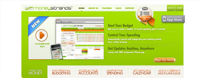
Money Strands is another website to help you budget your finances, and again we see a symbolic splash of green across the home page. The large and chunky Web 2.0 styled navigation underneath the main green body of the page offers the user bite-sized explanations of the services on offer, and the bright and welcoming graphics keep the user interested enough to read on further if they so desire.
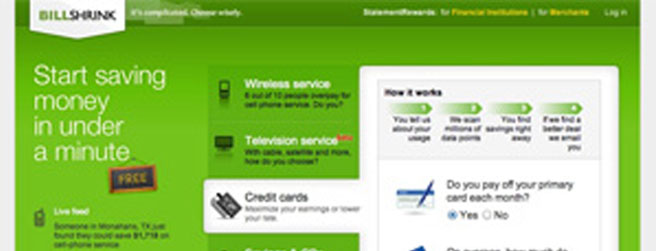
The money saving comparison website Bill Shrink allows the customer to compare everything from local gas prices, to television services and credit cards. The gradient green central section draws the eye straight to the information available, and the large navigational sections open to the right to provide the initial questions needed to enable the customer further in to the website. The use of “radio” buttons and Java sliders that the user can drag, make using the website innately more interesting than simply typing numbers in to an available field.
Welcoming and Personable Graphics
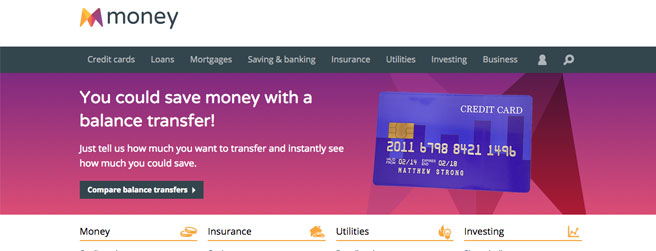
Money.co.uk offers everything from financial product comparison to the best savings rates and advice on benefits and debt management. The website is a huge cache of information, and the tricolored navigation at the top of the page instantly directs the user to the product or service they need. The rainbow colors of the logo, the glossy icon graphics, along with the large photographs of the site employees give the website a friendly and open feel, putting the customer at ease.
A Cool and Calming Corporate Color Scheme
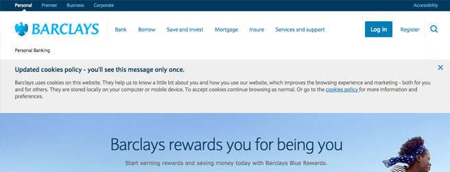
The Barclays banking website concentrates on using the company corporate colors throughout the design, and their use of a light Sky Blue gives the impression of calm and stability. Barclays offer many financial products, and the preliminary information about each product is presented in a grid-like style on the home page, spaced out with colorful graphics and icons.
Aiming at Everyday Finances
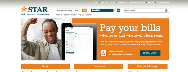
Star Financial go for a neutral background with great use of the two corporate colors in the homepage graphics and navigational system. The dark Teal gives an authoritative impression, whilst the bold orange is relaxed and inviting. When these two colors are teamed with large images of smiling faces, the design gives a definite impression of a banking institution that concentrates on the everyday customer.
The Cheery and Informal Approach
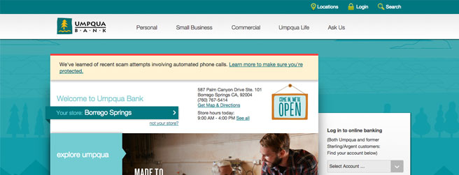
Umpqua Bank uses bold Cyan and Teal blue of various shades throughout the design of their site, and again this brings to the mind of the customer impressions of calm and stability. However, the graphics and copy on the Umpqua website are a little eccentric and unconventional. This informal approach to information presentation puts the customer at ease, and their unique “community” section allows the customer to feel part of the website and company, rather than just an observer.
Providing Depth of Field
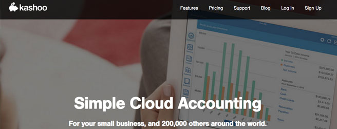
The online accounting software website Kashoo makes great use of overlapping graphics and drop shadows to give the website an almost tangible depth of field. The color coordinated green and blue graphics and icons give the website design consistency, and this is also reflected in the software they market, as screen shots can be seen on the front page featuring the same color scheme.
Black and White – Serious Money Matters
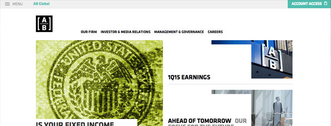
The sophisticated and serious black and white color scheme of the Alliance Bernstein website gives an impression of modernity and experience in executive financial matters. Although there is a small splash of green throughout the website to liven things up, the overall tone is that of authority and business.
Unusual Corporate Colors
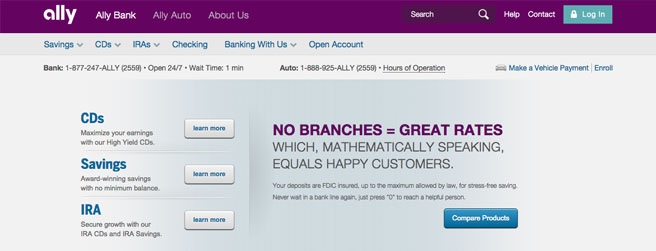
The Ally bank website design features an unusual and rich deep purple color scheme, and this unorthodox choice of corporate color is a great way to set a company apart from competitors. Ally’s specific and individual deep plum corporate color will be firmly associated with this business alone in the mind of the customer.


